(Archive) Advertising District / Jag's progress thread
-
 05-February 12
-
 Jaguar
Offline
Here's the Iron Tower, an observation tower more than 100 feet tall. It is one of the first attractions in the park, being constructed on the park opening year of 1910.
Jaguar
Offline
Here's the Iron Tower, an observation tower more than 100 feet tall. It is one of the first attractions in the park, being constructed on the park opening year of 1910.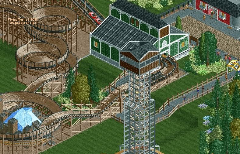
-
 Casimir
Offline
Now, that actually looks quite nice! Loving the supports!
Casimir
Offline
Now, that actually looks quite nice! Loving the supports!
But the station building... Mmmmh... Did you use a reallife reference for it? -
 BelgianGuy
Offline
look jag I feel like I need to speak out this time, keep the coaster and scrap the rest
BelgianGuy
Offline
look jag I feel like I need to speak out this time, keep the coaster and scrap the rest
-an icy mountain place that at the top of the lift not the bottom of the ride again a good idea with poor execution, this time in placement, also tidy up the quarter tile landscaping
-make your paths more flowing and use better path types, the combos you make look as if there's no thought in them in terms of aesthetics and texture
-Use more shapes in buildings, you basically always end up with a box that has a roof, look at shapes in buildings, I've seen little things other than a barn that are this boxy, lookat the station of vulture by K0NG a player who excels at detailed structures and complex architecture
-Make it a theme, you have a mountain, wich indicates alpine theme to me but there's nothing to enforce that feeling, you don't explain it visually, you let us guess and that's never a good thing. make it inmistakebly clear to the viewer.
Hack more and complex to prevent the glitches, your work is filled with these, sink the woodie track with MOM for 1 clearance and you'll have a way more satisfying result as it won't glitch
-Make sure everything makes sense, make it logical, your work doesn't show this.
-Focus on aesthetics first, your work isn't short of great ideas but the aesthetic appeal is never there, you could be a great player if you'd simply have an eye for ingame beauty unless your theme isn't as such as in dreamport where twisted acres was meant to be scary and someway more decomposed than the other areas, your use of colour is completely sub-par and this brings your work down drastically.
so to summarise:
get better structures
hack more and better to keep all clean and tidy
focus on aesthetics
make more logical choices
and above all make it appealing and clear to the viewer
-BG- -
Jaguar
Offline
I'm sorry, I should have clarified. That station and everything else besides the tower, were built eons ago.
I've seen little things other than a barn
Also, when you say that, would you consider these to be barns?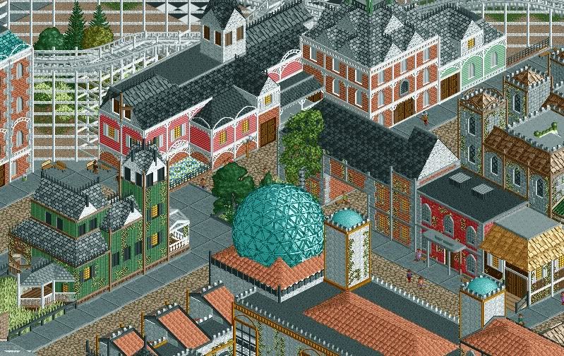
-
 highroll3r
Offline
its very good to be proud of your work but theres flat-faced issues with the buildings, texture clash, dull colours and i see no purpose for them. are they just hollow?
highroll3r
Offline
its very good to be proud of your work but theres flat-faced issues with the buildings, texture clash, dull colours and i see no purpose for them. are they just hollow?
its the colours that put me off mostly. i see theres no elevation change either.
edit: crown moulding is your friend when it comes to archy and flat surfaces. try that. -
 Ruben
Offline
At times you show glimpses of great skill, and then it returns to this ''he's-almost-at-a-breakthrough-but-not-quite-there'' feel. Maybe be harder on your work, revise and don't be afraid to let go what has to go?
Ruben
Offline
At times you show glimpses of great skill, and then it returns to this ''he's-almost-at-a-breakthrough-but-not-quite-there'' feel. Maybe be harder on your work, revise and don't be afraid to let go what has to go?
Furthermore you can be quite repetitive in your work, whether that's tóó many houses, too much use of vines, too many jagged rocks or even too many woodys in one park (one of your earlier releases). The key is to be versatile.
You have the talent, and to a certain extent the skill, and I can see you're somewhat annoyed by the (seemingly) lack of appreciation for that. What you need to do to change that is really work on reflecting on what you've built, how you built it, why it's there, whether it could look better, and whether it isn't just duplicating what's already there. Do that and your parks will automatically become way more exciting. -
Louis!
Offline
The trick to improving is to half listen to people. Listen to the advice they give, but don't let it knock your confidence. Just build, build, build. Practise makes perfect.
You know how I 'broke out of my shell' years ago, going from a n00b to an average player? I built a Micro. I focused all my attention on the areas I was weak at, foliage, architecture etc. And I built a micro purely for the reason to improve. I tried to imitate the current trend at NE.
Once I managed that micro in this 'new' style for me, I moved onto bigger things, it gave me the confidence to think, I built like that on that micro so I can build like it here.
And then I kept going and going, and went from an Average player to what I am today, a semi-decent player at both games.
Its about how much passion you put in. If you put in half the amount of passion you have to improve, into actually improving, you'll improve rapidly. -
BelgianGuy
Offline
jag you just have more boxes lined up next to eachother, make buildings come out, not all on the same line, awnings and such are your friends, balconies
-
 chorkiel
Offline
Do any of these buildings serve a purpose? Because they seem quite purposeless and build rather for the sake of building things on a map.
chorkiel
Offline
Do any of these buildings serve a purpose? Because they seem quite purposeless and build rather for the sake of building things on a map. -
 trav
Offline
^I don't get why people say this all the time.
trav
Offline
^I don't get why people say this all the time.
Even if building are just there as theming, then their purpose is to act as theming, not necessarily to be used for anything. -
 Pacificoaster
Offline
There's more scenery out there than just walls, corner poles, and fisherman arches . . .
Pacificoaster
Offline
There's more scenery out there than just walls, corner poles, and fisherman arches . . . -
 SSSammy
Offline
SSSammy
Offline
^I don't get why people say this all the time.
Even if building are just there as theming, then their purpose is to act as theming, not necessarily to be used for anything.
have you ever heard the phrase "there's no such thing as a free lunch" ?
it's a similar thing to that. there's no building without purpose. is it there to block a sight line or to direct your eyes towards or away from something. a building - like all things in rct - are there for a reason. any building built with the mindset "i'm going to fill this space" or "i have no idea what i'm doing" is inevitably going to look badly made.
so, for a TL;DR: buildings built to look pretty or immerse a theme are being used for somthing, even if that thing isn't selling burritos. -
chorkiel
Offline
^This exactly.
Also, the pathing between the buildings will look very confusing when you'd be standing there, the buildings look kinda like each other but not exactly but it's kinda shaped as in a maze. I'm not sure how I can explain this, though. -
Jaguar
Offline
I haven't gotten much done lately, but I'll post another screen showing a little bit of change.
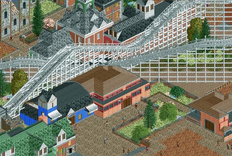
You may be asking what that building is, and I know that industrial looking structure may not match. It was actually my attempt to build a prairie style structure (one of the first true American styles of architecture) rather than continuing on the park with more traditional looking buildings. The question is, should I build more buildings in the park of this style or build in the other style.
Here's another structure I've already shown in the Dump. As you can tell, the screen is unfinished. I think it a better looking building than the other one though.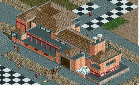
-
 Liampie
Offline
It looks more refined than your other architecture but don't fill the whole park with the same stuff. Vary the textures, colours and shapes. Without making it uncohesive of course.
Liampie
Offline
It looks more refined than your other architecture but don't fill the whole park with the same stuff. Vary the textures, colours and shapes. Without making it uncohesive of course. -
 Ling
Offline
With the heavy use of deco on the coaster as well as the buildings, I feel like you have overused it quite a bit. Colors aren't my favorite but I think it's more of an issue of blending and making sense than the colors themselves. You appear to have one and only one type (and colors) of underbrush - try to mix it up a bit more. I'm really not sold on the "prairie" thing. I didn't know what to think, but when I read "industrial" that's what stuck.
Ling
Offline
With the heavy use of deco on the coaster as well as the buildings, I feel like you have overused it quite a bit. Colors aren't my favorite but I think it's more of an issue of blending and making sense than the colors themselves. You appear to have one and only one type (and colors) of underbrush - try to mix it up a bit more. I'm really not sold on the "prairie" thing. I didn't know what to think, but when I read "industrial" that's what stuck. -
Ruben
Offline
Sorry, but whý custom support that woody?
It may be just me, as I've seen more woodies with custom supports lately, but imho it usually isn't an improvement. The rct supports are just fine, possibly with some minor custom additions. (Lots of the beam objects go really well/naturally with the standard supps) Right now you've got something that doesn't look natural, is véry glitchy, takes up a lot of your object limit/building time. Why?
Other than that I've gotta say I agree with Liam. Please diversify the park. Next to that it just doesn't really give me the amusement park feel. It more feels like a residential area with an accidental ride in there. Maybe change the ride<->structure ratio? -
 wheres_walto
Offline
wheres_walto
Offline

Boy, oh, boy. Do I like playing RCT. I practice and practice all day long, but I never get any better -
 Top Gun
Offline
^That really necessary? He HAS improved IMO. Posting things like that is not going to help.
Top Gun
Offline
^That really necessary? He HAS improved IMO. Posting things like that is not going to help. -
 Wanted
Offline
Wanted
Offline
Boy, oh, boy. Do I like playing RCT. I practice and practice all day long, but I never get any better
While this isn't really relevant for Jag cause he has improved, I laughed so fucking hard imagining that voice hahahahha
Tags
- No Tags