(Archive) Advertising District / Jag's progress thread
-
 05-February 12
-
 Jaguar
Offline
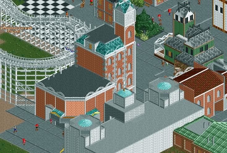
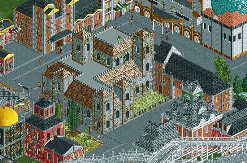
Thanks for the comments everyone, here are some more screens:
Jaguar
Offline
Thanks for the comments everyone, here are some more screens:
These are pictures of that brick building that was unfinished: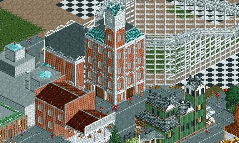
This structure was made over a year ago, I am not sure if I've shown it though: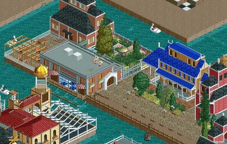
-
 Cena
Offline
It's still very blocky. Colors look much better in the last screen then in the ones you posted at the top of this thread. I would reccomand trying to fix those glitches. Rest looks pretty good.
Cena
Offline
It's still very blocky. Colors look much better in the last screen then in the ones you posted at the top of this thread. I would reccomand trying to fix those glitches. Rest looks pretty good.
About your question. I think you have a chance to be picked between spots 50-60. -
Jaguar
Offline
It's still very blocky. Colors look much better in the last screen then in the ones you posted at the top of this thread. I would reccomand trying to fix those glitches. Rest looks pretty good.
About your question. I think you have a chance to be picked between spots 50-60.
Thanks, also I hope so.Wow! You have improved so much. Great work.
Thank you.These screens are awesome, jag. I think you may have surpassed me.
Perhaps.
-
 CoasterCreator9
Offline
I like 90% of this. The main thing I keep going to is the wooden coaster's supports. I know what you're trying to do, but for some reason it looks very flimsy. I love the archy though.
CoasterCreator9
Offline
I like 90% of this. The main thing I keep going to is the wooden coaster's supports. I know what you're trying to do, but for some reason it looks very flimsy. I love the archy though. -
 chorkiel
Offline
I quite like this but it rather annoys me that a lot of your buildings have those white outlines (I can't recall what to name them atm..).
chorkiel
Offline
I quite like this but it rather annoys me that a lot of your buildings have those white outlines (I can't recall what to name them atm..). -
 Hex
Offline
Jag, you are improving but it's still got room for improvement. I am liking it though, except for those woodie supports.
Hex
Offline
Jag, you are improving but it's still got room for improvement. I am liking it though, except for those woodie supports. -
Jaguar
Offline
I think you're overdoing it on the vines.
Perhaps, but I wanted to make it look overgrown.
How's the architecture? -
 Liampie
Offline
Overgrown.
Liampie
Offline
Overgrown.
Bad colour schemes per building, no colour scheme overall. No cohesion. But definitely an improvement, and not at all bad. -
Jaguar
Offline
Bad colour schemes per building, no colour scheme overall. No cohesion. But definitely an improvement, and not at all bad.
I know that everyone will be annoyed by the excuses, but many of the buildings are not meant to have a color scheme, especially those red and green ones. I've tried giving them a "ginger bread" appearance like many victorian styled buildings. Most victorian styled homes I've seen were brightly colored in a red, yellow, green, white, or even pink scheme. It isn't meant to match. -
Liampie
Offline
I'm not annoyed by your excuse, at least is shows that you had a vision while building this. It's not the idea but the execution that needs work.
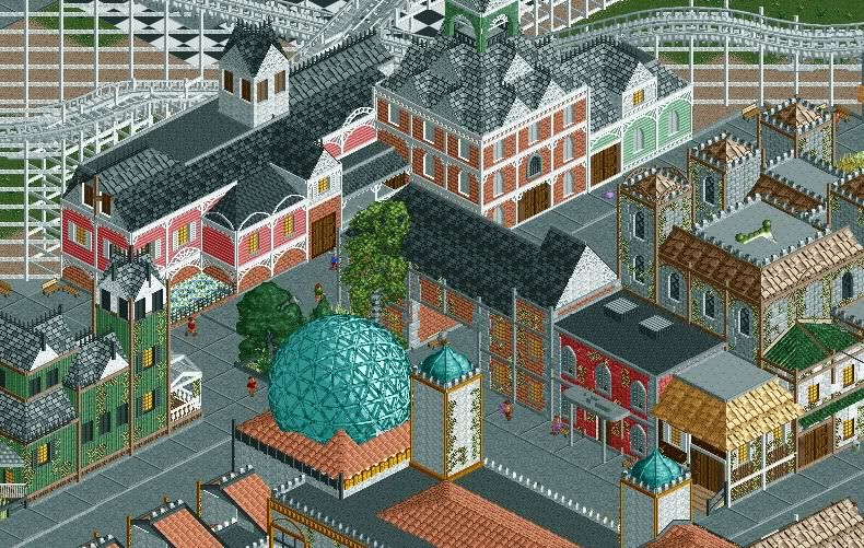
That said, I had no idea this was supposed to be Victorian. This is what I see when I google Victorian Architecture: mostly freestanding villas, made of wooden planks (horizontal, not vertical like in your park), pastel walls with white (or another colour lighter than the walls) detailing and darker roofs. No mosques. The concrete paths kill the atmosphere don't add anything to the theme. The foliage (vines included) has dull colours, another atmosphere killer. Unless you're going for a stereotypical Detroit theme, you didn't really do a good job on this. Consider every texture, shape and colour you've used. Which ones fit the theme and which don't? Consider everything you do. It sounds like a lot of work but it'll go automatically after a while.
Lastly... what's with the yellow dome?
-
Jaguar
Offline
mostly freestanding villas, made of wooden planks (horizontal, not vertical like in your park), pastel walls with white (or another colour lighter than the walls) detailing and darker roofs. No mosques. The concrete paths kill the atmosphere don't add anything to the theme. The foliage (vines included) has dull colours, another atmosphere killer. Unless you're going for a stereotypical Detroit theme, you didn't really do a good job on this. Consider every texture, shape and colour you've used. Which ones fit the theme and which don't? Consider everything you do. It sounds like a lot of work but it'll go automatically after a while.
Lastly... what's with the yellow dome?
Lol, that "Mosque" and the yellow dome were made quite awhile ago, I just haven't gotten around to changing them yet. The mediterranean/arabian building is a theater and the yellow dome was going to be an observatory. Funnily enough, that is kind of my theme. The car ride is called "Detroit Motors," as the park has a bit of a midwestern metropolitan theme. Should I use crazy paving path instead? Also, the siding of the victorian buildings can be vertical, but clapboard siding is also often used, which although is more common in New England, it can still be found often in the Midwest. -
 RRP
Offline
You're getting there Jag.Keep trying things and learning.Good work though,much better than your old stuff
RRP
Offline
You're getting there Jag.Keep trying things and learning.Good work though,much better than your old stuff -
Jaguar
Offline
You're getting there Jag.Keep trying things and learning.Good work though,much better than your old stuff
Thanks. Do you think this park will recieve an accolade?


Tags
- No Tags