(Archive) Advertising District / Python/De Vliegende Hollander
-
 22-February 12
-
 leonidas
Offline
I quite like the wild look of the foliage.
leonidas
Offline
I quite like the wild look of the foliage.
The castle looks exstremely cute, although I would still change the brown into something else.
It looks weird with the white and takes away some of the softness it should have.
You could try that Beige-pink skin-ish color. -
 Cena
Offline
Normally castles are build as a viewpoint on top of a hill. And don't have high foliage blocking that view. In reallife parks you see the same. As example,look at disney parks. The castle is almost all thetime visible from every angle.
Cena
Offline
Normally castles are build as a viewpoint on top of a hill. And don't have high foliage blocking that view. In reallife parks you see the same. As example,look at disney parks. The castle is almost all thetime visible from every angle.
I wonder though, is it somewhat peepable/a ride or shop in there? -
Colorado-Fan Offline
Maybe for Disney it's right to have a high castle but in the fairytale forest of Efteling there are a lot of small buildings that can't bee seen because of the big forest. I think he got the Efteling atmosphere with this castle. -
 Sulakke
Offline
Great screen with phenomanal atmosphere, although I think the foliage could be a litte more denser and I don't really like the blocky waterfall, nor the blocky path next to it. I would prefer path that doesn't fill a whole square over the ones you used here. It would add to the atmosphere I think. Maybe it's an idea to use the brown sand path in the sprookjesbos?
Sulakke
Offline
Great screen with phenomanal atmosphere, although I think the foliage could be a litte more denser and I don't really like the blocky waterfall, nor the blocky path next to it. I would prefer path that doesn't fill a whole square over the ones you used here. It would add to the atmosphere I think. Maybe it's an idea to use the brown sand path in the sprookjesbos? -
 highroll3r
Offline
very, very, very nice. i love the vibe. with castles i always go for grey or brown but the white is perfect here. the roof colour is fine too. looks class how it is.
highroll3r
Offline
very, very, very nice. i love the vibe. with castles i always go for grey or brown but the white is perfect here. the roof colour is fine too. looks class how it is.
-maybe use less junipers.
- i dont know why youve coloured the small rounded deco piece on the middle tower black. could change it to white like the rest. maybe white will stand out too much though. -
Sulakke
Offline
I agree on using less junipers. Most of the times a forest consists of large trees and small shrubbery. Don't know if you're going for a real forest though?
-
 nin
Offline
Disney's castles an entirely different purpose, Cena. This castle is fine. The only thing somewhat bothering me is the scale of the path in terms of the castle, but its not a huge deal. I like this screen a lot.
nin
Offline
Disney's castles an entirely different purpose, Cena. This castle is fine. The only thing somewhat bothering me is the scale of the path in terms of the castle, but its not a huge deal. I like this screen a lot. -
 Liampie
Offline
Thanks for the replies so far! Keep 'em coming.
Liampie
Offline
Thanks for the replies so far! Keep 'em coming.
I can try, it's no big deal, but I think the white works here. Also, pretty much every other building in the surroundings areas are brown/beige so it's nice to have a white building for a change. Plus, I think white feels more accurate than brown:The castle looks exstremely cute, although I would still change the brown into something else.
It looks weird with the white and takes away some of the softness it should have. You could try that Beige-pink skin-ish color.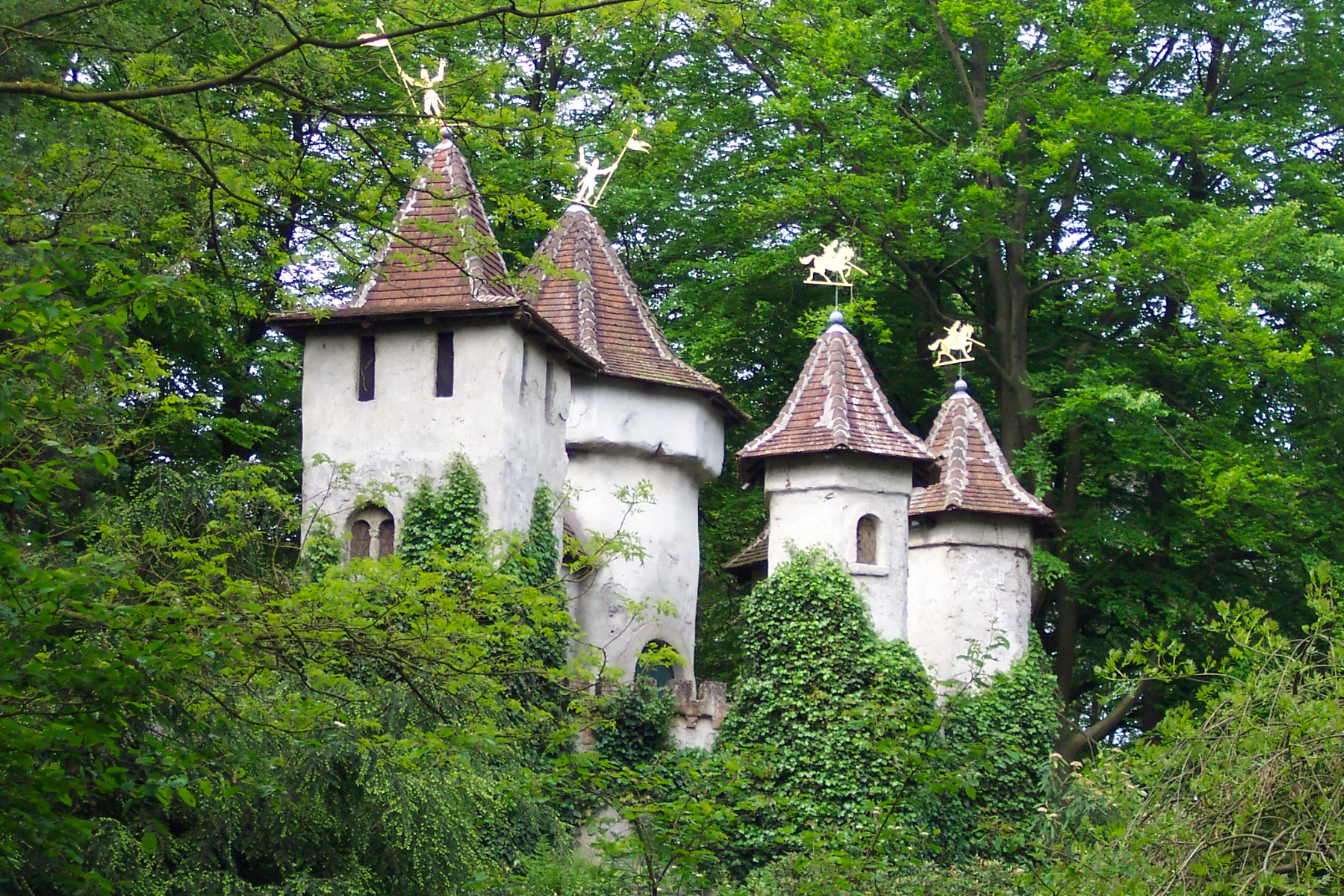
I'm not sure, maybe it's the light, but Doornroosje's castle feels slightly lighter than most other plastered buildings in the Efteling.
See picture.Normally castles are build as a viewpoint on top of a hill. And don't have high foliage blocking that view. In reallife parks you see the same. As example,look at disney parks. The castle is almost all thetime visible from every angle.
I wonder though, is it somewhat peepable/a ride or shop in there?
Nope. The building with interiors (no interiors in game, sorry) is the ride.
Personally I think the waterfall looks fine, but you're right about the paths. I can't really help it though, it has to be peepable!Great screen with phenomanal atmosphere, although I think the foliage could be a litte more denser and I don't really like the blocky waterfall, nor the blocky path next to it. I would prefer path that doesn't fill a whole square over the ones you used here. It would add to the atmosphere I think. Maybe it's an idea to use the brown sand path in the sprookjesbos?
They're supposed to look like windows, like in the square tower. It's not certain if they stay or not. Thanks for mentioning.- i dont know why youve coloured the small rounded deco piece on the middle tower black. could change it to white like the rest. maybe white will stand out too much though.
The type of foliage I want, on the right:I agree on using less junipers. Most of the times a forest consists of large trees and small shrubbery. Don't know if you're going for a real forest though?

Realistic density. This serves two purposes: firstly it resembles het Sprookjesbos, secondly I'm saving map data. I have to build very economical to get this park finished. As long as the map is not full I can't and won't scatter foliage randomly. I'm trying to make it look as full as possible using as few object slots as possible. I disagree about the junipers for now. Maybe I'll change my mind, we'll see in a couple of updates.
-
 Dimi
Offline
The building is beautiful, but I don't really like the foliage. Like Sulakke says, it should be more dense. More leaves, less ground texture, then you can cut back on small shrubbery and grass.
Dimi
Offline
The building is beautiful, but I don't really like the foliage. Like Sulakke says, it should be more dense. More leaves, less ground texture, then you can cut back on small shrubbery and grass. -
Sulakke
Offline
I didn't refer to quarter block paths, but to the original RCT paths, the peepable ones. They are smaller than the ones you usedPersonally I think the waterfall looks fine, but you're right about the paths. I can't really help it though, it has to be peepable!

-
 Super G
Offline
I would add some gray pieces into the castle. Like the shape of the building, verry realistic. I immediately thought it was Doornroosje!
Super G
Offline
I would add some gray pieces into the castle. Like the shape of the building, verry realistic. I immediately thought it was Doornroosje! -
 RHCPepperfan
Offline
Everything looks good, though, the first screen has too much brown for my tastes.
RHCPepperfan
Offline
Everything looks good, though, the first screen has too much brown for my tastes.
I wonder if your DvH is gonna look anything like my old project.
-
 Comet
Offline
I really don't like that S-bend planter in the first screen and I would definitely prefer you having one large rail crossing compared to the two smaller ones you have. So basically have the crossing on the right side of the screen be 4 tiles wide and connect the S-bend into the planter on the left side of the screen. I don't know why I just think it would look better and possibly push more people into the shop in real life while they're waiting for the train to pass or just walking by
Comet
Offline
I really don't like that S-bend planter in the first screen and I would definitely prefer you having one large rail crossing compared to the two smaller ones you have. So basically have the crossing on the right side of the screen be 4 tiles wide and connect the S-bend into the planter on the left side of the screen. I don't know why I just think it would look better and possibly push more people into the shop in real life while they're waiting for the train to pass or just walking by
Other than that this is awesome tho! -
Liampie
Offline
That's true but it works only for bigger patches of foliage. In this case there's always something like the map's edge, buildings or path to interrupt the foliage. Therefore there is always bare ground visible. I will definately use denser foliage for larger areas though, as I'm doing against the backs of buildings (also so I don't have to spend costly map data slots on the back sides). Thanks.The building is beautiful, but I don't really like the foliage. Like Sulakke says, it should be more dense. More leaves, less ground texture, then you can cut back on small shrubbery and grass.
Of course. It sounds like worth trying! Thanks.I didn't refer to quarter block paths, but to the original RCT paths, the peepable ones. They are smaller than the ones you used
That's that's not my problem.Everything looks good, though, the first screen has too much brown for my tastes.

I don't think there is.^pretty nice theming there. dl to that park?
I hope you like it more when you see the whole area... I'm not planning on changing it. Good thinking about the shop. Not good enough to convince me to change everything, but still good. Sorry for sounding so incredibly stubborn.I really don't like that S-bend planter in the first screen and I would definitely prefer you having one large rail crossing compared to the two smaller ones you have. So basically have the crossing on the right side of the screen be 4 tiles wide and connect the S-bend into the planter on the left side of the screen. I don't know why I just think it would look better and possibly push more people into the shop in real life while they're waiting for the train to pass or just walking by
It's just that some areas in this park are either clear visions I want to recreate or semi-recreations that can't deviate from reality too much. I promise, to everyone, that there will be areas that are more freestyle and thus more suitable for suggestions and criticism. Thanks for the thoughts anyway, Comet!
Thanks to all of you.
-
 Angroc
Offline
I personally love that S bend and how it seem to wrap around the the building sorta.
Angroc
Offline
I personally love that S bend and how it seem to wrap around the the building sorta.
I haven't seen in it in the context of the park, but it gives that particular screen more life. A curvy line is more interesting than a straight one. -
RHCPepperfan
Offline
Sorry mate, lost it during a computer upgrade years ago.^pretty nice theming there. dl to that park?
-
Liampie
Offline

Update #3
Not much happened since the last update. This screen made me realise that a traditional semi realistic park is what I really like to build. Imagine a park where Lijiang is just another area among others... That would make Legacies look like shit. I've always wanted to do a park like Eftel Towers as well, but somehow I lack proper motivation. I got some good stuff down already, but there are some others things crucial for this park that I cannot get to look right. And I'm afraid I'll never nail Nemesis, both the coaster and the theming. Never ever.
In other words, I'm not sure what to do with this park. Cancelling projects is not my style. I might turn De Vliegende Hollander and De Python into a double design, as in two coasters on one map as design submission. I might turn Anton Pieck Square into an area of a new themepark. It's easily the best (most atmospheric) stuff in the park, I think.
The more I look at this screen, the more possiblities I see to recycle the theming into something at least twice as awesome.


Tags
- No Tags