(Archive) Advertising District / Python/De Vliegende Hollander
-
 22-February 12
-
 Cocoa
Offline
I've never been there, but I have a nagging feeling that green grass would look sooo much better than sand. You have some amazing atmosphere and detail going there, but there's some sort of dark/barren atmosphere that having so much sand/dirt underneath your foliage brings. I'm also a little confused by the track type used. Wouldn't any of the more schwartzkopf-y or mack-y track types look better and be more accurate?
Cocoa
Offline
I've never been there, but I have a nagging feeling that green grass would look sooo much better than sand. You have some amazing atmosphere and detail going there, but there's some sort of dark/barren atmosphere that having so much sand/dirt underneath your foliage brings. I'm also a little confused by the track type used. Wouldn't any of the more schwartzkopf-y or mack-y track types look better and be more accurate?
anyway, you already know that it is an awesome screen. -
 chorkiel
Offline
I'm actually pretty sure you can do better. Your efteling inspired works are most likely the best things themed in an efteling sphere but this screen isn't just as good as others. It's very accurate but doesn't capture the atmosphere as the other screens did.
chorkiel
Offline
I'm actually pretty sure you can do better. Your efteling inspired works are most likely the best things themed in an efteling sphere but this screen isn't just as good as others. It's very accurate but doesn't capture the atmosphere as the other screens did. -
 Maverick
Offline
Well after seeing this I'm willing to forgive the lack of effort towards the Micro. (I wasn't ready either)
Maverick
Offline
Well after seeing this I'm willing to forgive the lack of effort towards the Micro. (I wasn't ready either) -
 Liampie
Offline
Thanks for the comments.
Liampie
Offline
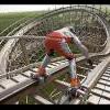
Thanks for the comments.I've never been there, but I have a nagging feeling that green grass would look sooo much better than sand. You have some amazing atmosphere and detail going there, but there's some sort of dark/barren atmosphere that having so much sand/dirt underneath your foliage brings. I'm also a little confused by the track type used. Wouldn't any of the more schwartzkopf-y or mack-y track types look better and be more accurate?
The sand area is supposed to represent a heath/dune landscape and is very much a part of the theming. Dark, in this case, is good. The ride IS dark. I might add some yellow-ish bushes to the area though. Only just thought of that. Might help for you?
The coaster is not manufactured by Mack, but by the one day fly KumbaK Coasters. It's a unique track type, also a huge tracktype, and I feel the standup track is the closest thing we have. Schwarzkopf track could work but feels too small in my opinion.
I'm actually pretty sure you can do better. Your efteling inspired works are most likely the best things themed in an efteling sphere but this screen isn't just as good as others. It's very accurate but doesn't capture the atmosphere as the other screens did.
Could it be that there's a wooden coaster missing? Maybe it's the poorly executed facade? Though accuracy is not something I aim for, I'd appreciate more specific thoughts on this.Well after seeing this I'm willing to forgive the lack of effort towards the Micro. (I wasn't ready either)
We're both guilty.
-
chorkiel
Offline
I could have been more specific indeed. What I wanted to say:
Your efteling inspired work is great, piranha and all the screens you have shown all really have that efteling atmosphere which is hard to capture. I personally think you could have done a better on job on getting that atmosphere in this screen.
I'm not really sure what the problem is. Maybe it's the gray or the sand but something is holding it back for me. You could do better on the facades for sure, yeah.
Also, are you and pacific implying that there will also be a joris en de draak in this park? -
 leonidas
Offline
The wooden cabin, hiding the MCBR seems too long in your version.
leonidas
Offline
The wooden cabin, hiding the MCBR seems too long in your version.
Also, 'De Python' is impossible to recreate in RCT2, so the layout looks silly.
Same counts for the facades of VHE, they look slightly blocky, childish maybe, and rigid.
The foliage, however is perfect and really captures the Efteling's forresty atmosphere.
You did a great job, but imo RCT2 is too limited to capture the finesse of the Efteling completely. Therefor, a more atmospheric/free interpretation would maybe look better, with some concessions it might be able to breathe the atmosphere a bit more, like I felt with your Piranha project, for instance. -
 Louis!
Offline
I've just realised how imprved this area is in terms of architecture and everything, really great work Liam.
Louis!
Offline
I've just realised how imprved this area is in terms of architecture and everything, really great work Liam.
Just a suggestion, the water trough that the cars travel through after the splash down, I think it would look better if they touched the surface of the water, like they do in the real thing. Also you're actual splashdown area could do with some work I think. If you get those little touches done then you've really got a great creation, yet again. -
Liampie
Offline
Therefor, a more atmospheric/free interpretation would maybe look better, with some concessions it might be able to breathe the atmosphere a bit more
That's exactly what this is. /> My interpretation differs quite a lot from the real thing. I think I haven't even used a single reference pic for what's in this screen.
I agree that the last part of the ride in the water is not quite as good as I had planned. Sadly there are limits to the technical possibilities and also my willingness and patience to spend hours over a few pixels. This is as far as I wanted to go. It's definitely acceptable if you ask me... Is this seriously keeping you from thinking this is great?Just a suggestion, the water trough that the cars travel through after the splash down, I think it would look better if they touched the surface of the water, like they do in the real thing. Also you're actual splashdown area could do with some work I think. If you get those little touches done then you've really got a great creation, yet again.
Please return the favour!95%
---------
99%
All that's left to do is adding shops, naming staff and writing a read-me. There's no test-phase! -
 Maverix
Offline
Hooray! The whole area gives off such a calm and pleasant vibe, really good stuff.
Maverix
Offline
Hooray! The whole area gives off such a calm and pleasant vibe, really good stuff.
How big is the map by the way? -
 pierrot
Offline
I actually can't wait to see this in game, this gonna be your best work along with Piraña.
pierrot
Offline
I actually can't wait to see this in game, this gonna be your best work along with Piraña. -
Louis!
Offline
That path is really killing the vibe.
Edit: I would suggest changing it to crazy pathing and switch the crazy pathing that is currently there to brick.
Or add in little patches of crazy pathing to break up that massive load of that path.
I just find that path very ugly and really harsh on the eyes in such a large block. -
 Steve
Offline
Please change the path, or at least break it up some. It's really distracting from the overall content and killing the atmosphere for me.
Steve
Offline
Please change the path, or at least break it up some. It's really distracting from the overall content and killing the atmosphere for me. -
leonidas
Offline
I don't mind the path that much, I do feel like there may be too much red in that screen, some more of that blue, green, yellow and white might balance it out nicely.
As for the rest: Amazing! Such a nice atmosphere. I love this plaza.


Tags
- No Tags