(Archive) Advertising District / Thoughts
-
 12-March 12
-
 verti
Offline
I've spent quite a few years working at train stations and I really don't see how this is wrong. This looks just like any real life larger public transportation hub.
verti
Offline
I've spent quite a few years working at train stations and I really don't see how this is wrong. This looks just like any real life larger public transportation hub. -
 Loopy
Offline
This looks great. Really solid, classical work. The first screen intrigues me especially.
Loopy
Offline
This looks great. Really solid, classical work. The first screen intrigues me especially. -
 Roomie
Offline
Just to whey in on the station
Roomie
Offline
Just to whey in on the station
I would say a Terminus is the the end of the line like Waterloo or Paddington where as a Terminal would allow through traffic such as this.
Anyway Liam it's a great screen, reminds me of Mala meets Levis in a way. -
 Liampie
Offline
Liampie
Offline

P O R T . R O Y A L

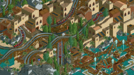
Some thoughts: trains are cloned in paint. This screen is more than the previous screens an indication of the average quality on the map. There's a 'naval warfare arena' with rowing boats to the right of this screen. -
 CoasterForce
Offline
Very cool. The s-bend works here for me. It's a ballsy thing to do, but it fits perfectly on that block of land. the layout of the woody looks great, especially the big drop and the turn under the monorail structure. I don't know what's going on with the pirate ships in the bottom right. maybe it'd look better if they were more flush up with each other (still positioned in the same way?) I don't know, maybe its the convoluted paths in that area that get me. only other comment I'd add is the palm trees on rocks--never liked that.
CoasterForce
Offline
Very cool. The s-bend works here for me. It's a ballsy thing to do, but it fits perfectly on that block of land. the layout of the woody looks great, especially the big drop and the turn under the monorail structure. I don't know what's going on with the pirate ships in the bottom right. maybe it'd look better if they were more flush up with each other (still positioned in the same way?) I don't know, maybe its the convoluted paths in that area that get me. only other comment I'd add is the palm trees on rocks--never liked that. -
 gir
Offline
I agree with Louis, the composition here is lacking. You can make well-functioning peep-friendly parks look good, but this is just messy.
gir
Offline
I agree with Louis, the composition here is lacking. You can make well-functioning peep-friendly parks look good, but this is just messy. -

RMM Offline
the layout is what makes the surroundings look like a mess. sure, it's peep-friendly but that doesn't mean that flow doesn't need to be maintained to sustain a good looking park. and i think alotta people think that they can be lazy with layouts and 'flow' simply because it's peep friendly. and that is my friend is bullshit. but as i was saying, the coaster layout looks bad from this screen. -
Liampie
Offline
Thanks for your thoughts.
Actually there's three.I really like it! So classic. Not sure on the two swinging ships though.
 The English Navy, the Spanish Armada and the Dutch Fleet.
There's also a trio of motion simulators in another area. They're called Milk, Cheese and Cream. It might sound weird but it actually looks cool to have three motion simulators next to eachother.the layout is what makes the surroundings look like a mess. sure, it's peep-friendly but don't that doesn't mean that flow doesn't need to be maintained to sustain a good looking park. and i think alotta people think that they can be lazy with layouts and 'flow' simply because it's peep friendly. and that is my friend is bullshit. but as i was saying, the coaster layout looks bad from this screen.
I admit the coaster has some good parts and some bad parts. The good part isn't in the screen. I'm not redoing it because I don't think it's terible, plus it's a stream of consciousness. I can whip up these areas in a matter of hours so this park might actually get finished. Maybe within a month even? I'm not lazy with layouts or flow because I just go with the flow. No pun intended. Hope you like it better when you see it in game. Thanks for the feedback anyway. It'll help me with future work.
-
K0NG
Offline
but don't that doesn't mean that flow doesn't need to be maintained
I couldn't not disagree...more or less
-
Liampie
Offline
T H E . S I R E N
.
.
.
.
.
.
.
.
.
.
.
Lots of thanks to 5Dave for the logo. I love it. In case you can't see the screen (please notify me here), here's an attachment. Should work.


Tags
- No Tags