(Archive) Advertising District / Zac's/ Shotguns?'s stuff thread.
-
 13-May 12
-
 Xeccah
Offline
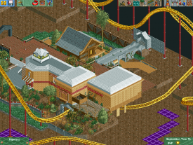
Hey guys, I just want to get some feedback from these screens to see if i'm headed in the right direction.
Xeccah
Offline
Hey guys, I just want to get some feedback from these screens to see if i'm headed in the right direction.
-
 MorganFan
Offline
Very nice foliage, however repetitive.
MorganFan
Offline
Very nice foliage, however repetitive.
I like the few details that have been finished, although I have no idea what you're going for, so I can't say much more. -
Xeccah
Offline
BC(rct2) : thanks for your input!
MorganFan : once I add some archy, it won't look repetitive whatsoever.
Arjan : ^^ -
 Ruben
Offline
I see custom scenery! Yay.
Ruben
Offline
I see custom scenery! Yay.
For now quite a solid start. Good foliage, could use some brighter/fresher stuff to diversify. (get some green in there! )
)
As for the archy: Not much to see yet, just make sure that if you build something it has some sort of purpose. Don't just build stuff for the sake of building.
Edit: Btw, also keep some sense of what's real/logical and what's not. For example the bridge, there's a lot of roof and not a lot of support. That usually doesn't go together very well.
-
Xeccah
Offline
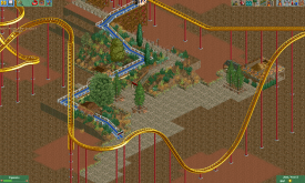
there is green, but definitely is not the primary color. I was trying for a spanish feel as well as an outdoorsy one.
Ruben, I was just too lazy to change Atrophy into a CS park, I had the bench made and everything.
The station and brake run will definitely include well-made archy, I'm about to delete that hut under the coaster. -
Xeccah
Offline
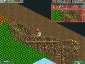
The foilage is bad?
Thats the whole thing in this screen.
If you look, there is a method to the landscaping/foilage.
Its still good for the fact that these screens are being viewed as generally positive. Thanks, but negative ( even nitpicky ) things help me out TONS more.
Bump -
 Super G
Offline
No the foliage is awesome! You only have to custom-support your coaster, it will look so much better!
Super G
Offline
No the foliage is awesome! You only have to custom-support your coaster, it will look so much better! -
 Arjan v l
Offline
Arjan v l
Offline
The foilage is bad?
Thats the whole thing in this screen.
If you look, there is a method to the landscaping/foilage.
Its still good for the fact that these screens are being viewed as generally positive. Thanks, but negative ( even nitpicky ) things help me out TONS more.
Bump
Nothing wrong with the foilage, maybe add some flowers for some more atmosphere. -

RMM Offline
see, i get the feeling that you were building with the intentions of showing a screen as soon as possible, rather than building and then deciding the show a screen. try not to build for screens but rather for the sake a building... then show what you're proud of or what you want criticism on.
i fall into the same trap all the time. especially when i played often. i would literally build a bit and then my mind would just make me build at certain angles and only in certain areas, just enough to fit into a screen. i'd post the screen, get some thoughts, and then BAM! that was it... there went my project and all my interest. not because of the content of the feedback but because i was building to show a screen and not building to complete my idea.
i may be way off here, i get that, but this is just a thought that immediately branched off... and i went with it.
EDIT: nobody can tell you whether you're heading in the right direction. only you can, man. there isn't enough substance in your screens for you to actually take in any feedback, therefore the feedback here isn't even credible. -
 Ling
Offline
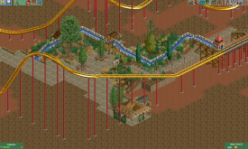
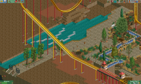
The fences kill your use of the diagonal path. Raise the land and texture the far side of the land instead of just putting fences beneath the path.
Ling
Offline
The fences kill your use of the diagonal path. Raise the land and texture the far side of the land instead of just putting fences beneath the path.
I don't really like how you're coloring the trees, doesn't look natural at all. And the colors for the roof on the station don't really work with that texture of roof. It could also stand to have a little more variation in the layout (the station, I mean). -
 In:Cities
Offline
I'm glad to see such persistence from you! You've greatly improved over the past few days, and this is my favorite work from you so far. I love the interaction and the structure of the building. The colors need a bit of work though, as well as the foliage.
In:Cities
Offline
I'm glad to see such persistence from you! You've greatly improved over the past few days, and this is my favorite work from you so far. I love the interaction and the structure of the building. The colors need a bit of work though, as well as the foliage.
Keep at it! -
 FK+Coastermind
Offline
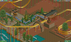
I'm not sure of the coaster. A chain hill without a mini-drop and a huge drop into essentially an s-bend. I'd have it rise again after the first drop, then turn into the second hill. Either way, I like the archy, lots of atmosphere, but yeah, weird colors.
FK+Coastermind
Offline
I'm not sure of the coaster. A chain hill without a mini-drop and a huge drop into essentially an s-bend. I'd have it rise again after the first drop, then turn into the second hill. Either way, I like the archy, lots of atmosphere, but yeah, weird colors.
FK -
MorganFan
Offline
Unrealistic B&M drop is unrealistic. You could make it somewhat like Superman: Krypton Coaster's or Alpengeist's, where it helixes around to the right at a 270 degree turn.
I like how it dives under the building, and I really like the last screen a lot. The little porch area is neat.
I'm not sure about the color of the water. -
Xeccah
Offline
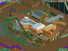
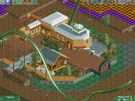
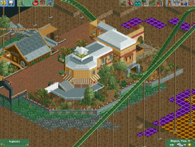
Screenz:
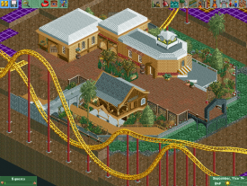
As you can see, I changed the coaster to an Intamin because I think it'll work better. I also smoothed out the drop.
Just added a few touches and finished up another building.
Just for fun. -
 trav
Offline
Work on your foliage, make it thicker and it doesn't have to be on every tile. Foliage, unless it's in a forest, tends to grow in clusters rather than spread out so thinly.
trav
Offline
Work on your foliage, make it thicker and it doesn't have to be on every tile. Foliage, unless it's in a forest, tends to grow in clusters rather than spread out so thinly.


Tags
- No Tags