(Archive) Advertising District / The Mrbuckeye park thread (official)
-
 21-June 12
-
 Jaguar
Offline
It looks quite nice. If I could offer suggestions, I would add brighter colors and more foliage to give it a warm and exciting feel as well as making the buildings a bit less blocky. Add more details, like broken walls with piles of rubble. Show more signs of decay. Doing so can create a huge difference and make it look natural.
Jaguar
Offline
It looks quite nice. If I could offer suggestions, I would add brighter colors and more foliage to give it a warm and exciting feel as well as making the buildings a bit less blocky. Add more details, like broken walls with piles of rubble. Show more signs of decay. Doing so can create a huge difference and make it look natural. -
 Ruben
Offline
I kind of agree with Green da... err... Pacificoaster I fear.
Ruben
Offline
I kind of agree with Green da... err... Pacificoaster I fear.
It's all a big blur of the same stuff, and worst of all, there doesn't seem to be a reason for it. Would a theme park ever pay millions and millions for entire structures only for the sake of theming? It's almost always combined with uses like restaurants, indoor rides, shops, office space, you name it. Not just buildings for the sake of buildings.
So yeah, my tip is think about whý and whát would a real park do, and build what you base on that. Or if you wanna go for fantasy after all to not have this problem, at least create some contrasting stuff, some variance in there etc. -
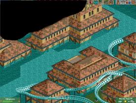
 Scoop
Offline
Hey all.
Scoop
Offline
Hey all.
Here is some stuff that I have been working on during my time
away from the site here and there.
I hope you enjoy and feel free to give feedback. />
/>
Also It's definatley in complete I still need to foilage the screen and support the coasters,
-
 MorganFan
Offline
So you can put pointless supports over a queue but not on a coaster? Fix that. Other than that, the archy is okay, but that path needs to be broken up.
MorganFan
Offline
So you can put pointless supports over a queue but not on a coaster? Fix that. Other than that, the archy is okay, but that path needs to be broken up. -
 Arjan v l
Offline
Nice to see that you're experimenting with more versatile shapes in your architecture.
Arjan v l
Offline
Nice to see that you're experimenting with more versatile shapes in your architecture.
You're improving. -
Scoop
Offline
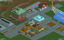
Hey all. I am really proud of the new progress that I have encountered and hope it still excels. here is another screen of some work being done.
Attached Thumbnails
-
-
 WhosLeon
Offline
I think it looks pretty nice, but the station might be a little bit blocky, and all the different fences look a little bit messy, and i dont think the path from the ride exit fits in the area
WhosLeon
Offline
I think it looks pretty nice, but the station might be a little bit blocky, and all the different fences look a little bit messy, and i dont think the path from the ride exit fits in the area -
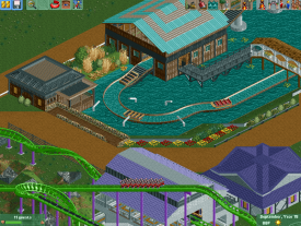
 Luketh
Offline
Hey buckeye, nice screen! I've got some small critiques that may help you improve a bit if you'd like:
Luketh
Offline
Hey buckeye, nice screen! I've got some small critiques that may help you improve a bit if you'd like:
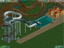
I'd suggest putting that little 1/4 tile water spout piece at the end of at least some of those white water guns in the middle of the screen (assuming that's what they are, of course) to make them look functional; right now they remind me more of pieces of an abstract sculpture more than water spouts.. that might just be me, though.
Extend the supports on that ride all the way down to the bottom of the lake! Do this by lowering the water, continuing the supports downward, and then turning on zero-clearances in 8cars and raising the water back to the desired height. You'll find that continuing the supports helps greatly aesthetically as well as logically.
I really like the shape of that dark purple roof at the bottom of the screen. I like the station for that floorless coaster as well but I think it would look much better with some color and detail on it; since it's a ride station it should be interesting and grab guests' eyes so that they know where to head in order to get on the ride.
Finally, try changing that strange black path at the exit of the splash boats ride -- it'd probably look better if you just continued the same path type as the covered bridge.
Looking back over this thread, this is one of the better screens you've posted so far; keep it coming! Feel free to take or leave any of the suggestions I left above -- I'm no expert, but I feel that they'll help improve the quality of that screen. Good luck and happy tycooning! -
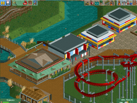
Scoop
Offline
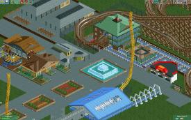
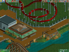
hey guys here is a new set of screens from my park exclusively for twitch.
disregard the brown pole in the second screen and the path supports in the first screen.Attached Thumbnails
-
-
 chorkiel
Offline
For starters, make that slide landing longer. People will fly right into the stairs.
chorkiel
Offline
For starters, make that slide landing longer. People will fly right into the stairs. -
 AK Koaster
Offline
Buildings look nice, especially the one with the cool facade before the games buildings. Also, that fence is nice. Slide tower looks good, but needs some cleaning up. Altogether, very good
AK Koaster
Offline
Buildings look nice, especially the one with the cool facade before the games buildings. Also, that fence is nice. Slide tower looks good, but needs some cleaning up. Altogether, very good -
Scoop
Offline
midafternoon stream. come and watch.
btw I stream every night at ten.
http://www.twitch.tv/mrbuckeye1


Tags
- No Tags