(Archive) Advertising District / Goliath - La Ronde Vancouver
-
 14-January 13
-
 Maverix
Offline
I like them, gives the coaster a sense of age. Nothing to overly exciting about the screen, but a good realistic scene nonetheless.
Maverix
Offline
I like them, gives the coaster a sense of age. Nothing to overly exciting about the screen, but a good realistic scene nonetheless. -
 Pacificoaster
Offline
its*
Pacificoaster
Offline
its*
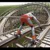
Aside from typos I am not too fond of that queue. It seems that you turned an old maintenance road into some of the queue. I can acknowledge that you might be attempting some Six Flags realism here, but it just looks a bit silly IMO. Also, I don't like what you did with the queue railings. I would suggest using Kumba's in this case. -
 Steve
Offline
I agree with dr dirt and Pacificoaster (and Austin55 too), but I really like that helix and the wooden queue coverings you made!
Steve
Offline
I agree with dr dirt and Pacificoaster (and Austin55 too), but I really like that helix and the wooden queue coverings you made! -
 Louis!
Offline
Louis!
Offline
It seems that you turned an old maintenance road into some of the queue.
hit the nail on the head, so in my eyes, i've done my job pretty well
-
 Dimi
Offline
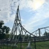
I think it's a good idea to use the old maintenance road as a queue, but I dislike the queue fences, especially the diagonal ones. I'd pick or make a more noticable fence type. Everything else is great, I love the custom brakerun, the usage of the small footers, the minimal foliage here and also the brown rail.
Dimi
Offline
I think it's a good idea to use the old maintenance road as a queue, but I dislike the queue fences, especially the diagonal ones. I'd pick or make a more noticable fence type. Everything else is great, I love the custom brakerun, the usage of the small footers, the minimal foliage here and also the brown rail. -
 RCT2day
Offline
Dimi sums up my thoughts pretty well. Not a fan of the queue fences, but the detail in the brake run is awesome and that helix executed brilliantly.
RCT2day
Offline
Dimi sums up my thoughts pretty well. Not a fan of the queue fences, but the detail in the brake run is awesome and that helix executed brilliantly. -

Disney Imagineer Offline
Cool project. Not sure how I feel about the maintenance road being used as a queue. Your queue over-hangings are really creative, though not sure how I feel about them either. They kind of clash with the modernness of the coaster. Though I think I understand what you were going for, with the setting being Canada, perhaps?
The support-work is great, and I guess by looking at the footers that are off, its because there wasn't a footer that would have the correct placement (under the helix). I like everything else. Will be watching this! -
 SixFlagsTexas1994
Offline
Did you use a Junior Coaster on the brake run to make the wheels? Because that's a brilliant idea...
SixFlagsTexas1994
Offline
Did you use a Junior Coaster on the brake run to make the wheels? Because that's a brilliant idea... -
 pierrot
Offline
I used junior coaster as break wheel in my old work, it feels great to see it again.
pierrot
Offline
I used junior coaster as break wheel in my old work, it feels great to see it again. -
Louis!
Offline
To address previous concerns over the queue fence and coaster rails, the fence is now coloured black to make it stand out and the rails are staying brown as orange rails makes the coaster too bright and grey rails are so pale they look white.

Due to limited space for a coaster of this size, La Ronde Vancouver had to re-think their car park design.


Tags
- No Tags