(Archive) Advertising District / Busch Gardens: Ports of Adventure
-
 26-January 13
-

Disney Imagineer Offline

Hey guys, this is my second attempt at a park. I'm putting Singapore Disneyland on hold indefinitely until I regain my inspiration to finish the project. I had so many ideas for what I wanted Wonderland to be that it started to work against me. So in the mean time I've decided to work on something a little less intense and something more fun. So I give you, Busch Gardens: Ports of Adventure!
Unlike the two Busch Gardens parks in existence which are each themed to specific continents, Busch Gardens: Ports of Adventure will take you around the world within a day inside the park. Guests will journey through colorful themed lands themed after different regions and continents of the world, and get a taste of what it would be like if they were to really visit these countries.
In addition to the theme park itself, guests will get the opportunity to experience an outdoor mall with luxury brand stores, fine dining, and entertainment, being very similar to Universal's CityWalk or Downtown Disney in terms of style.
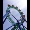
The entrance plaza to the outdoor mall (currently unnamed).
Let's take the journey together. More to come!
-DI -
 AK Koaster
Offline
Really liking that tower, and the building behind it is pretty good too, but you might want to look into changing that wooden structure sticking out from it, looks kinda blocky and random. Still, pretty good screen though
AK Koaster
Offline
Really liking that tower, and the building behind it is pretty good too, but you might want to look into changing that wooden structure sticking out from it, looks kinda blocky and random. Still, pretty good screen though -
 Xeccah
Offline
Xeccah
Offline
Really liking that tower, and the building behind it is pretty good too, but you might want to look into changing that wooden structure sticking out from it, looks kinda blocky and random. Still, pretty good screen though
I'm not. It's out of style of everything else.
Good job elsewhere, really. -
 In:Cities
Offline
I really like it, but your object selection could be refined a bit more. That lantern is terrible, as well as the top of the tower. And as stated before, the roof texture is bad.
In:Cities
Offline
I really like it, but your object selection could be refined a bit more. That lantern is terrible, as well as the top of the tower. And as stated before, the roof texture is bad.
Otherwise, great job! -
 nin
Offline
dat pirates of the caribbean font.
nin
Offline
dat pirates of the caribbean font.
This is seriously a huge step up from your other work. The theme is more clear, but could stand for a bit of refinement. I'd say that the tower and the building behind it are two different scales, especially looking at the size of the windows compared to the walls (looking at the building here).
I'd also change the black roof to some sort of TT block, just to keep the textures looking better. Most people use them, and they just tend to look so much better than what you're using here. But still, this is just so much better than that other park you had going and I'm waiting for more. -
Disney Imagineer Offline
Thank you! I agree, I have a few other roofing pieces in mind...though it would totally change the architectural style I was aiming for. But we'll try them out. I was going for a Moroccan meets African hut sorta style with this one. This will be a Starbucks. I will also be doing interiors to a lot of the buildings in the mall.I think this is already an improvement! I'd change the roof textures though.
I probably should have mentioned: the wooden structure is actually a giant pergola that spans across the entry plaza. I'll show a picture once it's at its finest. Thanks man.Really liking that tower, and the building behind it is pretty good too, but you might want to look into changing that wooden structure sticking out from it, looks kinda blocky and random. Still, pretty good screen though
Not sure I understand. First: What is out of style?, and if you're referring to not liking the tower, you like everything else? o.OI'm not. It's out of style of everything else.
Good job elsewhere, really.
I see your point and will most likely switch out these pieces. Not really feeling them after hearing your opinion. Thank you sir!I really like it, but your object selection could be refined a bit more. That lantern is terrible, as well as the top of the tower. And as stated before, the roof texture is bad.
Otherwise, great job!
Why, yes it is!dat pirates of the caribbean font.
 />
/>
Yeah, I'll have to figure out the sizing; I see your point. And I love your idea of using blocks as the roofs, I love that set (its probably my favorite at the moment, can use those blocks for almost anything!). Thank you so much. I have much more to show you!This is seriously a huge step up from your other work. The theme is more clear, but could stand for a bit of refinement. I'd say that the tower and the building behind it are two different scales, especially looking at the size of the windows compared to the walls (looking at the building here).
I'd also change the black roof to some sort of TT block, just to keep the textures looking better. Most people use them, and they just tend to look so much better than what you're using here. But still, this is just so much better than that other park you had going and I'm waiting for more.
Thanks for the comments! -
Xeccah
Offline
You see the way you built the other part?
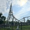
The tower is uncharacteristic of that way or theme of building. -
 JJayMForce
Offline
Wow, you're improving so rapidly, very good to see, and it looks like you're getting the hang of the smaller objects
JJayMForce
Offline
Wow, you're improving so rapidly, very good to see, and it looks like you're getting the hang of the smaller objects />/>
/>/>
For the screen, I would add some more objects on the path, like trash cans, benches, planters, signs, etc... Nice work, keep it up! -
 hulkpower25
Offline
I agree,the roof on the first building is horrible and lantern is terrible, you should also change the on the tower.great work
hulkpower25
Offline
I agree,the roof on the first building is horrible and lantern is terrible, you should also change the on the tower.great work -
 Liampie
Online
I think the tower is pretty awesome and original. Gates at the bottom would make it even better.
Liampie
Online
I think the tower is pretty awesome and original. Gates at the bottom would make it even better.
It's the other two buildings that are generic, and spoiled by ugly textures and blocky uninspired shapes. With the right reference pictures I can see you doing great things though, especially considering this is only your second attempt at a park. -
 Louis!
Offline
This is actually really interesting. When you posted your first park, I thought, great another n00b. But this shows a lot of promise.
Louis!
Offline
This is actually really interesting. When you posted your first park, I thought, great another n00b. But this shows a lot of promise. -
 Faas
Offline
Looks cool but fix the roofs. And by that I mean every roof. The textures are horrible.
Faas
Offline
Looks cool but fix the roofs. And by that I mean every roof. The textures are horrible. -
Disney Imagineer Offline
So you're saying the building isn't cohesive with the tower? I've edited the bottom building now to match the tower itself.You see the way you built the other part?
The tower is uncharacteristic of that way or theme of building.
Yeah, I'm working on that. Thanks!Wow, you're improving so rapidly, very good to see, and it looks like you're getting the hang of the smaller objects
/>/>/>/>/>/>/>/>
For the screen, I would add some more objects on the path, like trash cans, benches, planters, signs, etc... Nice work, keep it up!
Thanks!I agree,the roof on the first building is horrible and lantern is terrible, you should also change the on the tower.great work
Added the gates. I've looked up a few resource photos of Morocco. I'll most likely be remodeling a little to give a distinct, Moroccan vibe.I think the tower is pretty awesome and original. Gates at the bottom would make it even better.
It's the other two buildings that are generic, and spoiled by ugly textures and blocky uninspired shapes. With the right reference pictures I can see you doing great things though, especially considering this is only your second attempt at a park.
lol, thanks Louis!This is actually really interesting. When you posted your first park, I thought, great another n00b. But this shows a lot of promise.
Roofs have been fixed. Thanks.Looks cool but fix the roofs. And by that I mean every roof. The textures are horrible.
A minor update; a few changes have been made. The turquoise Arabian dome was taken off, looks a lot better now. I also removed the straw roofs from Starbucks (don't know what it is with me and straw roofs! I guess I should completely stay away from them) and replaced them with clay to match the sides of the building. Took Liampie's advice and added a gate. Also added a little more detail to the tower's lower section - the building itself (which you'll see more of later).
-
nin
Offline
Already so much better. Do't be afraid to use roof objects though, just for future reference. Not every building top has to be flat. Also. it'll probably look better if the tops were still black instead of pink, tan, and grey.
The tower does look much better too. -
nin
Offline
I didn't realize that the grey thing at the bottom was meant to be the actual park entrance..? If so it does need a bit of refinement.
-
hulkpower25
Offline
excellent on the changes, still change the latern with objects that make it look more realistic
-
 panther33
Offline
If thats the park entrance, its going to need a lot more detail than just that. And be ready for a lot of landscaping, I've been to both Busch parks including Seaworld Orlando, so if you need any help, let me know!
panther33
Offline
If thats the park entrance, its going to need a lot more detail than just that. And be ready for a lot of landscaping, I've been to both Busch parks including Seaworld Orlando, so if you need any help, let me know! -
 Milo
Offline
It's cool to see a new guy with visible improvement screen to screen. Nice work and keep playing.
Milo
Offline
It's cool to see a new guy with visible improvement screen to screen. Nice work and keep playing.


Tags
- No Tags