(Archive) Advertising District / Baker Lake Amusement Park
-
 18-February 13
-
 gijssie1234
Offline
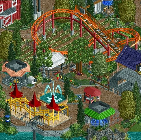
The curved path on the background is my favorite !
gijssie1234
Offline
The curved path on the background is my favorite !
I've got the feeling that theres happening to much at the screen.
I think it will look much better if you remove some of the plants underneath the coaster, and also the fountain, Everything else feels very child friendly and looks awesome. -
 chorkiel
Offline
At first I thougt it looked too crammed, but then I figured that children areas are always that small. You may want to give the elements some space to breath.
chorkiel
Offline
At first I thougt it looked too crammed, but then I figured that children areas are always that small. You may want to give the elements some space to breath. -
gijssie1234
Offline
you right
 , when you take a second look those plant are no problem and fits well to the area, i only doubt about the fountain.
-
 CedarPoint6
Offline
I don't think the green roof fits your overall color scheme. I'd like to see something on the other side of the color wheel. You could potentially say the same thing about the bright play area, but it seems like the park would've just bought a new model from Landscape Structures or somebody, which already comes with the high gloss finish. That's my only complaint-- I quite like the screen otherwise.
CedarPoint6
Offline
I don't think the green roof fits your overall color scheme. I'd like to see something on the other side of the color wheel. You could potentially say the same thing about the bright play area, but it seems like the park would've just bought a new model from Landscape Structures or somebody, which already comes with the high gloss finish. That's my only complaint-- I quite like the screen otherwise. -
 Liampie
Offline
As I said yesterday, the colours are not very good, or there's too little style cohesion. You need a colour scheme or something else to keep the area together. Maybe give the two flatrides the same roof?
Liampie
Offline
As I said yesterday, the colours are not very good, or there's too little style cohesion. You need a colour scheme or something else to keep the area together. Maybe give the two flatrides the same roof? -

TwistedHelix Offline
You cows look like sheep......
But no seriously this looks lovely coupon, some real nice atmosphere in this image.
Cheers
twistedHelix -
 Austin55
Offline
I agree that the colours, especially on the various roofs, lack cohesion. The Salmon is the worst offender in my opinion.
Austin55
Offline
I agree that the colours, especially on the various roofs, lack cohesion. The Salmon is the worst offender in my opinion.
However thats a tiny nitpick on a great screen coups.


Tags
- No Tags