(Archive) Advertising District / Baker Lake Amusement Park
-
 18-February 13
-
 Dark_Horse
Offline
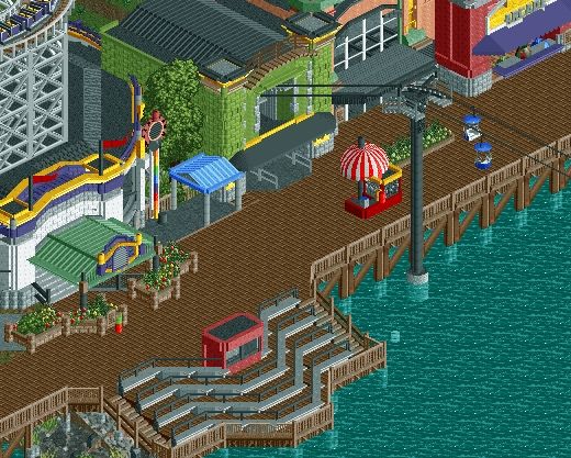
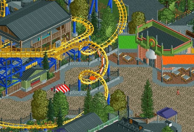
Sorry, Coups, but I don't like it. That green brick is atrocious. Also, the Arcade sign seems out of place (unless there is no entry into the arcade, then it's fine where it is). The grandstands along the water seem out of place, and just seem really textureless compared to everything else. I do like the entrance to the Dragon coaster though.
Dark_Horse
Offline
Sorry, Coups, but I don't like it. That green brick is atrocious. Also, the Arcade sign seems out of place (unless there is no entry into the arcade, then it's fine where it is). The grandstands along the water seem out of place, and just seem really textureless compared to everything else. I do like the entrance to the Dragon coaster though.
EDIT: Thinking about it now, this doesn't really give me a boardwalk feel. Feels more like a generic midway with a wooden path and water, kinda like a cheesy amusement park ripoff of a real boardwalk. Where are the lights, colors, banners, carnival games? It just doesn't give me a boardwalk feel, unless of course you were going for what I said earlier, then it looks great. -
 chorkiel
Offline
The green isn't the problem, I think. I think the problem is the combination of that green with the tree next to it. I'd switch that shit up.
chorkiel
Offline
The green isn't the problem, I think. I think the problem is the combination of that green with the tree next to it. I'd switch that shit up. -
 gir
Offline
Are the bleachers for a show? If so, won't the people on the diagonals be facing away from the action and blocking the view of the people on the straight sections behind them?
gir
Offline
Are the bleachers for a show? If so, won't the people on the diagonals be facing away from the action and blocking the view of the people on the straight sections behind them? -
 Maverick
Offline
^ I was thinking the same thing.
Maverick
Offline
^ I was thinking the same thing.
Also: I'm not a fan of the name either. Just, having the word "Park" in the middle sounds awkward. There are other options to keep the same acronym. -
 In:Cities
Offline
The bright green and orange rooves are the only thing that bother me about this. Aside from that, its fantastic!!
In:Cities
Offline
The bright green and orange rooves are the only thing that bother me about this. Aside from that, its fantastic!!
They kindof look like signs or billboards haha. I like the colors, I just feel like making them black like the roof would be more effective in this particular situation.
Regardless, this is great work buddy. You are easily one of my favorite builders at the moment, and I am really looking forward to your next release. -
 disneylandian192
Offline
These last two screens have been the best i've seen from you yet. Keep it up!
disneylandian192
Offline
These last two screens have been the best i've seen from you yet. Keep it up!


Tags
- No Tags