(Archive) Advertising District / Baker Lake Amusement Park
-
 18-February 13
-
 Pacificoaster
Offline
Thunder Alley Waterpark? Why not Thunder Bay or Thunder Cove. Something water related.
Pacificoaster
Offline
Thunder Alley Waterpark? Why not Thunder Bay or Thunder Cove. Something water related. -
 tyandor
Offline
Love the second screen. The composition is spot-on, especially in the pink-roofed building.
tyandor
Offline
Love the second screen. The composition is spot-on, especially in the pink-roofed building. -
 Coupon
Offline
Thanks for all the wonderful comments guys! The name is going to stick since the acronym for it is the same as the one for TPR.
Coupon
Offline
Thanks for all the wonderful comments guys! The name is going to stick since the acronym for it is the same as the one for TPR.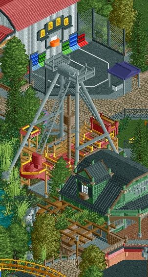
Dont worry, this is the last time i'll post a picture of the pirate ship.
Enjoy! -
Pacificoaster
Offline
Some trash cans, lights, colorful flower beds, and peeps would do this screen some good.
-
 imawesome1124
Offline
It looks great, but it seems a little cramped. PC's right about adding some flowers and other small stuff. It will really complete the screen.
imawesome1124
Offline
It looks great, but it seems a little cramped. PC's right about adding some flowers and other small stuff. It will really complete the screen. -
 Fisch
Offline
I disagree about it looking cramped. Infact the only 2 reasons why it looks a little cramped are the perspective and the dense foliage. But I think it's a very realistic architectural density. What I dislike about that first screen in the topic though is all the grass. I wish you were more of a "theme park guy" as compared to a six flags type guy. You got the abilities to theme heavier but so far I haven't seen you really try it.
Fisch
Offline
I disagree about it looking cramped. Infact the only 2 reasons why it looks a little cramped are the perspective and the dense foliage. But I think it's a very realistic architectural density. What I dislike about that first screen in the topic though is all the grass. I wish you were more of a "theme park guy" as compared to a six flags type guy. You got the abilities to theme heavier but so far I haven't seen you really try it.
The architecture is of course great though and so is the foliage. -
 Dark_Horse
Offline
I would suggest using Kumba's basketball net/rim/goal object instead of deco blocks. Other than that, this looks great.
Dark_Horse
Offline
I would suggest using Kumba's basketball net/rim/goal object instead of deco blocks. Other than that, this looks great. -
 FK+Coastermind
Offline
This looks wonderful, *cough* its the same thing we have seen over and over *cough* but just wonderful.
FK+Coastermind
Offline
This looks wonderful, *cough* its the same thing we have seen over and over *cough* but just wonderful.
suggestion, on the green building, LOVE the posts on the awning, looks very decorative, but not a fan on the roofline, looks out of place their where they would likely not be seen and otherwise serve no purpose. just my thoughts
FK -
 AvanineCommuter
Offline
lol ^
AvanineCommuter
Offline
lol ^
Looks great just like the previous screens. I'm still just as impressed with the ship as the first time I saw it.
I agree with Fisch, I hope you can do some heavy theming as I think you'll do some great work. I guess I'm just personally not that excited with Main Street/generic themes given that we've seen it a million times before. -
Airtime Offline
I would suggest using Kumba's basketball net/rim/goal object
I disagree because it's an object that can't be used for much else unless he has tons of slots spare. I do think however you should use one of Toon's B&M supports, like CP6 in SFC did, which would use an object you're already using so wouldn't take up any more object slots.
Lovely stuff Coupon. I think it's purely the angle that makes everything look a little cramped? I'd love to see some more stuff other than the vekoma/arrow, main street and that swinging ship. The second screen has a great atmosphere.
How far along is the park? -
 Six Frags
Offline
The only thing that I think could be improved upon are those grey 1/4 tile path bits outlining the brick path in the 2nd screen of your first post. I think it looks better without it..
Six Frags
Offline
The only thing that I think could be improved upon are those grey 1/4 tile path bits outlining the brick path in the 2nd screen of your first post. I think it looks better without it..
Otherwise it looks very nice, great architecture and foliage. Love to see more of this
-
Louis!
Offline
Dislike the green rails, dislike the red building.
Also, fir trees? In a Boardwalk area? I also don't think the path works. The buildings are great for the theme, but everything isn't.
I still think your station could do with a little bit of work. -
Airtime Offline
The queues perfect. Exactly what I meant.
I think a tarmac path underneath the queue and the first tiles in front of the station would look nice.
Really nice stuff Coups. I just hope it fits into the park/>
-
Dark_Horse
Offline
I would open up the area underneath the Arcade sign. Right now, there is limited to no access through that opening. I would either do that or move the sign to above where the glass doors are to better communicate an entrance area.
-
imawesome1124
Offline
For the colors, I would change the orange trim and green railings. The buildings are great, but something about the overall area seems off. I can't put my finger on it.


Tags
- No Tags