Contests / New Element Design Challenge 6
-
 16-February 25
-
 Xtreme97
Offline
Xtreme97
Offline
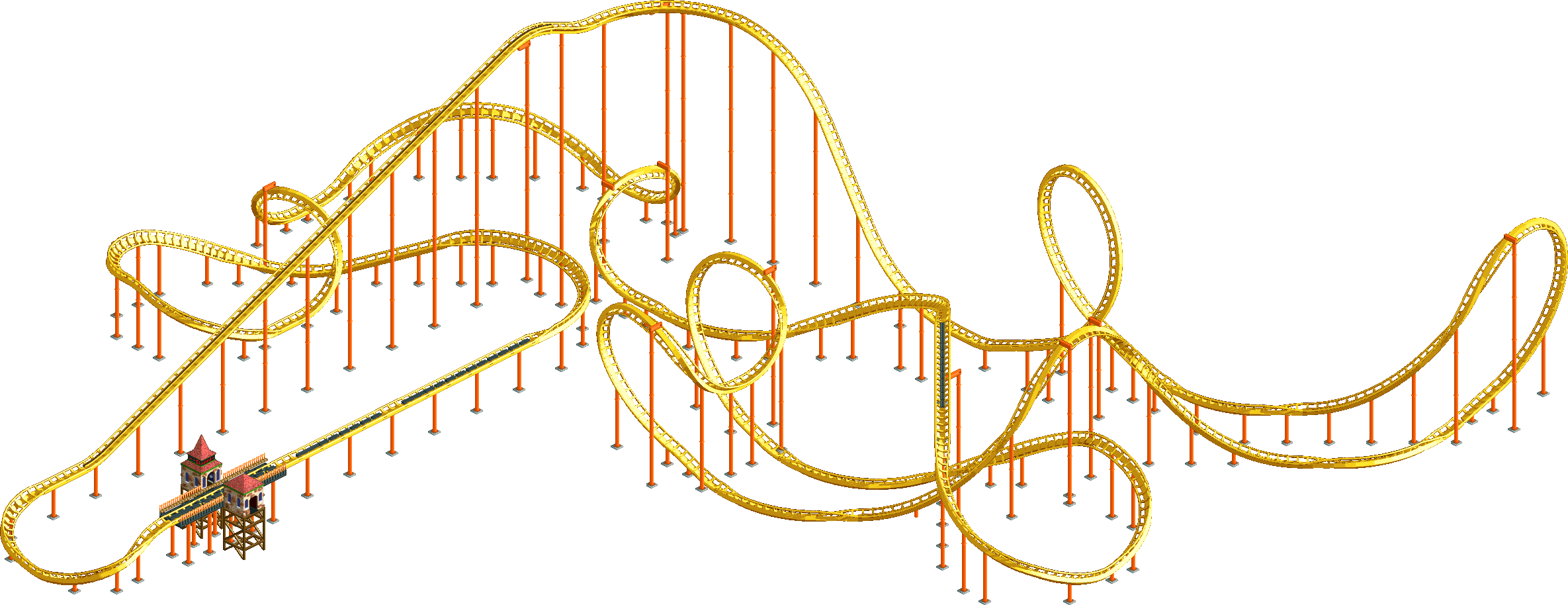
NEDC6  Logo by bigshootergill
The New Element Design Challenge returns for its sixth edition! After a few years on ice the contest is back, giving you the opportunity the put your theming and design skills to the test with a pre-determined layout. Whether you choose to ground it in a realistic setting or let loose with a fantastical theme, the end goal remains the same: creating the best Design submission you can using the layout provided.
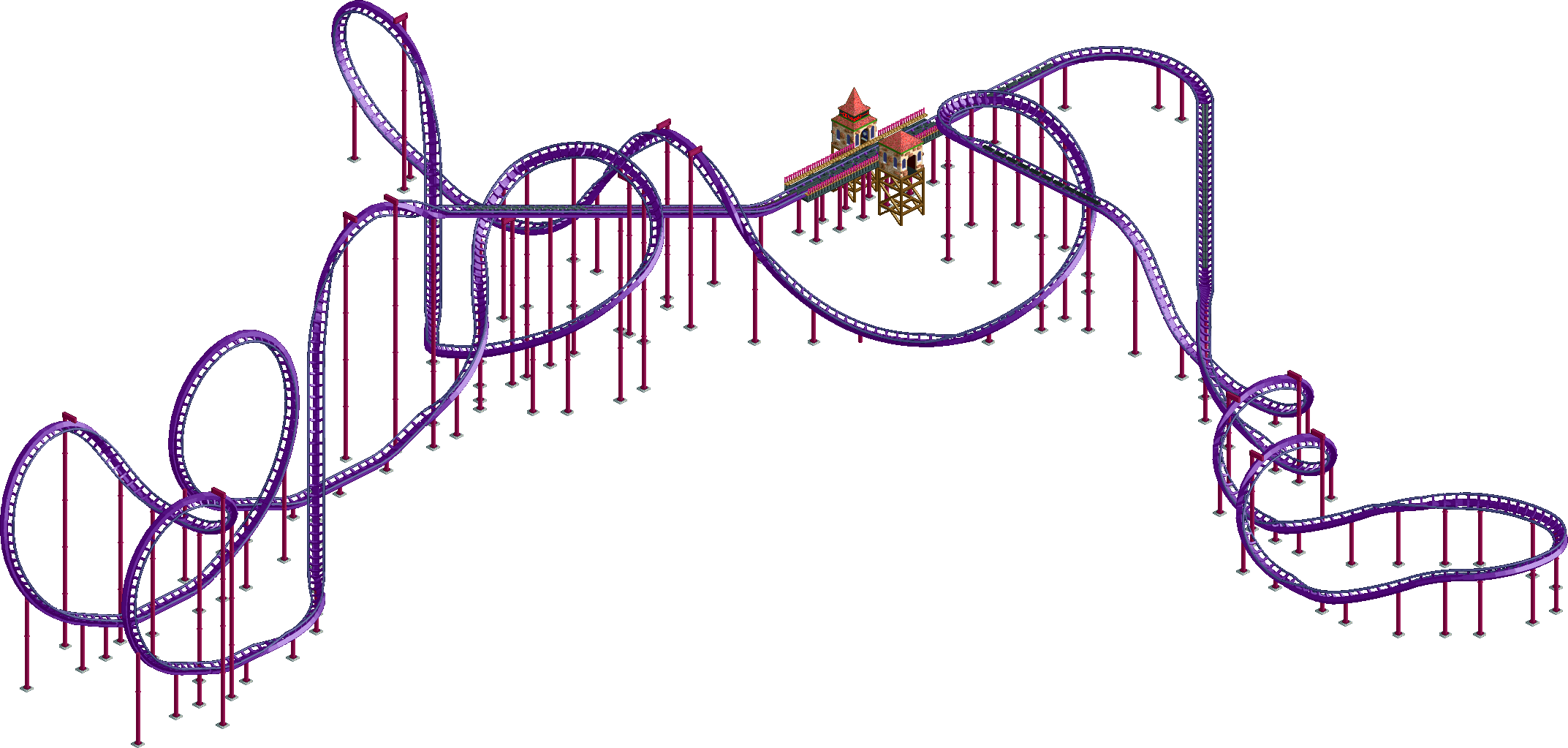
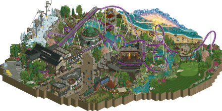
PalmaresNYearWinnerEntryScoreLayout1201185.77 %2201372.69 %Custom3201767.50 %Dynamite Blaster4201780.63 %5201983.50 %LayoutFor this edition we have opted to include a public pre-selection of the layout to be used. We have invited alex, CedarPoint6 and Pacificoaster to design an original layout for us, with the instruction to make use of the newly introduced track elements in OpenRCT2. All three responded enthusiastically, but only one layout will be chosen to continue into the main tournament where entrants compete to design the setting of each layout.
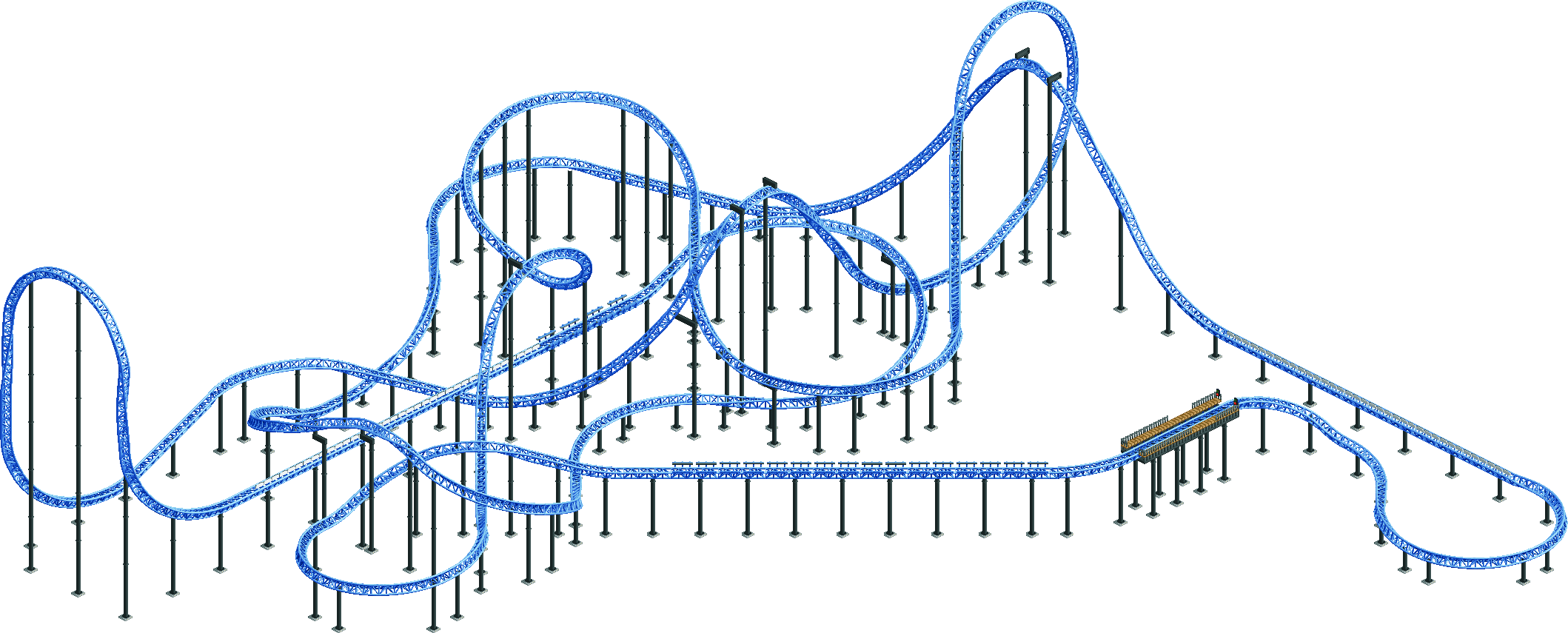
 Workbench
There are no restrictions on which workbench you can use to build your design. However, due to the limitations of the new track pieces it may not be easy to move the layout to a map of choice. As such, we've provided a set of popular workbench options below with the layout included in the center. You do not need to use one of these if you won't want to, and if you need help placing the layout on a map feel free to reach out to the admin team and we'll help as best we can.
Rules
Please note that failure to follow any of the following rules will result in the respective park or player being penalised or disqualified.
-
Besides the layout, all aspects of your entry must be built solo. Help with hacking is permitted so long as all creative content on the map remains your own. All hacks must be declared to the admins. If in doubt feel free to message the team on site or discord.
-
Your entry must be ≥ 625 tiles and ≤ 3600 tiles in size, equivalent to 25x25 and 60×60 square tiles.
-
Anything outside the map that plays a visual feature (ie a dragon flying, a train animation created via shoestring) will count towards the 3600 tile limit. Anything outside the limit that isn't visible, and only contributes to something visible inside, will not count.
-
Any modifications to the track, such as brake speed/arrangement, station format (dummy station, etc.), must be cleared by an admin. Since everyone is intended to work with the same layout, any changes that are not very minor are unlikely to be approved.
-
Any changes not cleared by an admin will result in penalties or disqualification. If you have a concern, check with us before making any changes.
-
Please submit your entry as a competitive design submission, including the layout builder alongside you with a 10% share.
-
Please add [NEDC6] at the beginning of your submission's name so that we can differentiate from normal submissions.
-
The timestamp of your submission will be reported by the database which will tell us whether you have met the deadline or not. Please be aware that there will be absolutely no exceptions given. It is your responsibility to submit on time and to allow for potential problems that may delay your submission.
-
Please include any additional content such as logos or plugins with the initial zip download. Due to the expected volume of entries logos will not be requested from the NE Graphics Team, but you may reach out to them privately.
-
Custom music, if it is to be included via .PARKOBJ, is considered map content, and must therefore be part of the .PARK before the deadline. Any music that is not direct map content, and merely intended to be played in the background while viewing the park, for example links to online music sources, or included audio files like MP3 are considered extra materials.
-
The maximum file size of submissions (including extra materials) cannot exceed 15 MB. If a submission exceeds this size, the admins may sometimes try to help you bring it down, for example by improving image compression in attached PDFs, or by enhancing audio compression or shortening custom music in PARKOBJ. In this latter case, only the admins are allowed to re-export the .PARK file with the edited music.
-
After the deadline, all submissions will be voted on by a group of non-participating panelists outside of the system. Once a winner is determined, we will begin releasing entries from last to first place. Respective panelists are then asked to confirm their votes into the system as per usual. All entered votes will be admin reviewed. All entries are eligible to win the Design accolade, but only the highest scoring one will grant its creator the title of NEDC6 champion.
ConstructionSubmissionVotingDeadlineSunday April 20th*
23:59 GMT* A one week extension has been granted to prioritise quality and ensure a good number of finished entries. -
-
 mamarillas
Offline
mamarillas
Offline
Looks like the original Pac layout had chain lift speed set to 7mph but the workbench copies all have it set to 5mph
-
Xtreme97
Offline
Thanks for catching that mama, we've updated the workbench saves now to match the original layout lift speed. See the Q&A below for info on changing the lift speed also.
Q&A
Q: Can we add a second layout to make it a duelling coaster?
A: After some consideration, we feel this would be changing the core of the design too much from the original layout. You can make supporting rides and tracked rides, but Pacificoaster's layout is the main feature and should remain as such.
Q: Can we use different trains?
A: Yes, as long as the train is still able to complete the layout and doesn't impact the pacing to an obvious degree.
Q: Can we change the lift speed?
A: Yes, you can change the lift speed as long as it remains within a normal range for this coaster type.
Q: How will the panel be selected?
A: A group of non-participating panelists will be selected after the deadline has passed, and we will likely want to select more active panelists. We may reach out in private beforehand to find out if a panelist intends to compete so that we have a panel group decided more quickly.
Q: Also, is changing the placement of the entrance huts allowed?
A: Yes, you can change the entrance and exit hut placements.
Q: I want to copy the coaster in but I keep getting an error? How do I fix this?
A: Load the layout map, delete the station (and block brakes, noting their speed), copy and save it into scenery manager. Open your bench, place a random twister coaster station somewhere, paste in scenery manager layout and fill in the station and block sections. (Thank you to 94SupremePosse for answering this on the discord)
Q: Are we allowed to cosmetically edit ride vehicles in a way that doesn't affect stats, like using ride editor to change the front of the train cars into another vehicle but it acts the same?
A: Yes, different vehicles can be part of theming. -
 Jaguar
Offline
Jaguar
Offline
I have a question about the map size limit: If I used the background tiles to cover unused parts of the map, but painted those tiles another color, for example, if I surrounded the map with a red void instead of a black void, would that count as part of the map size limit?
-
 RWE
Offline
RWE
Offline
I have a question about the map size limit: If I used the background tiles to cover unused parts of the map, but painted those tiles another color, for example, if I surrounded the map with a red void instead of a black void, would that count as part of the map size limit?
As long as the background is the same color it won't count to the limit. -
Xtreme97
Offline
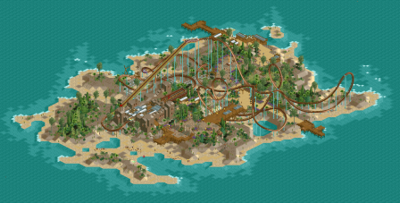
The first NEDC6 batch has been released, and we see Milo claiming the first design of the contest with his throwback release Cerulean Breeze. Liampie and Ge-Ride sadly miss out on a Design win but their entries nonetheless offer something to enjoy and a unique application of Pacificoaster's layout.
#14
 Ge-Ride - Met a Rebel
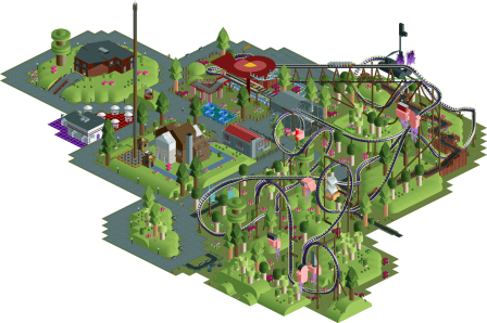
#12
Milo - Cerulean Breeze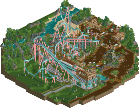
-
Xtreme97
Offline
Two more entries have now been released below! While both feature a castle theme among an inviting green landscape and a pseudo-ncso flair, the entries hold very different approaches. Lurker beats his personal best score and earns his first
 Design win to claim spot #11, while AJ- breaks into the top 10.
#11
Lurker - Wellspring Gardener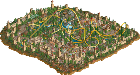
#10
AJ- - The Metal Moss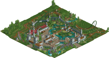
-
Xtreme97
Offline
The next two parks to be released break into the 70s score range, with ottersalad's sweet-toothed candy explosion placing 9th and Sulakke grabbing his first
Design win with the Egyptian-set Ramses sliding into 8th.#9
ottersalad - Sugar Rush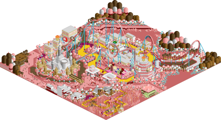
-
Xtreme97
Offline
Another two entries are released tonight, close in score but starkly different in theme! Scoop claims 7th place with her dark undercity setting, while Mulpje's lush valley theme lands him just outside the top 5.
#7
Scoop - Paint the Town Blue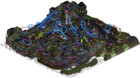
-
Xtreme97
Offline
We enter the top five with an energized entry courtsey of nin, who echoes the Sci-Fi flicks of the '50s with an idyllic suburbia transformed by a fleet of alien visitors.
#5
nin - Unfriendly Invader
-
Xtreme97
Offline
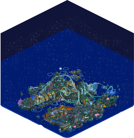
The countdown continues and we now break the 80% barrier with our fourth(!) place entry by Jaguar, who at long last earns a Parkmaker position with his extravagant galactic ocean. Congratulations!
-
Xtreme97
Offline
We enter the top three with a brilliant display of talent by monsterbux, who claims a Parkmaker title with her bright, eclectic homage to Antoni Gaudí and his visionary organic architecture.
#3
 monsterbux - Gaudi Gardens
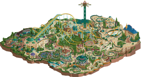
-
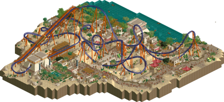
RWE
Offline
Today we present you the final two parks of the contest. With a difference of just 0.50%, barnNID grabs first place ahead of Xtreme97 - while both presented incredible skill and huge talent: with scores above the 90% mark they both claim the elite parkmaker title!
#2
 Xtreme97 - The Cartographer
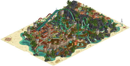
-
 wheres_walto
Offline
wheres_walto
Offline
#1 Farewell
- This is hitting right. At first glance it would look appropriate in a Grand Tour final, but there's so much more happening. Love the design choice of silhouetted figures to set apart the main characters. It feels deeply personal, I don't want to know if the story is real or imagined, nor do I want to know if the ending is happy or sad. The quality of work is so high: the theater alone is absolutely bonkers, every detail throughout feels perfectly manicured. Your story-telling, object creation, and vision are absolute top tier. Congrats on the win, it's well-deserved. 90+ is more than fair, it's rare to find such expression in any form
#2 Cartographer
- The colors on this are SO pleasing: transitional beige with deep terracotta rooves, dark black rockwork, coaster blending in with the water tones. What a vibe. The sand map is a cool touch, nobody is better than you at incorporating style-breaking visual elements like that. It is an auditory nightmare though, far too much competing noise. Easy 85 quality here
#3 Gaudi Gardens
- The obvious comparison is Park Guell, you've done something really extraordinary capturing complete novel shapes and architectural forms. This is great, your buildings are so complex and distinct without being difficult to read. I can imagine them in reality but would have never thought to build them like this in RCT. The integration of bobsled track is a revelation. Very cool, very modern, very unexpected. Solid 80 from me
#4 Hydrocelestis
- Music, background, and floating whale entertainers are such an immaculate vibe, this is dreamy af. Love the inner tube bubbles. It's giving Asteroid Fields, Cosmic Infection, it's so shamelessly your style: absolute maximalism, fearless object choices, densely layered texture overload, I have to applaud the boldness here. counteracting with a chill song and atmospheric background really help keep things from becoming too overwhelming. Good stuff, I'd give this an 80
#5 Valley of Huanglong
- This is quite good, outstanding roof work with neat tricks all around (rapids boat entry sign, single view wooden track supports), this is pure class. Super high quality execution, I keep finding great interactions throughout the map. I would have given this an 80, very well done
#6 Unfriendly Invader
- Fun, total nin (keeping up with your trend of toddler fixations as park ideas: Bugs, Robots, Zoos, Race cars, Aliens). Can definitely feel the invasion vibe, it's a dramatic scene with a good blend of static and dynamic set pieces. I enjoyed this, 75 for the novelty and execution
#7 Paint the Town Blue
- Lots to take in here, this is probably the most complex, fleshed out map of the contest. It feels very Incredible Hulk queue/Batman universe. I like it a lot but think it's a bit hard to focus on any one thing. It's more of a vibe map than design map, but that's not a bad thing because the vibe is interesting. Love the overcrowded queue line, suspended tram, and general weirdness. 75 for how packed the map is
#8 Cerulean Breeze
- Pure nostalgia! Love love love the landscaping and overall color balance. Nice wide pathways, cake layer architecture, thick chonky supports, this is good stuff. Sadly feels unfinished in the plain grassy areas, but what's done is done right. I'd be a solid 70 because I admire what's here, this could easily hit 75-80 if fully executed
#9 Ramses
- Cute little submission, not trying to do too much but very consistent in its theming, style, and execution. Great coaster colors and support work, really like the pyramid station. Everything is tight and on point, see this as a 65 (70 if layout was original), quality work all-around while staying safe
#10 Metal Moss
- I like this quite a bit, it's understated and relies on simplicity and openness. Sort of goes hand in hand with lurker's entry. Not going to lie, I deleted the secondary coaster and found the entire scene much more relaxing and digestible without the extra movement. Thumbs up, 65 from me
#11 Wellspring Gardener
- Lovely little park, classic in the best kind of way. Castle wall perimeters are giving base game scenario, I like the calm, comfortable, ren faire vibe. Cool mix of support work (Intamin track, PT2 pipes, classic Toon). Would have gotten 60 from me, right on the cusp of being a design. If this had been an original layout it's an easy 65. Good job, very true to your style
#12 Sugar Rush
- Finally some more cel shaded work! Would have benefited from more custom objects to expand the set and keep stylistic continuity. The penile imagery is sublime. Very cool, imaginative, and recognizable from the source material, though admittedly not the most pleasing to look at from a color perspective. 60 score, feels like a concept we would have seen in the 2000s (in a good way), vibrant color never goes out of style
#13 Met a Rebel
- I really like the idea here. It's giving Katamari Damacy as a low poly smooth-textured environment. I like the impressionist pine trees and total disregard for the expected. Execution is not always there, gray tarmac takes away a bit of the charm and I'm not sure the neon lights add much either. Fascinating exploration of minimalism with a lot of conceptual potential. I'd give it a 55
#14 Mirage
- Assuming this is a 1-2 hour speed build, it's enjoyable. I like the station form and dock detailing, neat to see what a highly skilled player can do even in a short time. Not really design-worthy for me in its current state but there's clearly underlying skill in the overall composition. 55, what would this look like with more investment?
-
 Kumba
Offline
Kumba
Offline
Great effort on this contest everyone! I really enjoyed watching each entry roll out. Pac's layout was my favorite of the 3 options we started with. I gave some thought to entering, but this is a busy time of year for me and frankly, I would rather make my own layout to fit a theme. This Pac layout is really good, great use of all the new track pieces. Still, it seemed a little vanilla and had a few views that seemed off. Pac, open offer for lessons on coaster design! lol, kidding of course. Really a perfect layout for this type of contest.
My rankings:90% X97 - So good... love the setting being bordered by a map. The supporting flat rides were awesome too, some of the best I have seen. The landscaping was amazing, I think your the best in that game with it these days. Archy is all great too. Still, I think this was missing some finish, it had no fun peep/staff scenes. It could have done a lot more to have a story/narrative too. I used cutaway to see if a full map was under, but it was just the edge. Congrats on the elite upgrade. Fantastic entry!85% BarnNID - Wow, an entry no one will forget without a doubt. I cannot recall another release with a real life emotional pull to it. The scenes were outstanding and tug at the heartstrings. The black'ed out peeps were inspired. The music hits home too. Love the beach/sunset and the theater entrance... just so many great details. Still, I arrived at 85% due to the fact that the coaster really is not a part of this. Yeah, it is supported perfectly and integrated great, but no peeps and no Q. Also the trains and food truck looked too large in scale. Awesome entry and proof that you have real elite parkmaker skills. Congrats on winning the contest!80% Jaguar - In outer space and underwater, what an idea! lol. This is awesome, I think... not easy to view/dissect. Your skill is nuts, looks like an Ethan park. Not surprised by that, but glad to see you make such an effort. Congrats on NE Parkmaker!80% Bux - I recall watching a Guadi park being built during H2H8 and loved it so much. This is up there with that park and such a creative and vibrant take on it. Great use of curved path and gardens. Congrats on NE Parkmaker!75% Mulpje - Great NCSO work here. So many creative uses of track and scenery. Like with X97, I think it only lacked scenes and story/narrative.75% nin - I love that you did a remake of a classic design. Tho at first, I was not sure it was of Phatage's old PT prelim. Good way to pick out the basic features and work from there. Great fun details and yeah, cool how you take simple things and make them pop in RCT.75% Scoop - Great basic idea, just I think you put too much time into the surroundings. Love the peep congestion, you do that really well. Very good overall vibe, tho I am not a big fan of dark palettes. Nice work!70% Sulakke - Simple, but solid work. Great atmosphere.65% Otter - It's good, just not a type of theme I enjoy, even back when JKay did it. The skill is there, just cannot relate to it. Great work on the supporting rides like the go karts and mini golf.60% Milo - That plaza and haunted house were so good. Wish you had more time to put into this because you have some awesome ideas.60% AJ - Really nice work, great feel to the entry. Awesome RMC suttle coaster, but otherwise, not that much to write home about. Hope to see you get more creative in the future.60% Lurker - Very nice work with the castle theme. Can always tell you have fun with your work and glad to see you in this.60% Liam - A two or three hour design? lol. Still, really good atmosphere.55% Ge-ride - Fun little entry, cool use of green blocks rather than grass.Again, great job by all the builders and the NE team. Cannot wait for the next contest as I should have some time to build this summer. -
 Gustav Goblin
Offline
Gustav Goblin
Offline
Gonna take a stab at this.
#1: Xtreme97 (90%)
Everything I live for as a RCT player. Off-the-wall concept executed to near perfection. Seamless blend of crunchy semi-realism and daring aesthetics. Coaster integration leaps and bounds above the rest. Inventive flat rides that complement the theme. This is the kind of RCT I would die to make myself.
#2: barnNID (85%)
Insanely close with Xtreme's; his concept, amount of content, and focus on coaster layout won me over. Still, this was a shock in how intimate and emotional it was. It takes the storytelling route but with a focus on realism to a far more stunning effect than it sounds in a vacuum. For someone who values RCT as an art form, this absolutely nails it. If I could rate it an 88.50%, I would.
#3: monsterbux (80%)
What a shock! So ballsy to take a whack at an architectural style that has barely if ever been tackled before. For a player that just a year ago was getting her feet wet in the NE meta, this is astounding release I'd expect from someone who's been here for at least a decade. Unfortunately, some rushed and unpolished parts prevent this from breaking into Elite tier for me.
#4: Jaguar (80%)
Just bonkers. Such a strong concept with loads of potential and an unmistakably maximalist execution. Aesthetic broad strokes like space stations and starry skies juxtaposed with coral reefs and marine life are supercharged by details like the insane Squidward wormhole. Suffers from being too cluttered and overwhelming at times, but just cracks that 80% threshold.
#5: Mulpje (80%)
Some really detailed and groundbreaking NCSO. What would otherwise be a cliche theme takes on a life of its own thanks to the groundbreaking details within. There's a lot in here I haven't seen done before, and that inventiveness combined with a refreshing atmosphere and beautiful broad strokes makes this worthy of a green name for me.
#6: nin (75%)
I call this a 77.50%; a smidgen better than most 75s but lacking the bravado of a green name. Nothing against this design, of course; such a fun and classically nin idea with a lot of great details that really play into the theme.
#7: Scoop (75%)
Such a cool and vibrant take on the layout and the supporting coaster is easily the best secondary ride of the contest. Unfortunately doesn't come together for me on a macro level due to the map shape and focii not complementing the main coaster and a lot of similar-looking buildings fighting for attention.
#8: Sulakke (70%)
A working man's design. Simple and gets the job done while still being memorable. Little details and simplistic take on crunchy environments work well.
#9: Liampie (65%)
IDK man. Something about this really really tickles me, even for a rushed speedbuild. I just cannot get enough of classic aesthetics, especially in your hands. Despite having an unmistakably John vibe, you still find ways to go above and beyond by using disconnected paths as easy crunch. I really do think this was worth Design.
#10: Otter (65%)
What a fun and unique entry, even if directly tied to an IP. I liked the aesthetic a lot more than many voters it seems. It borrows a lot of realistic techniques despite the pastel overlay to a very strong effect. A shame the clock got the better of you, leading to some mishaps and lack of polish.
#11. AJ (65%)
Slay. A no-nonsense NCSO-ish design but unmistakably AJ due to the sweeping foliage and carefree attitude throughout. Impressive for a speedbuild, but having watched you piss out half a park in a day or two multiple times on H05 it's not exactly surprising either.
#12. Lurker (65%)
He is a machine and nothing he makes ever gets old. Really fun take on the design with a retro feel and a gorgeous anti-centerpiece in the middle. Some bits didn't come together for me as well as others, but all in all I would call it a design.
#13: Milo (60%)
Always a joy to see you enter. The classic aesthetic works, but it doesn't come together as well as Liam's for me. Some choices like the fenced-off nothing near the edge and the dark brown paths were a little off-putting to me. I feel really bad putting this below the Design threshold, but those big macro strokes make a world of difference for me.
#14: Ge-Ride (55%)
Hate to put such a creative design last. Love the story-based approach and the abstract aesthetic. Unfortunately the broad macro strokes and story elements weren't as cohesive as they could have been, and at times I was wishing it went a little more in on the abstractness.
Hats off to all fourteen builders for some good-ass RCT across the board and to the admins for hosting such a smooth and successful contest. Would have been fun to enter but other commitments and lack of inspiration with the layout made me fine sitting out. The top two entries have really reignited my passion for this game and what can be done in it!
-
 In:Cities
Offline
In:Cities
Offline
Getting my reviews in finally. I purposely didn’t view these in depth until I could look at them all in one go. I also haven’t read anybody else’s reviews on purpose, so I’m sorry if I’m reiterating things that others have said before.
I think my biggest takeaway aside from the insane quality that showed up to this contest, is that the animated butterfly object should really get an MVP award.
14 - Met a Rebel - Ge-Ride
Quick thoughts: This is a fun entry that was a pleasant surprise. I like how bold it is. The theme is a tricky one to decipher as a viewer, so there naturally is a bigger emphasis on judging by the aesthetics. I really enjoy the pseudo cel-shaded cartoon vibe and admire the commitment to sticking with it throughout.
What I really enjoyed: The unique supports, the custom stylized trees, the general cartoon aesthetic
What didn't resonate: General lack of polish, clarity on the theme, coaster colors
What I'd score it: 55--
13 - Mirage - Liam
Quick thoughts: Even knowing that this is a Liam quickbuild, i’m still surprised with how beautifully cohesive this map is. The theme is pleasant and easily identifiable. The macro shaping is top tier. It feels like classic NE parkmaking through and through.
What I really enjoyed: The purple accent color flowers, the natural coaster station, the wooden elevated paths paired with white canvas, the tide pools on the beaches, the foliage in general
What didn't resonate: Honestly I didn’t dislike much on this map. The low-fidelity land tiles tend to work in this park’s favor as opposed to blending the edges. I know that this was a speedbuild, but custom supports would have really elevated this layout even further.
What I'd score it: 65--
12 - Cerulean Breeze - Milo
Quick thoughts: My neighbor’s dog is named Milo, so I already like this entry. Man, this map is just classy. Colors overall are top tier. Great aesthetic overall.
What I really enjoyed: The coaster colors, the signage, Lawnmower Man 1, the Offspring ride is super clever
What didn't resonate: Some of the architecture trended towards messy in places. The overall forms were there, but the object choices felt a little too cluttered at times.
What I'd score it: 70--
11 - Wellspring Gardener - Lurker
Quick thoughts: Right off the bat, this feels denser than a typical Lurker park. Great choice of theme and style.What I really enjoyed: Love the coaster colors (always a sucker for dark green supports), the distinction between the architecture outside the castle walls and within, the sweet lift hill supports, the music, the birds and the butterflies
What didn't resonate: While I like how bustling and busy it is, it does feel cluttered at spots. I don’t think that this map made the best use and integration of the coaster layout as well.
What I'd score it: 70--
10 - Sugar Rush - Otter
Quick thoughts: Wow where did you get these beautiful objects. I love seeing you take a bold and unique approach to this contest and pursuing a theme that you know many people may not enjoy. Tons of fun. The cel shaded objects aren’t the easiest to build with at times, but it seems that you picked up on it quickly!What I really enjoyed: The colors (I almost wish you pushed it farther and went for an even more vibrant color selection), the kart track, custom mini golf course, the chocolatey mountains
What didn't resonate: It does get a bit messy in some spots. Colors overall are great, but I think you could have pushed for even more vibrancy and variety.
What I'd score it: 75--
9 - The Metal Moss - AJ
Quick thoughts: This immediately feels like an AJ map, and that’s a great thing. You always do such a great job at creating natural feeling interactions and integrating rides and layouts together. There’s some really picturesque moments on this map.
What I really enjoyed: The foliage is beautiful, the natural feeling queue, the dark green coaster color, floating yellow pumpkins, the little pink flowers on the white columns, the music
What didn't resonate: Not much to dislike here. I think the coaster supports could have been pushed a bit further (the loop feels undersupported).
What I'd score it: 75--
8 - Ramses - Sulakke
Quick thoughts: Wow another Egyptian theme in rct. Wow, this one is actually great. This map is deceptively well done. While some of the architecture seems basic at first glance, it really is so perfectly executed throughout.What I really enjoyed: The foliage on this map is some of the best in the contest (love the orange trees), the coaster station building, the foliage along the river, the little pond in the queue, the staff scenes and names, coaster colors are bold and work perfectly in the setting.
What didn't resonate: I think there’s too many peeps. While I know this is a design challenge, I think this map could have benefitted greatly from a slightly larger map - this feels a little too closely cropped to the coaster. I’d have loved to see more of the riverfront, as well as maybe some expansion of the desert into mountains or cliffs to the left of the station area.
What I'd score it: 80--
7 - Paint the Town Blue - Scoop
Quick thoughts: This is a super unique and bold theme to take on, and I think it’s largely successful. Cool to see you continue to push yourself as a builder and take big swings like this.What I really enjoyed: Coaster colors are a great choice (monochrome coaster and track with a darker shade for supports is always a win in my book), the custom objects are great, lots of extra movement and life, the suspended monorail weaving throughout the map, the map edge, the covered walkway, the rapids and the integration of the drop with the giant wheel, bridge, and coaster element (super iconic moment). The large masses of people on the streets
What didn't resonate: While this is successful as a park, I don’t think it’s quite as successful as a design. The focus tends to be taken away from the main coaster at times, and while the track interactions are excellent, there’s almost too much extra content that’s unrelated to the design itself. The music is also very low for some reason. I also think that it’s a big risk to take on a theme such as this one. For those who are familiar with the source material, I’m sure it’s excellent. But as is the problem with most IP based parks in rct contests, you run the risk of the viewer not having a clue what is being referenced, and the park not resonating nearly as much with them as it does with you the builder.
What I'd score it: 80--
6 - Hydrocelestis - Jaguar
Quick thoughts: This map is borderline overwhelming. I can see how it would be polarizing for some. But it doesn’t take away from how impressive it turned out to be. There’s so much content packed on this map. I love the theme you went for - so much storytelling and worldbuilding to unpack. Oh wow, more animated butterfly objects.What I really enjoyed: The vibrant colors overall are a lot of fun, your general use of pattern repetition in your structures, the bits of coral and sea life around the map, the music, the astromarine cosmobiologists, lovecraftian abomination, the starry background
What didn't resonate: While I love the overall colors, there really is a bit too much visual noise for them to fully work together to the best effect. This map would really benefit from some larger structures of a well-defined color scheme to help anchor it together. As a result, some of the impressive elevation changes are a bit hard to read.
What I'd score it: 85--
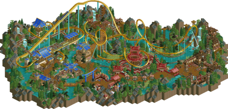
5 - Valley of Huanglong - Mulpje
Quick thoughts: This feels like NCSO at it’s finest. Which is crazy, considering that we just experienced Leafy Lake. The aesthetics we see here feel so unique and well executed, that the differentiation between ncso/cso/etc becomes irrelevant. This is simply beautiful RCT. The theme and setting is gorgeous, and this map has some of the best interactions in the entire contest. Everything feels intentional, well-crafted, and embedded as if this place grew up around the coaster itself. Beautiful work
What I really enjoyed: Everything. The chairlift along the cliffs with the tall wooden supports (clever trick),, the map edge with the waterfall, the distinct architectural differences between each “village”, the foliage overall
What didn't resonate: I don’t really have anything negative to say about this map - I loved it all
What I'd score it: 85--
4 - Unfriendly Invader - nin
Quick thoughts: Everyone becomes Walto eventually. This map is a beautiful piece of worldbuilding. Everything feels incredibly well thought out and intentionally placed. The theme is immediately apparent and the music really helps elevate the atmosphere.What I really enjoyed: The massive powerlines provide great balance to the map, the sheer amount of movement and kinetic energy, the NE logo crop circle, the barn station (I have some roof objects that might have interested you), the scenes of the peeps being abducted, foliage overall (okay I feel like i’ve seen this butterfly object in almost every park), the land being ripped up and the water mains leaking
What didn't resonate: Why didn’t you use the levitating roof tile objects you fool - you clearly found the UFO street signs i made for Yucca lol
What I'd score it: 85--
3 - Farewell, For Worse Until Someday - Barnid
Quick thoughts: My dog is named Lucy, so you’ve instantly earned +5%. This is an interesting map. Tons to love here, though I could see how it might not be everybody’s cup of tea. I think you’ve done such a wonderful job depicting these immensely personal memories and scenes, and things become more apparent to the viewer the longer you view. It’s a bold choice to theme your map to something so uniquely personal in a contest such as this, and I think it’s largely successful. It’s been awesome to see your journey as a builder and member over the years. Huge congratulations on the win and elite status man - so well deserved.What I really enjoyed: The ski slope is a great pop of contrast, zoo structure is awesome, i love the choice of putting a body of water underneath much of the coaster, the music is beautiful, flamingos, foliage overall is so well done, I like that park name sounds like an album title for an indie band
What didn't resonate: Torn on the sunset scene. While it works very well from one angle, it feels messy from the rest. The overall map shape and edge could have used a bit of polish and cleanup, but that’s a super minor nitpick.
What I'd score it: 85--
2 - Gaudi Gardens - Monsterbutts
Quick thoughts: This is RCT at it’s finest. Simply beautiful work for the sake of being beautiful. There’s so much to love here. I think this map succeeds the best out of all entries in it’s color usage. While this theme has been attempted before, this is by far the greatest depiction of it. Sincere congratulations for not only finishing this map, but for earning your parkmaker spot on something so wonderful.What I really enjoyed: The color of course (The strong use of green throughout the map is what anchors the palette - allowing the beige to work as both a path and building color and the vibrant accent colors to really pop). The coaster queue with swan boats underneath is beautifully done. The curvy hedges everywhere - especially around the back half of the coaster are top tier. The waterfall by the starflyer is fantastic. That carousel! The tiered planters and steps everywhere are beautifully done and very readable as a viewer. I love the music.
What didn't resonate: The map edge was a tad messy in some sections, but that’s a minor nitpick.
What I'd score it: 90--
1 - The Cartographer - Xtreme
Quick thoughts: Simply spectacular. This map immediately feels extremely recognizable as an Xtreme map - which is further proof that your style is distinct and associated with the highest level of parkmaking. There’s such a clear macro here, and the overall park concept is very apparent. Frustratingly enough, the whole cartography map edges is an idea that I’ve wanted to create myself for quite some time, so congrats for beating me to the punch. You’ve certainly done it justice and at a level that would likely far exceed my own attempt! Shout out for using the cel shaded trees - super clever idea. This map is my favorite out of all submissions in this contest.What I really enjoyed: I sound like a broken record, but the colors on this map are perfectly chosen, the overall readability (everything is placed in a way that it’s so effortless to navigate as a viewer.) The details on the map itself (compass rose, the squid, the waves, X marks the spot, steve fishing for compliments). I love the little log flume that extends into the map. The foliage is appropriately lush and used to great effect. The Dancing Dragon ride is too good - I love the sun sails in the queue. Everything on this map just feels so organic and distinct. Sincere congratulations for creating such a wonderful scene.
What didn't resonate: The overlapping music was sadly very distracting. I’d almost want to see the map edges extended by a few tiles on all sides to make the cartography effect more apparent.
What I'd score it: 90


Tags
- No Tags