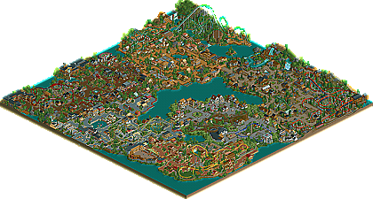
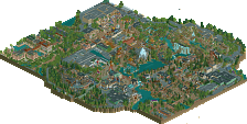
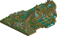
Park / Spellbrook Shore
-
 04-September 07
-
Spellbrook Shore
- Views 13,834
- Downloads 5,416
- Fans 2
- Comments 44
-
-
 79.38%(required: none) Spotlight
inthemanual 90% Austin55 85% Stoksy 85% Cocoa 80% MCI 80% Poke 80% 5dave 75% geewhzz 75% Liampie 75% Xeccah 75% 79.38% -
2 fans Fans of this park
-
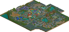
Full-Size Map
-
Download Park
5,416
-
Objects
445
-
Tags
Similar Parks
-
Six Flags Carolina
-
Marriott's Discovery Bay Golf Resort
-
Arabian Secret
-
DisneyEarth Vancouver
-
Mountain Mania
-
The Beasts
Thanks for the equally long reply, it's nice to know you take feedback well and enjoy it.
As for the sky swat......all I will say is that you may think that my original one was the best......but you'd be wrong
Keep an eye on your inbox in the future
RCTFan
inVersed Offline
-The theming throughout is packed with tiny details that just make the park fun to look out.. Traverse Town might be my favorite. The atmosphere here was astounding.
-The overall atmosphere was superior, you really use terrain and foliage to your advantage here
-Kestral was beautiful. enough said.
Time to be a bit picky just a little bit of criticism-
-I really thought clock-work was poorly paced. Had it had had a better pace it would have been my favorite coaster over Kestral.
-The orange flowers in traverse town stood out too much for me.
-I honestly did not care for the mainstreet section too much. I think the coaster just took away too much from the atmosphere there and seemed out of place. Ticket sales also could have been a bit better done.
-The vintage car (which is usually my favorite flat ride) was just so small. I understand it was because of spacing, it might have gone better in replace of Pendula
-Please build a full size wooden coaster (not relating to the park).. i dont think i have ever seen one from you! (the slide friction was great BTW)
Great stuff J_K.. well deserved. you sure have came along way from Sikinos (i think thats what your debut was called)
Edited by inVersed, 08 September 2007 - 08:11 AM.
It was kind of interesting because most of the coasters with the exception of Kestral weren't mega-coasters, like every RCT park features these days. It's like, you build a solo, check off the standard woodie, arrow, beemer, and intamin, and then use some kind of combination of jurassic, medieval, pirate, etc. Anyway, I was happy to see that your themes were fairly unique and your coasters family oriented. That made me happy.
I'm going to point out some of the negatives first so I can get back around to the positives at the end. I thought that Spellbrook Shore had much less of the "little things" that you had gotten so good at executing. Like when I look at Cape Congo, I see the fantastic ideas everywhere, with SS, I see it scarcely. It's not that big of an issue, though. For example, the boats in the entrance area were awesome. I'm kind of concerned though, what that entrance plaza would be like on a busy day with all the kids fighting over it and the rest of the volume of people at the entrance. That kind of brings me to my next point that the paths were not varied enough. Yes, the 2 and 3 width paths are great, but I think the areas could have featured some more differentiation and wider paths at times. Now, this also kind of plays into what I'm going to say next, which is very abstract, so I will try and articulate it, though I don't think I will be able to. In mostly all of your areas except for the victorian cove one, (Brabble Cove?) I thought that the park kind of fell into a formula with aesthetics and structures. You had your 2-width paths around planters, a few flat rides scattered, and 2x2 architecture dropped in almost as filler. You did a decent job naming the shops so we could kind of figure out most of their purposes, though I wish you added more shops and stalls. I know it's a pain in the ass to like rehack everything but sometimes it provides better insight to the area.
Anyway, going back to why I disliked this "formula" was that it aesthetically was almost too much stimulation. There were all these houses in each area, and I wanted to look at them, but I also wanted to look at everything else in my screen: the flat rides, the shops, the employee buildings, etc. And it was like, there's so much to focus on with the coasters and stuff, that I found myself kind of not really focusing attention on one thing. It's like when you're really exhausted studying for finals and then when you're done, you look back at the day, and you're like, "wow, that was a blur," despite the fact that you would probably remember the difficulty of one or more tests. It was kind of like the same thing when I looked at this park and pretty much strolled through the areas, while I actually spent about an hour in the park. I don't know if this is really helping.
Well, I guess what I'm saying and suggesting is to cut down on some of the useless buildings. Near the end of your construction, I could tell, your parkmaking was much more focused and refined. For example, the restaurant in the victorian area, and others held much more compositional purpose and aesthetic appeal. The rest felt like a clustered overload at times.
Don't get me wrong, I felt like this contributed to the atmosphere, even, in Traverse Town for example. (the best area for someone to hang out in the train storage area
I'd also like to add that you rely too much on brown. The Victorian and Spanish areas were nice at the end of the visit because I couldn't imagine another area with both bases and roofing as brown, but you seem to be improving at that.
The splash boats ride was simply majestic.
Great job. I feel like I have forgotten some stuff and I will let you know when I remember. Congrats again. Can't wait for your PT.
Overall it was a very solid park. You have real skill when it comes to adding just the right amount of details to create a pleasing and realistic atmosphere. There was so much to explore and enjoy and this is really one of my favorite rct releases in a while. It just has such a clean feel to it that brings it up to the Spotlight level. All your areas were pulled off well and I like how the setup and themes were not generic ones we see over and over. That really made this special to me.
I liked a lot of things... the bull stadium, all the little custom signs, the area with the maze around it (a unique and creative idea, great job there), overall your coasters were well done and had solid layouts. All the themes really pulled you in and were a joy to walk through.
Here are a few cons I found though:
- Your coasters stopping at the tops of lifts was a bit of a drawback to the park. Now, I'm not one of these people that freaks out every time a coaster stops at the top of a lift but all your coasters did it (except the suspended I think) and a couple had pretty long waits. Just a sloppy aspect to a highly polished park imo.
- There was something bugging me about this park and I couldn't put my finger on it until it finally hit me: this parked lacked a major woodie... something I think every park should have
- Seige was pretty sloppy in comparison with the other flats, I never liked that rct2 trackitecture attempt at flats... probably would have been wise to redo it but I'm sure you were wanting to get this done
- That turnaround on Ironside can once again be described as "sloppy". Looked like you wanted to have a cobra roll over the path or something but then realised you were going for small inversions so you had to settle with that 180 over the path.
- Didn't like the colors of Kestrel to be honest, the green and aqua did not fit well in the area. Some brighter colors would have looked better imo.
A great park and Spotlight worthy for sure. Nice job and I can't wait to see some more work from you =)
For the overall feel of the park, I think you've layed out the areas and attractions quite well. The most exciting coasters, Ironside and Kestral, are located in the back of the park where they should be and there's enough fun attractions to keep guests entertained no matter which area they go. For the architecture, the consistency in basic form both adds and detracts. The detailing vastly changes from area to area, but the basic form ties together the park providing a large amount of the overall atmosphere. However, the contrast between the similar form and highly varying details convince me of the artificiality of the park detracting slightly from the park's charm. The park has plenty of flat rides and other small attractions which are quite nice, but seems to lack in water rides, though the ones there are nice. The foliage is nicely placed but the lack of variety throughout the park in accordance with the themes is also somewhat of a letdown. All in all, you've
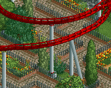
The coasters of the park had their high and low points which I'll get into further. Your park seems to obey an unwritten rule that there can't be more than one roller coaster per area and yet there has to be a roller coaster in every area. Traverse Buggies seemed to be more of a dark attraction than a real roller coaster. One of my largest dislikes of this park is the lack of a true family coaster, as Greyheart seems intended for moderate thrill seekers with the lack of many modern safety features. Pendula in the front entrance is well designed from the perspective of the formation of the coaster elements to form an exciting ride, but the coaster itself doesn't fit in with the surrounding environment. The coaster itself looks designed for fun in very little space and yet with the surrounding environment its feel is interrupted making the experience more akward. Clock-work was my favorite coaster in the park for the balance between the flow of it's layout, the positioning of each element, and the balance between the nature excursion and theming interaction. Kestral, in the back, looks nice in the area for the screen you advertised, but the rest of the layout is mediocre like some of your earlier work and the ride as a whole feels like it was jammed into the area like a puzzle piece that almost fits. Gee's coaster Ironside is quite well designed, except for the large turn and lack of transfer track which may have been left out for spatial reasons. CP6's coaster, Matador, is quite well designed and gives a good realistic feel for it's style of coaster which is complimented by the name. I would have preferred to see atleast one wooden coaster of the regular type, but it's not a very large loss. Overall, the quality of the coasters vary, but none are truly let downs.
The other attractions are all well positioned and designed, providing undoubtedly one of the park's strengths, despite the lack of water rides. Water rides refers in this review to rides that actually get the person wet, rather than rides involving water. The custom rides, theater, and bullfighting stadium are nice but the custom flats aren't especially unique in any manner. The transportation IMO, was a bit of a joke, because you had a fancy train on one side of the park, and absolutely nothing on the other side. The shops are a bit of a joke too, because they didn't have any interior detailing and are only shops on the outside. The helicopter ride was a nice interactive ride, but the shape of the layout could have been more thought out. All in all, your non-coaster attractions have good amounts of thought in them, save a few small flat rides that are placed in slightly akward settings.
Theming was quite good, despite the abundance of similar architectural shapes. The stimulating theming carried the atmosphere of the park, though some of the themes in the front are more generic. Traverse Town was my favorite area overall, but really could use some sort of water ride. The entrance is quite generic, and this area, IMO isn't quite up to spotlight quality, though the theming in the rest of the park helps compensate. I've already given my opinion about the foliage which, however, adds to the realism of the park. The interaction of the architecture, landscaping, and foliage are the single biggest strength of the park and give this park it's spotlight quality. Your interaction of elements is undoubtedly what's made you a parkmaker so fast.
All in all, the park suffers from a few flaws, and isn't my preferred style, but I highly enjoyed viewing it and will continue to do so with each continued viewing. Congratulations on the spotlight and parkmaker spot, and I hope to see more work from you in the future.
Entrance Area
Something that instantly cach your eye is the style of JK, where other parkmakers always try to use very complicated archy and large buildings etc is this park build with almost everywhere simpel archu. The entrance area also, the buildings aren't that complicated but look very nice nontheless.
The entrance building is beautifull because of its simplicity and the monorail station is maybe my favorite buiding in that area.
The station of the coaster is a bit dissapointing, where most buildings consist of many colors in the entrance area the station only consist of 2 colors, what for the style is at least one color to few.
The foilage suits the area very good and also the landscaping has not real eye cachers but it looks good still.
the lay-out of the coaster isn't that spectaculair but again it isn't bad also like most things in this aree.
Spanish Area
I guess this is the spanish area. I really liked the simpel hack with the angry bull, again JK proves here that he can make something nice with something simpel.
The coaster made by CP6 is pretty nice, one thing that really cached my eye (what others maybe don't see) is the way the transfer track is done ... by moving 3 of the 4 tiles S-turn you get a very risky hack, not because it causes glitches but I think you noticed that if you want to remove the coaster it isn't possible and I believe you can't even edit it anymore
the custom ride Solaris wasn't bad but didn't really catch me, I think it would be nicer if it was a bit bigger.
the rest of the area didn't really contained special things imo but still it looked good, the atmosphere was very good because of the chose of colors.
Greyheart area
Is this the english area? I was to lazy to read the read me so I don't know how you call the area's. You can see that this area is build later because the detaillevel is higher. But still the level isn't as high as we are used at the moment from JK, but you can see here that he begins to use "little things" , there are some nice little things in this area like the custom sign for the information kiosk and the tractor on the land.
the choise of paths here is really good ... maybe you only use a bit to much mazes in this area. The lay-out of the coaster isn't very stunning also, but it servers it purpose here.
maybe the thing that I think misses the most is a nice waterline .... I had liked it if there was some more foilage near the water, the water seems a bit useless for me now, maybe you could have build some pears or something.
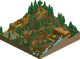
Ironside Area
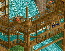
Now here is the first REAL coaster of the park, I here we see the real skills of johny, his coaster making skills are very good and he really is good at creating an atmosphere, the foilage and landscaping are a bit more daring in this area also and it turns out very good. the buildings arround Odin's Plunge are very good, I really like that splash with the track over it.
And little point of attention in this area is maybe that it is a bit dull .... at some place it misses something. I think it could have been a bit better if you used a brighter color in the buildings at some places to hightlight some things. Or maybe you could have used a other type of path at some places, this one doesn't really creates an contrast. Luckly at most place you've got the yellow flowers which give it the right feeling.
Btw I really like those things made out of the poles.
Kestral Area
I think this area draws the least attention to me, the coaster is pretty good it seems but the rest of the area doesn't really do me anything. I think I see some influence from TA (Tierra Adventure) in it or maybe this was build before and you used a bit the same style in TA also. The coloring is very plain and everything seems to have the same colors, imo it blends to good. I think a nice color to create some contrast should have done this area good. Or maybe an other choise of path. the attractions are hidden well in the buildings and you really get the feeling of beeing in a village, but this village is death, there is no life in it.
Next time try create some more life in your area, in most areas you succeed in doing this but in this area you failed imo.
Still the flat ride Raven is pretty nice and lifts the area up again.
To bad also that when I watched this area the coaster was broken down and there was no mechanic able to fix this attraction.
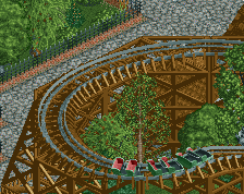
Clock-work Area
The first look at this area is really nice but when I turn to the coaster I think by my self, even you should know that it is a not-done to let a coaster wait on top of the lift hill because of the blockbrakes.
The archy and atmosphere in this area was really nice and it is obvious that at least a part of this area is one of the last things made in this park.
Like I said before already when you showed the screen I really like that podium, and if I remember good you made one like this in TA also.
the foilage in this area has a really nice feeling also, in this area you used some more ground foilage and it worked.
Last Words
Overal this park is pretty good, its not awesome but also not bad, like verything in the park. J K is a very consistent parkmaker who keeps the level always good but maybe if you try a little more and be a bit more daring you could really peek and get an even higher level. you still are bound to your own rules, most buildings looks almost the same but when they become a bit larger or have to be adapted for a ride or something they become special and look better. So my advice to you is to scrap your own made rules and try to handle every buildings you make like those special buidings.
*Entrance
+Great idea on the RC boats!
+The goodbye sign combined with the transport area was thought out very well.
+Pendulum has a nice lay-out. I would have made a shallow drop at the end instead of a steep one though
-Problem with Pendulum is that it's blends in with the environment... yes, that's a negative because it doesn't stand out and blends away in a way that you hardly notice it.
*Puerto Espana
+Solaris is a very nice custom ride (I probably wouldn't have named it that though)
+Matador interact nicely with it environment.
+The Bull stadium was my favorite of this area, nice work on the head.
-While the area flows it is sometimes a bit lackluster. Too much 2X2 stuff and you should have tried a more daring color scheme.
*Traverse Town
+One of the stronger areas, colorwise and atmospheric.
+I liked the virginia reel coaster very much. It reminds me a bit of one that I made in one of my ancient LL parks.
+Nice crafting of the stage show
-The pacing of the Corkscew could have been better. For realism I would prefer a lower chain speed, but I believe it was simply necesarry to give it a high purely to get it around the track properly.
*Kestral area
+Solid coaster and custom rides.
+Nice detailing (horse/games)
-Area is way too bland & too brown.
*Viking area
+Ironside is lay-out wise very strong
-Beside Ironside this area has very little too offer for me...
Bramble Cove
+Easily the strongest area of the park in my opionion.
+great decorating with the hedges. It flows very strong.
+Great to see a sidefriction again, even more so because Greyheart is high quality stuff.
-I personally would have like something of a fountain in this area.
-The only weaker part in this area is the SOS copters.
Overall
+good flow everywhere
+nice detailing, but sometimes a bit spread thin
+solid coasters and nice non-coaster rides
+both shows are among the best the park has to offer
+the classic feel of the park was good, but could have been accented better. This park craves for a decent oldstyle woodie if you ask me (besides Greyheart)
-way too much 2X2, and too many pointless buildings if you ask me. Try to make more buildings with there own identity.
-sometimes the coloring is to dull. The effect of this increased because it is allowed to continue all-over the park. This is the downside of the good flow.
James - rctnw
5Dave- Hey nice idea for that Church. We really need to speak some time. Have you got Msn or AIM or something?
Yeah i know what you mean that curve seemed to spoil Ironside for a few people. I loved the layout itself so it seemed wierd to change it. I thought you'd like the area with Greyheart and SOS adventure. You appreciate the little details which is what your so good at as well. Glad you liked the water ride i think I'm finally managing to nail them.
I also knew you'd get me with the "No purpose" comment. My answer to that now is my PT3 park is the first park that i've actually planned it on paper with different ideas going into it and what shops i want to create with the ideas connected to it. I havn't planned every single detail but with my new solo i'm going to. Your'll see alot more refined work from me soon.
Anyway as i said get in touch i'd love to have a "meeting of the minds" lol.
Toon - Erm wow . . . . All i can say is is i'd love to hear what you think about the park. it would mean alot coming from you.
Zodiac - Where's this detailed comment you promised? I did a guestspot for you in the time you could of written it
RCTFAN - All feedback is good feedback. Aslong as i'm happy with my work and i know what to do to make it better, that's all i can ask for.
I'm checking my inbox everyday mate so hurry up and send the screen. Lol. I can't wait
Inversed - Looking back Traverse Town is the area of the park that i love the most. I want to apply that creativity and ideas to every single square of my next park. If i can achieve that then i'd be so happy.
I'm so glad you mentioned my foliage and Landscaping, i thought it wasn't a strong point but looking back on it i really enjoy landscaping and foliage so much.
I do really need to sort my pacing out with some of my coasters so i'm definately going to sort that out in my next solo. I'll have to disagree with you on the orange flowers in TT i loved the look of them and thought they really added to the atmosphere.
Sorry to "diss" your vintage cars lol as you realised it was a filler but i'm sure i'll explore a better theme with them next time.
I thought someone would mention a comment about a wooden coaster and anyone that knows my work will know i've never released one. That won't happen with my next release
Yeah it's scary how i released Sikinos last April and now i'm here. It's wierd but I'm not complaining lol.
Postit - Thankyou so much for the multiple comments on fury and here. Your constant support makes you a good friend of mine in the community.
I'm glad you've seen that the areas i created weren't the "norm." I'm not one for that standard checklist so your'll see all different things from me in a park.
The boat ride will be in my next solo but alot bigger, I'm sure i'll show you a screen when its done but good idea making it bigger. I've pictured the new one and how its going to be so hopefully i can recreate it.
Shops and stalls will be in my next park alot. I wondered if it would play a big factor in the park but it should of been added for more clarity.
Most of my useless buildings will be gone with my improved work. After seeing Xcoaster plan Shadowlands it's taught me alot and i know i have to plan a great deal if i want to create a mixture of innovative ideas.
I will admit now my safe coloures are brown and grey. I will definatly mix it up in future.
Yeah my PT should be interesting actually, I'm quite excited about it.
OLE
I know what you mean about the "clean" feel. I look back now and it all just seems to fit. I know this sounds like a stupid question but here it goes. How can i make it so my coasters don't stop at the top of a lift hill for a long time? Once i know i'll make sure it dose'nt happen in my next solo.
Major woodie coming soon from me.
Siege really sticks out to me and i love the ways it's done. I think i could've added a few more things to it but i love it. Looking back now the original colour scheme of Kestral didn't stick out at all so when i changed it to this i felt it fitted the area alot more. Guess it's just trial and error sometimes.
Your'll be seeing some more work from me soon mate. Hopefully you can answer me that question in my reply to you, so i can sort my PT out.
Geride
Wow thanks for the long reply mate. Good point about not varying my foliage enough, i'll make sure i sort that. I'll correct you as i built Ironside. Geewhzz just pimped it out with supports and details. It's interesting to see you like clockwork the most. As i've said before i like how everyone has there own different area or roller coaster.
More water rides is a must for my next park.
Thanks alot for the comments towards the end of the reply. I feel if i get my coasters up to the same standard as my architecture i'll get alot better. Glad you also recognised the landscaping and foliage.
Levis
I love the monorail station as well. Like the pay and ride boats it's a must for my next solo yet on a bigger scale. I love the angry bull hack. I'll definatly be adding more "fun" hacks in my next park.
I'll give that idea to egg head as he taught me how to do it. Thanks for that one mate. Hope to hear from you soon.
Glad you liked the Spanish area, the mainidea for that section was to build things to accent Brian's roller coaster. I think i pulled it off pretty well, i kinda had to with a layout like that.
My workbench wasn't up to date with all the objects out now so i know i could add a few things to the victorian buildings to better them.
Glad you liked Fort Ironside and i'm even more glad you liked the coaster so much. Like the "greyheart area" (Bramble Cove)
As i've said before Sunshine Kingdom is the most hit or miss area of the park. i wanted to create a warm atmosphere with decent rides and inviting architecture. It was actually the hardest area to complete and i nearly deleted it at some point. I'm glad i didn't because it showed me if you pout more work into it, it'll turn out good in the end.
I actually built the podium before the one i built in TA. I was revising different type of staging in drama at the time so i wanted to try creating one in the game. I guess it's become one of my trademarks in parkmaking.
"you still are bound to your own rules" I know exactly what you mean ! i have so many rules for parkmaking so i'm really trying to break most of them and make individual buildings with individual purposes. Thanks alot for your detailed comment. I know how long it took you lol.
Tyandor - Even though it's late it dose'nt mean i don't appreciate it as much as the rest. I actually apreciate it alot more because it's from you and i was really hoping for a comment off you.
I know what you mean with Pendulum, it does blend inwith the entrance area which is it's downfall. I was thinking about changing it but when you see it over and over i guess it just looks right.
Wow i'm glad you liked Bramble cove so much, it's a joint favourite of mine.
As i've said to others i promise you a wooden roller coaster soon.
Thanks alot for your comment, i agree with most points youv'e made and i'll take it all into consideration when i'm building my next solo.
Can't wait for EGAS !!!!!!!!!!
RCTNW -
----------------------------------------------------------------------------------------------------------
Another long reply but thankyou everyone SO MUCH for your comments. I'm still hoping for alot more so any would be great please.
JK
This park is PERFECT in all ways. The buildings have the simplistic style that is maintained throughout the park, and gives it a classic feel that seems to be lacking in most parks these days. The coasters add a nice sense of the “amusement park”, yet the areas each have their own feel and style. Small rides are awesome, and I liked how you attempted the Sky Swat and Sky Swing, which fit perfectly with their areas. The coaster designs were flawless, and very original, with Kestral being my favorite (I liked the yellow/white combo better, though). I definitely want to see more from you.
Yeah, it’s not as long as I promised, but I’m just too lazy. Oh, and thanks for the guest spot, man. I wouldn’t be where I am right now in this without that.
More comments on this park are needed. We can't have a new NE Spotlight until this (and all spotlights for that matter) gets 60 replies and who knows, maybe we got something hot on the way
still like the park J K
Which hasn't happened very often lately, but I still drool over it