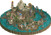
Park / Charybdis and Scylla
-
 22-August 23
- Views 2,404
- Downloads 173
- Fans 2
- Comments 22
-
-
 79.00%(required: 65%) Design
posix 85% Terry Inferno 85% wheres_walto 85% G Force 80% ottersalad 80% Scoop 80% Xtreme97 80% bigshootergill 75% Liampie 75% RWE 75% SSSammy 75% Faas 65% 79.00% -
2 fans Fans of this park
-
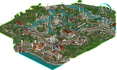
Full-Size Map
-
Download Park
173
-
Objects
31
-
Tags
Similar Parks
-
DisneyEarth Vancouver
-
Sea World Brisbane
-
The Seven Liberal Arts
-
The Histories
-
Euroscape
-
The Time Machine
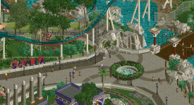
I love the tasteful foliage. The wild vegetation is lush and dense but there is still enough space there for the individual parts to breathe. The planted vegetation looks fittingly planted. And I really like the plain grass areas.
The rapids ride looks good and interacts well with the rest of the area.
Or rather, everything interacts well with everything else and the general composition of the whole area is well done. The railroad ties things together nicely.
However there are some object supports that make the rapids look a little unpolished.
For the coaster, it intersects with itself. Whoever signed of the clearance checks should be fired and publicly exposed as a fraud.
I would personally have put the supports over the water line.
The backstage areas are really well done and fit snugly with the rest of the park while looking well hidden from the peeps. Nice!
I'm not a fan of this levitating bridge/path.
And lastly, the logo is absolutely fucking fantastic.
OddmentsAlchemyLab Offline
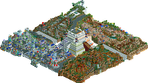
I really like this park. A couple of things that stand out:
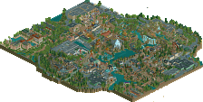
1. The subtle transition of the path types near the shops.
2. The pre-launch on the coaster is super (as are the overall stats)
3. The splash boats loading area looks great, My wife and I agree that walking on those rotating stages is wonky, but the look is awesome.
There are a number of uncomfortably close track interactions, but the layout is well-conceived.
This is fantastic work as always. You always have some of the best object usage when it comes to form of architecture. Such a natural way of blending different angles in a game that makes that really difficult. The layout is solid. Love the colors and the interaction it makes with the rapids. The tracked transport ride with no engine is kind of strange to me, but that's a more personal take. Some of it has been mentioned before already on the website and discord, but you always seem to leave so much on the table when it comes to polish. I understand that you use these designs as more of a sketch (which is apparent), but I think it's a disservice to yourself and the time you put into this game. Especially since there isn't a time constraint. Sketching is great for the creative process, but I see the NE database.... more so for stuff being put towards a panel vote... as a place for finished work.
This layout is super cool, love seeing all these multi launches recently. I love the colors, the underrail is striking! The slow roll over the medusa looking entrance. The object and color use is super modern, especially the round queue for the transport ride. I like the idea of the fake queue but i think i personally prefer peeps. It looks good for screens tho. The river rapids are really inspiring, super refreshing and pretty!
Despite a few rough bits, this is really really good. Big improvement from the few screens you posted, the coloring works great almost everywhere. You also have a great eye for unique details that even realism nerds like me miss in our own parks. Always makes viewing your work a unique experience. Great work once again.
i was going to actually write something lengthy to this much against my gut instinct to not start a flamewar in my own park’s comment section. instead,
who cares dude? you’re not paying me. id rather center my stuff around my own experimentation, improvement, and passion for the game rather than making some super polished product that by the end of it i’ll be burnt out. as far as i concerned this is finished, and if the missing back of a building really hampers your enjoyment of others’ stuff so much, i cant let that concern me.
Gotta say, I don't really understand the lack of polish thing too much. Maybe I don't pay as much attention as other people, but things like the supports on the rapids ride don't lower my enjoyment because I don't even notice them.
Thought this was your best work since coming back and seemed clear to be the one you had the most fun with. Coaster layout was strong, architecture was solid and felt detailed enough without becoming messy, and the colours throughout pulled it all together giving it a very distinct atmosphere. Top stuff, well done.
Sephiroth Offline
Through NE's history, this site has been known as the place where the best of the best RCT players congregate to share and critique each other's work. In Ye Olden Days this critique was often relentless and filled with personal attacks and profanity, but in the 20 years since then, progress has been made and aside from H2H, a lot of the discourse has become civil and much closer to professional, if I can say that.
NE used to be a bunch of teenagers and early 20-somethings, and now it's a much wider range of people from teenagers to people in their 30s and 40s with professional careers in graphic design, computer graphics professionals, video game environmental designers, architects, project managers, and engineers in electrical, mechanical, civil, and structural disciplines, just to name a few.
All the above, combined with the fact that work like this is what most would call "top-tier" at this site, means that people are going to evaluate these releases with a fine-toothed comb, and provide feedback with the smallest of nitpicks. Isn't that how things go with top-tier work though? I mean everything else is there and refined: macro, interaction, detailing, grid-breaking, immersion, atmosphere, on and on and on. The bones are there and the bones are good, very good.
So yes a few people who are good at finding small details are going to comment on them. It looks like your personality is able to look past those, which is a great skill to have. Asking those with personalities that have trouble looking past small details that might not be complete is an endeavor that will yield mixed results, just keep that in mind. People are different and come with different points of view.
I also know that you pour so much into your RCT creations which has good and bad sides to it as has been thoroughly discussed over on Discord.
My best advice would be not to even engage with the nitpicks. You see it your way, they see it theirs. And this is coming from someone who is usually bothered by a lack of "polish" in a finished work. Just the way I am. Does is hamper my enjoyment of a release? No, not really. But I'd include it in a reply to help the creator step up their game even more.
However in this case, given the reaction to Scoop pointing this out, I'm going to hold off. Given how personal RCT is to you, maybe it's best to just step back and breathe a bit, or just enjoy working on the next project. We're all here in our free time between work, house chores, and the other responsibilities.
Aside from the polish comment, there's really not much else to say because it's just that good. I expect this to score very high, at least 70% but I would not be surprised to see 80% or more.
i hope i continue to never understand why people think it is worth getting upset over this 20yr old game.
fantastic release, xeccah. i love how effortless you manage to make the complexities of half-diagonals feel. it feels super organic and a testament to your composition skills.
The coaster didn't really pop off for me - there's something about how people are building coasters at the moment which doesn't spark joy for me and I sincerely hope i figure out why. I know you to be a talented coaster builder from your numerous other bangers so i am very eager to understand.
keep the bangers coming xeccah. love to see such incredible work.
a little trip down memory lane - one of my favourite design submissions of all time is Kesler Gap Rumbler by gir.
https://www.nedesign...er-gap-rumbler/
the release is incredibly gestural and "unfinished", but it still works so so well for me. polish is important for some, and less so for others. vote according to your taste, and allow for others of other tastes.
I don’t think anyone is upset over the game. If I’m upset over anything it’s the money mindset.
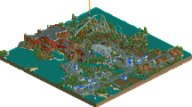
Congrats on the release. Love the layout of Scylla - really solid, unique, great pacing, and there's great interaction with the rapids ride. Definitely some headchop moments as pointed out already, but I'll pretend those had proper clearances lol. Awesome queue entrance as well. As always, your rapids ride is solid - you are definitely who I would look to in terms of making the best rapids rides!
I think the missing polish brings it down a tiny teeny bit. Mainly the handful of black supports scattered about. I also see the argument Scoop is making here. But it didn't impact my viewing experience too much.
I didn't care for it much on first viewing but I enjoyed it more this time. I liked the layout of Scylla, even the first time, but it seems to be the embodiment of the current bag of tricks. Make a generally full circuit coaster but with some back and forth shuttle sections to spice it up. It's a good idea but it's been overused since the last Micro Madness. But the overall setting is good enough that once I got over my main issues there was still more to explore which shows that it is a quality design.
I have no idea what the previous comments mention, but maybe I missed a previous discussion. Who is asking for money in this specific case? And who is getting upset? Very confusing.
Also Sephiroth, do you really think someone commenting on the fact that a design submission is literally unfinished in some parts 'the smallest of nitpicking'? It is noticable without going through the park with a 'fine toothed comb'.
Anyway, I liked the scope of this design, and there were some very solid bits. For example the way you did the waterfront, and the outstanding queue line entrances.
There were things I found distracting though. Namely:
- The way you choose to do your map edges.
- The unfinishedness of some parts. Especially with such bright colours and remarkable textures, combined with the way you choose to do the map edges, it does stand out badly.
- The combination of working, peepable rides, but not working, unpeepable queue lines.
Awesome release xeccah! Love the coaster layout, it has some really nice flow especially near the end from the double down onwards until the final brakes. No notes on the foliage and rockwork as they're both sublime. It would've been nice to see some color variation in the rocks (e.g. adding hints of darker grey near the water levels for a more 'wet' feel and green-ish hints near patches of foliage and/or deciduous trees) but that's just a personal preference. Some of my favorite bits scenery-wise:
The entrance area for Scylla is fantastic, one of my favorite things I have seen in OpenRCT this year. The coaster sign, sculptural entrance and the plaza in front with some lovely path details and curved hedges are all executed very well in my opinion.
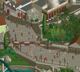
Love the use of the water coaster with invisible beams as the train track. The half diagonal string lights combined with the hanging signs also works really nicely.
No I think it's fair to link the two in some capacity. Especially when it was brought up in a screen for this very project. But honestly I was just explaining to you what was going on because your comment made it seem like you hadn't read everything else thus far.