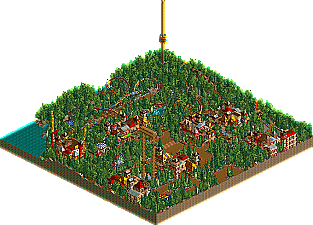
Park / Linoma Woods
-
 22-August 03
- Views 3,421
- Downloads 412
- Fans 0
- Comments 41
-
Description
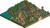
This was my first completed and publicly released park at New Element. Much to my delight, people were actually taking notice about me, even though I was considered a “n00b” to NE. There is not much to the park: a B&M; launched coaster, a combo twin S&S; tower ride and a few other minor attractions. The park may not be much, but finishing something was a major accomplishment for me as a new-to-the-scene parkmaker, and it would prove to be quite the difficult task from there on out.
- John on his parkmaker page -
No fans of this park
-
Download Park
412
-
Objects
155
-
Tags
Similar Parks
-
Anuradhapura
-
EverQuest: Waters of the Past
-
Sepsis
-
Khalma Cove
-
Erwindale Forest
-
Coral Creek Adventure World
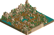
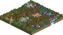
Oh yeah, I am making this park without custom scenery so it should be interesting at the final result, it's only 100x100 so it won't take all too long to finish (hopefully)... anyway, here are two screens:
The entrance to LWP...
The flyover the restroom that comes after Truene Aguila's first drop...
Comments/criticism welcome.
Really, this sums the park up perfectly. Your archy is nice, exspecially the fact that it isn't the same old 2x2.
So, that whole speil about the park being "qauint" wasn't a good thing for your information. So let's talk about fixing it.
Try to add someone color to the park, I mean, what you've got here is fine but the colors you've chosen are those monotone earth colors which all newbs pick. It just gets boring. I guess the reason that they pick it is because it's safe, you can't go wrong with it. So, add some color here and there, I mean bright colors, flowers and coaster themeing should help with that. Change the color of the coaster to give it some more life, not that boring dull orange which you've got painted on there now.
Stay away from the wooden rocks, it just doesn't work (except for in jungle themes). Make the distance between your rocks smaller and have more of them. For that earthy feel that you're trying to achieve here I would use, rock, dirt, and red, with dirt sidings to them all.
So overall, your archy is very nice just put some more color in there, your rock themeing needs some work but it really isn't hard, and your coasters seem fine, just change that color and your on the road to success. Good luck with your constructions.
Nothing bad so far.
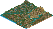
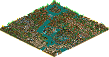
Here are the first two screens revisited:
I'm liking the new version, I really like the red, it looks great, especially on the middle building, on the bottom left hand building, it looks kinda out of place. I'd suggest using a different type of wall and still the red, and see how that works. As for the green...hmm...I think the old colors of the overhangs would fit in well here, but it's your choice.
Lookin' good, keep it up!
Everything is just great. The new red in the screens really gives some life to the park, spicin' it up.
So yes, you did everything wonderfully, the new coaster colors look good, really brings it out. Overall there is alot more life to the park. Now on to some more stuff you can fix up.
Now, don't get me wrong, I don't know what your going for but I'm not too fond of your tree selection. If your going more for that woods feel then get rid of those Willows, they don't help. But more pine trees and conifers. Stuff you would see in cold places pretty much. Get rid of the short trees also (the name escapes me now), they don't look too good. Try to go for taller trees. If what I'm saying goes complety over your head look at some of Fatha's' and Pyro's parks, they match themes well.
So yeah, get rid of those trees, oh and that green rock in the water and your better off than you are now (which is really good still). Oh, and try to keep bushes off the roof. If you can't find something to put there, do what I would do, just make the building better, it only makes it better.
Good luck! Don't take everything I take so seriously, it's just what I think.
Good job so far, a better park than I expected.
GuestLittle Wilso Offline
The first screen is too colorful for my taste. But it's your park, doeth as thou wisheth.
You could improve your rocks with putting in some black wooden sidings with the black rock-surface here and there. Try to make siding and suface fitting together. Yep.
Looks great otherwise.
MfG
BG
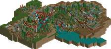
i like the invert better with the bright orange and without the trees in front of it (by the restroom), also think that the entrance looked better with the brown instead of the orange (you used floors !, youre my hero...)
would be nice to see some more of the coaster
looking really good, nice archy, cool
Silenced Offline
I wanna see more of that invert! Cant wait for more screenies
knuckles
RMM Offline
The awnings add more color being yellow and green so the brown and red are out, otherwise the building would be flooded with too much red.
I'll show more of Truene Aguila after I finish more theming around the latter part of the ride, all that is finished there is the mountain which you've already seen.
For now, here's a screen of a shop without a name yet... lol
The screens look decent, but you ned to show more then just 1 section...
More screens please...
Raven-SDI
§
Here is Wildfire and part of the S&S-manufactured drop towers Dynamite & Detonator.