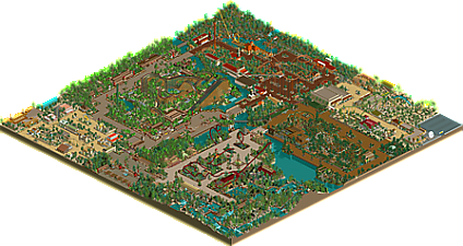
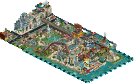
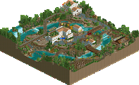
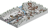
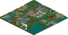
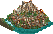
Park / Asian Adventures

Park_2323 Asian Adventures

73 Comments

  • Rage%s's Photo
    Beutiful 4D. Great work. You've captured the theme brilliantly!
  • v1perz%s's Photo
    Wacky Worlds! :fuck you: !

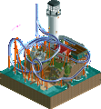
    I love that 4D coaster. This park is pretty good so far, but that WW stuff makes me cringe, mostly because it would take so much effort to see it in the game. (install WW, dload file, uninstall WW, make everything work again). Good job.
  • John%s's Photo
    Um... that is the sorriest station for the King Cobra. The plain pillars and orange roof just aren't appealing at all.
    You can do much better than that.

    And, "Asian Adventures" has to be one of the corniest names ever... think of something original and interesting. ;)
  • sloB%s's Photo
    The landscaping for King Cobra is pretty good and I like how it goes out over the lake, but John is right, the station is boring.

    I don't really care for Bombay Bengal, its too unrealistic for me, but I guess thats kinda your style of rollercoaster so don't listen to me.
  • guljam%s's Photo

    ^ Sorry I don't have a Korean section of this park. I did think about it before, but thought it might be too similar to China and Japan.
    ---------------------------------------------------------------
    ^That's OK;

    kkk

    have a good time

    Wow king Cobra Coaster Designs and Themeings was Great!
    Mike Robbins... Very good parkmaker^^ :D
  • Mike Robbins%s's Photo
    Two more screenshots:

    This is the 1984 Arrow Dynamics coaster, Gando, which is a mythical crocodile in the rivers of the Middle East.

    Posted Image

    Posted Image
  • Meretrix%s's Photo
    Nice work,mate. I do think that the back straight away on the shuttle loop needs to be longer. In real life, the reverse spike does not start right at the back of the station. By the way, are you hacking the archways onto the path (zero clearances), or is that a special piece of custom scenery?
  • Mike Robbins%s's Photo
    It's just TT scenery.
  • Steve%s's Photo
    ^yeah but i think u need to use zero clearences to get it to go on the paths, right? ah, well what do i know...im just a noob...lol...

    steve :spidey
  • sloB%s's Photo
    ^yes, you do.


    The screens look decent but I say, first of all, lose the sand pathways.

    The coaster colors are good and I'm glad you are staying away from the HUGE corkscrew coaster like you had in MLF.

    As for the station, IMO, it still looks ugly and too basic. Maybe try adding in some more balconies and such.
  • MickMaximus%s's Photo
    Looks great Mike...you already got my full review early.:bandit:


    About this zero clearances thing. How do you do it? Everytime I do it, it totally distorts my whole park.
  • Titan%s's Photo
    ^ Are you restoring the clearances afterwards?
  • Ride6%s's Photo

    First time I've heard that. Mick saved MLF from being just an 'average' park to a great park. His architecture saved a lot of my plain buildings.

    Yes but it's your "plain buildings" that make or break your atmosphere. There were just to many "amazing" buildings in that park... They overwelmed and altered the atmosphere...
  • guljam%s's Photo
    WAK!!
    color themeing is look very good,
    Korean Language
    Very good Á¶È­¼º!!
  • MickMaximus%s's Photo

    ^ Are you restoring the clearances afterwards?

    I must not be....thanks
  • MickMaximus%s's Photo

    First time I've heard that. Mick saved MLF from being just an 'average' park to a great park. His architecture saved a lot of my plain buildings.

    Yes but it's your "plain buildings" that make or break your atmosphere. There were just to many "amazing" buildings in that park... They overwelmed and altered the atmosphere...

    I work pretty hard on my architecture, I am almost anal you could say.. :bandit:
  • Mike Robbins%s's Photo
    Two more pics of the Turkish Market section of the park:

    Posted Image

    Posted Image
  • v1perz%s's Photo
    I think this section is pretty good. The buildings and landscaping is nice.

    The coaster sucks, but thats because its a kiddie coaster. The placement of the coaster is good tho, it fits with this theme.
  • Scorchio%s's Photo
    The sandy type paths are very nice looking. You execute the theme very well.

    The only thing I don't like is how that Kiddie Coaster flies over the green and brown roofed buildings - it looks a bit bare....

    Otherwise, Red Dragon looks awesome, and the green water you use around Viper looks great too.

    :D
  • Tech Artist%s's Photo
    Can't see the pics. :(