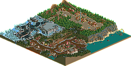
Park / Terrain
-
 25-December 14
- Views 3,238
- Downloads 611
- Fans 0
- Comments 11
-
 50.00%(required: 50%) Bronze
nin 60% 5dave 50% alex 50% Cocoa 50% csw 50% inthemanual 50% Liampie 50% Ling 50% ][ntamin22 50% chorkiel 40% 50.00% -
Description
A LL thing. This was much more enjoyable to build than RCT2. Enjoy!
-
No fans of this park
-
Download Park
611
-
Tags
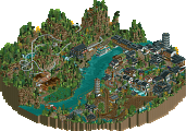
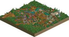
I feel I may be the low vote here, but there was so much here that was repetitive. The enormous paths were just so big compared to everything else, the huge castle was a good 1/10th the size of the entire park, enormous swaths of samey foliage all over, and a very similar formula for all of the roller coasters. They all have their stations set off on the park border and dive in for one little bout of path interaction before leaving again. Layouts themselves were okay. I think I enjoyed the Asian area the most - easily the liveliest and warmest area in the park. The cliffs make a nice landscaping challenge that you didn't really do anything with other than that one element on the B&M. In small parts the architecture was quite good, perhaps with a bit too much reliance on path. Also, it seems like some of the best stuff you've been showing lately is quite a bit newer than what's here, so I'm hoping there is more yet to come.
So, you definitely have an eye for LL architecture. Most of the buildings were really put together well. Your park planning could use some more work. The issue was that the landscaping, foliage, layouts and wide paths really killed any atmosphere that you were building with your buildings. It turned what looked like skillful work into a big bland awkward park. That's an easy next step to correct though, I think. It just felt lifeless and motionless like this.
Entry:
Strong gates; you definitely landed on an architectural style that works and kept it working throughout the area. I like that the side friction has a boardwalk-style station and layout - very cool utilization of an uncommon ride. The invert also displays some cool ideas in the form of the tangled track know on the path island and the waterfall near-miss, but the layout really doesn't flow well between those features. The foliage works very nicely in small clumps, but the full-tile jungle trees in big swaths are a little painful. I think the thing to do there would be either show off some bare rock face to emphasize the cliffs or create a dense enough foliage mix that we just don't see the grass underneath or the tree trunks. It would have been cool to see a travelator or something to get up the cliffs aside from a big underground path section.
Cliffs:
My favorite area, and one that really demonstrates strong fundamental skills. Gust is easily my favorite layout of the park, and the queue is nice as well. Simple and effective. Cliff diver has an okay "gimmick," but the real highlight is the back half with all the action over/visible from the main paths. The architecture is classic, but it was nice to see a healthy mix of colors and height variation to keep every building unique and interesting. I would like to see structures more clearly aimed at being something in particular than just generic buildings there to look good. That's a little bit personal taste, but sometimes all it takes is a banner that says "Cliffside Tours Office" or something to add that extra depth and create that atmosphere. Foliage here is great - the dense green helps frame the rides and buildings nicely, and the flowers are a great way to highlight the things we want to look at. If I were going to suggest changes to this area, they'd be 5-10% changes: 5% more bare grass. 10% more shrubbery. 10% less 2x2 architecture. The only thing that really looks out of place here are the (massive) paths, which don't really seem to be there for a reason other than that's just how you build.
Castle:
The feel you were going for is difficult to pull off with the limited resources we have in LL; there's only so many grey castle wall options and so many snowy trees. I think you got about 75% of the way there, but a little more heavy-handed touch with codex would let you bring things like the brick and ice maze walls into play. Loopy has pretty much nailed the Spooky Castle thing on several projects, and I think his formula of more dirt and rock would really have helped you out here. I do really like the haunted church flat and your use of the graveyard fences throughout the area; the enclosing walls around the whole area are cool, and the main castle is reasonably-well-done. I would have preferred to see less sameyness in the main building, maybe more wood and brick (log fences?) in the "castle village" and some of the architectural notes used there moved to the castle instead. I like the dual-level thing - watching riders on Summit fall past you from the upper path would be very cool - but again, some kind of escalator system or a more gradual climb would be nicer than a sudden massive ramp-up.
Overall I'd put this in Bronze territory. Even the above review feels a little too far in-depth, since this is the kind of park that I'd much rather just sit back and enjoy knowing better stuff will be coming from you than go over with a fine-toothed comb. Very promising ideas here.
Not enough comments on this park.
I think you've got area composition down pretty well. You can choose colors nicely and put them together in a pleasing fashion. Next I think you should work on tying the different areas together. The transitions between areas were severely lacking here, and could have aided the feel of the park a lot. Another thing is the abundance of negative space: the giant forests, wide paths, and large section of water were a bit too much. Too much area with nothing really going on. I know it's hard to fit only three themed areas into a full map without empty space, but these could have been tied together a bit better.
Overall, architecture and coasters were pleasant, but the landscaping and overall composition needs a bit of work. I agree with ]['s last paragraph there.
This really does deserve more attention than it's getting...
Aesthetically this is very nice. The color choices and foliage were great and I actually thought everything blended together nicely except for the snow area though blending that into another area fluidly is almost impossible.
I enjoyed all of the coasters except for Cliff Diver which was a cool idea but took the cobra roll way too fast and I didn't like that it needed a booster. The second half and it's interaction was cool though, Gust has some really nice flow and was overall a beautiful ride. Crimson dragon's layout is incredibly fun and I loved the interaction.
I think this absolutely deserves a bronze. You had some unique ideas and your coasters interacted well with the surrounding paths and rides which was fun to watch. I didn't care for the snow area but that may just be because I don't really like that theme in RCT and not really a fault of yours.
60% from me.
Thanks for all the indepth comments as certainly this is my worst LL work. The awkwardness and unrefinement were intential as I thought I could call it a 'style' but in reality more care and refinement just looks more better and I'm more pleased. My current LL is much better and expect a full size solo in time.
It'd be nice to see this hit Accolade voting. I think it deserves one.
And suddenly, five months later...
Can we get some more LL panelists? It's really a shame to see LL work sit as long as it does.
Congrats!
Probably the most consistent voting in NE history. Congrats on the bronze.