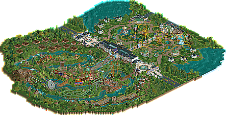
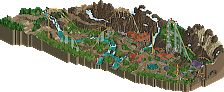
Park / Kingdom of the Moon and Stars
-
 23-February 20
- Views 4,062
- Downloads 509
- Fans 2
- Comments 25
-

-
 71.00%(required: 70%) Gold
saxman1089 80% Camcorder22 75% Jaguar 75% posix 75% RWE 75% WhosLeon 75% bigshootergill 70% CoasterCreator9 70% G Force 70% pierrot 65% csw 60% Scoop 60% 71.00% -
Description
"The World's Most Extraordinary Vacation Experience"
Welcome to luxury vacationing done right. Welcome to the Kingdom of the Moon and Stars, an immersive experience combining thrills and theatre. Not on stage, but all around you. Boasting high-end amenities, comfort-filled accommodations, and the best service, there's nothing quite like a vacation at the Kingdom of the Moon and Stars. -
2 fans Fans of this park
-
Full-Size Map
-
Download Park
509
-
Objects
443
-
Tags
Similar Parks
-
Ohio River Amusement Park
-
Dolphin Bay Resort
-
Pacific Ocean Park Vespucci Beach
-
Patagon
-
Calypso Theme Park LA
-
Porto Encanto
Great park Jene. It's really unique and atmospheric, and the rides are mad fast lol. The area I liked most is the open gardens section with the spinning coaster and ferris wheels:
Beautiful!
Hey everyone - I've reuploaded a fixed version from Jene regarding some bugged launch speeds. Recommend redownloading if you've already checked the park out!
@CC9: Thnx for helping me out and giving me the opportunity to show this park the way it was intended.
Hope you guys enjoy this park and I'm looking forward to reading your feedback.
I'm loving the overview. That is some vibey forms and colors to complement a cool park name. Will check out tonight!
Thoroughly enjoyed this Jene, felt very original and stylistic. I'll comment more tomorrow when I have time!
I think this turned out amazingly. Thanks for sharing it with us.
I enjoyed this quite a lot. There aren't many tracked rides but I really liked both coasters for their multiple launches and lifts. I don't know about the others here but for me the rapids was my favorite part and was a great way to slowly take in the scenery at a slower pace which is a good thing considering the low number of rides. Good work and I'll check out some of your other parks.
This is absolutely fantastic. Unique theme, and great execution. I like the star side better - it's just so cleanly done and more appealing to me.
I love the signage at the entrance - perfectly created.
This is a really lovely release Jene, please be proud of it.
I think your aesthetic choices look very fresh and clean. I would make this an example of the default palette working really well: all the greens are beautifully saturated and intense combined with the predominant grass texture, and I love how you set them against bright yellow to white tones. This produces a very healthy looking contrast.
You also have really good macro, for example the main alley combined with two mirrored and creatively themed ferris wheels. Little ideas like that are hard to find, but work wonders here.
I also still like your non-conformist ride choices. The launched or smaller footprint coasters are unexpected and thus interesting, and you design them well. Gives a bit of a Phantasialand feel.
I'm also impressed by how effortlessly you incorporate diagonals. The path layout is actually quite complex when viewed on its own, as it's quite windy and curvy. Together with the peeps on it very much adds to a vivid atmosphere.
Well done.
I'm excited to see a new project by you. I think you're clearly on to something with your RCT, and I wouldn't want to suggest anything for you to do. I'm sure you have enough inspiration.
edit: I've just triggered the accolade voting on this. Good luck!
Congratulations
I really don't know what to say other than that this park is awesome. I completely agree with what posix said, but I'd like to add some more of the macro that I saw:
- Multiple small huts on the stars side of the map, making it look like stars in a green sky.
- The crescent shapes in the moon side, made by the rapids cutting through the landscape.
I'm not sure if either of these were intentional, but I thought they just added to the whole experience.
Well Jene you are becoming a great park maker. I really like the theme of this the sun side is really nice the river ride is my fave. I think you might have put a little more on the other side to me it looks sparse. But its still a great park well done..
Thank you all for taking the time to look into this park and for all the nice comments. Here and on Discort
@Saxman1089 Thank you for noticing. This is the first park in which I planned all the macro at the start. I wanted to put a lot of symbolism in this, so the Moon-side is indeed planned as a crescent moon and the Star-side is based on old starmaps. The white villa's originally where thought of to symbolise the eight planet's surrounding our own star; the sun. But I also like your idea of them representing stars in a vastness of green
This park is really cool but also super weird (in a positive way). I really like it. I really like the architecture, it is so unique and looks really good. The atmosphere of the park is great too. The only weak part of this park I feel are the coaster layouts. Moondance has a couple of really tight helices which are taken at pretty high speeds which look kinda deadly/dangerous. Stargazer has a visually pleasing layout (my favourite part is the diagonal launched lifthill) but the trains crawl trough the layout which really kills the flow and the many launches it required just looks a bit silly to me. I feel like if you tweaked this layout a bit more it could have been great. The area around it looks great though, especially the two ferris wheels and the station building look very cool. The main building in the middle of the map also looks stellar.
I feel like this review is a bit of a ramble but overall I think this is a very nice park with an interesting unique vibe to it. The quality is a bit inconsistent throughout but for the most part I think this is a good park. Hope to see more from you in the future.
I agree with Recurious about the layouts.. kinda detracted from the rest of the park for me. Stargazer was cool though. Loved it's flow, but Moondance was sorta just spaghetti to me. Sorry if that's a harsh opinion.
Your style of gardens and structures and the macro layout of the park were definitely the highlights. The whole moon side of the map was really cool. The station for Moondance and the Maze Runner area was well done. The plaza in front of the Rapids queue was super atmospheric too.
Overall I really enjoyed this. Look forward to whats next.
Thanks for the feedback guys. I´m glad you like the architecture and macro. Those are also the parts I'm most proud of in this park. Coaster layouts are definitely one of my weaknesses, so I´m going to focus on that for my next projects. Already got some great pointers on my screenshot of the RnR/Iron man coaster for Disney Studio's and I'm going to have a good look at some high scoring Designs.
I'm really happy KotMaS got Gold! After a strong start I hit a 'writers block' building this, and I kind of lost interest in it. I started working on Disney Studio's and only intermittently worked a little on this. In the end I liked it too much to not get it finished. Ended up stil working months on it to get it finished, but I'm happy I did.
@Jene, mamarillas has kindly done a logo for your park, and it's now added. Congrats on the Gold again.
@mamarillas Thank you for the logo. It's perfect!
while great in theming and scope i kinda feel the coaster lack some flow to be truly great.