Park / Phototrophian
-
 14-August 20
- Views 5,323
- Downloads 662
- Fans 5
- Comments 26
-

-
 78.50%(required: 65%) Design
RWE 90% Scoop 90% CedarPoint6 80% Dr_Dude 80% G Force 80% posix 80% chorkiel 75% CoasterCreator9 75% Cocoa 75% csw 75% geewhzz 75% Liampie 70% 78.50% -
5 fans Fans of this park
-
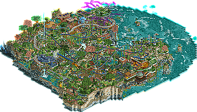
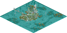
Full-Size Map
-
Download Park
662
-
Objects
448
-
Tags
Can't help but think this should be above 80% after seeing those screens. I do agree however with the "overload" concern.
Fullsize aerial added.
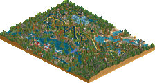
>architecture is the weakest part of the map
I don't think you're being fair by not giving it context, but again, find me a 60s submission with consistently better archy.
>futuristic and modernist vibes
I mean there's only a giant metal building designed to look like a beehive and various curved terraces, not to mention the industrial look of the older buildings
>random golden roof
Brass compliments green and brighter shades of blue like turquoise. You're making one of the tamest colors in the game, and one that you love in other submissions sound jarring.
>jagged roof
Yeah, it's kinda like sawtooth roofs exist in real life
> random grass in ten colors
Notice how it's in a gradient?
>nothing here rhymes in screen three
Again, you're not giving it context by cropping out the waterfall, but how doesn't it rhyme? Every color compliments one-another except for the red that was deliberately put there to draw attention to that earth-sheltered house
>I sound very negative
Yes, you do, because you'd rather look at the ten million generic, conservative lego-land looking parks that require all of five minutes to look at and that haven't changed since 2011.
I don't know why you sound so bitter, and I don't think it's deserved that you call my tastes traditional. I appreciate parks that are different very much and I try to contribute such parks from time to time. I don't appreciate parks just because they are different though, it has to be backed up by quality. In this case there's a ton of quality, hence why I voted 70%...
I'm not criticizing the colour palette as a whole, just the way you used those colours in ways that seem a bit random to me, while you also could've used those colours to make the geometry of the park more clear.
I don't care whether things exist in real life (strange argument, coming from you), I think it doesn't look that good here.
I didn't notice the gradient. Probably because there's differently coloured stuff everywhere, that I did not recognize that in this instance there were a few patches of grass that were arranged in a certain order.
No cropping of the screenshot would be fair, since due to the density any cropping would cut shit in two and leave stuff out.
Et cetera.
This map successfully executes every element I strive for when building with CS: curvy buildings, glass in all the right places, pinpoint quarter-tile landscaping complete with colorable rock tiles, multi-story landscapes, and of course, generous trackitecture. And yet, while my unfinished NEDC entry contains all of this (I also went for a quasi-futuristic theme), no part of it comes close to the level of precision at which you were able to execute this. Even with the random objects that generally don't fit with "mainstream" CS pieces, nothing seems out of place here.
I will say that this map does have one weakness that may have caused its rating to suffer: there is almost no negative space. The crunch factor is positively mind-blowing, but it's essentially the same level of crunch throughout the map and thus no single bite can be truly emphasized. The various shapes can get lost in the dense thickets of phototrophic foliage, rendering some viewers' perception of height and distance somewhat warped. That's the best explanation I can think of for why something so intricate would have scored below 80.
Your work in the surreal and the psychedelic realms is unmatched, and I know you're going to break that threshold very soon. Much like this map, your name will be green before you know it. Do not let this release falling short of what was anticipated dissuade you from continuing to build brilliant pieces like this in a style that only you can bring to life!
I'm getting tired of hearing this shit, especially when it comes from people who have no trouble to score 80+ on their work.
I think this deserved 80% or more, I find 70% really too low. Just my 2 cents.
Here's a review of the park:
https://youtu.be/zgzkWv-pXbQ
I really enjoyed this. Love the aesthetic and the landscape is just beautiful. Yes it's a little mess/chaotic, but I think in this case that adds to the overall feel.
Thanks for the review, CP6... It's certainly a very in-depth look at the park with all the features and scenery. I'm glad that you liked the aesthetic, especially all the small, mundane stuff like the truss bridges or flower lamps. I definitely enjoyed the video; really appreciate what these reviews are doing for the community.
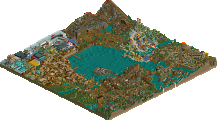
As for the cave area around the elevator, those crystal things are giant mushrooms, which is admittedly a bit more fantasy than the rest of the setting.