Park / GeekFest 2022
-
 07-February 22
- Views 2,899
- Downloads 325
- Fans 1
- Comments 13
-
-
 73.00%(required: 70%) Gold
RWE 85% Terry Inferno 80% CoasterCreator9 75% G Force 75% In:Cities 75% posix 75% WhosLeon 75% bigshootergill 70% Scoop 70% Xtreme97 70% Liampie 65% ottersalad 65% 73.00% -
Description
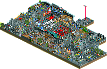
Welcome to the first edition of the Geekfest !
Geekfest 2022 is a festival dedicated to pop and geek culture, taking place at the Jean Vilar exhibition center in Rennes, a building designed by the famous brutalist architect Le Pigeonnier in 1953. For 1 month, come and discover your heroes during this exceptional event. Attractions, video game and pokemon tournaments, screenings with live orchestra, concerts and other surprises await you!
An exclusive event by DreamLand company -
1 fan Fans of this park
-
Full-Size Map
-
Download Park
325
-
Objects
1
-
Tags
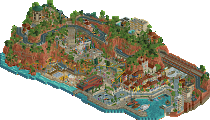
![park_2455 [H2H6] SF - Hurricanes - Rowling Versus Tolkien](https://www.nedesigns.com/uploads/parks/2455/aerialt2205.png)
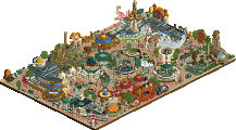
![park_3338 [H2H7 R2] World's Fair](https://www.nedesigns.com/uploads/parks/3338/aerialt3037.png)
This is so geeky. Considering your last park, this is the perfect concept for you. Good job finding a concept that lets you do all this good stuff in a context that makes sense! No lack of ideas here, again. Love it.
Considering you had mentioned Dream Land being your first and only release, I had to do a double take seeing a second release from you. Not that I minded of course; you're one of the most exciting new parkmakers so far and Dream Land had too much potential to be the beginning and end of your time at NE. Your adeptness with strong and recognizable theming makes a con the perfect venue (pun quite possibly intended) for your style, and once again you deliver with this release.
Highlight time!
-I love the logo. Is that original?
-The outside of the convention center has a really slick theme with the multicolored glass and the trees between the glass and the walls. I'm also realizing big curvy entrances are a Babar staple.
-The Harry Potter section is dynamite. I absolutely love the Diagon Alley facade. The dark ride is great too, but I almost wish it had some walls separating the queue from the ride itself instead of a Q-railing. This way Hogwarts would feel separate from the rest of the con and have more of a surprise factor once you board the dark ride. You could have even had a wall with a cutaway effect showing some of the inside of the ride.
-I love the forced perspective diorama in the LotR section with the eagles circling overhead. The giga coaster track and supports above it are an amazing touch. The big highlights of this section to me are the orchestra with the huge Minas Tirith setpiece and the Smaug head tunnel on the rapids ride.
-The Gotham set and facade in the Batman section are amazing. Almost reminds me of Disney's American Waterfront in its execution.
-Finding the Pokemon TGC tournament, rotating it for a better look, and then finding the Smash tournament on the huge screen right next to it was a real whoa moment. All in all the themes and execution in the video game section were remarkable.
-Love the sculpture work in the Star Wars section.
-The back of house was a nice surprise with the trucks, crates, and graffiti everywhere. I also like how some of the rides are outside the convention hall.
Wonderful release, definitely Gold-worthy.
Wow Babar, you came out of nowhere and just dropped two amazing parks in a few months time. Amazing stuff. Your parks are just so much fun to watch. Filled to the brim with all these great and recognizable references and original archy. I'm sure I'll revisit this park many times.
This is so fun, really can feel an improvement here compared to your last park, just a lot more refined and professional. Wish the map was bigger, or at least had more context! Sorta a shame it gets cutoff like that. I think a more "complete" version would have really made this extra special.
Excited to see more from you! You definitely have a skill when it comes to designing creative and realistic feeling theme park areas and attractions.
Thanks a lot for your feedback !
@Gustav Goblin
-The logo is an original creation !
-I really like to create entrances, I love architecture and I spend a lot of time trying new things.
-For the dark ride, I hesitated a lot to separate it with a wall, I finally decided to keep it half open to allow a better reading of the attraction but I regret..
@G Force
-My desire was to work on a small space, at the beginning I had some ideas that I had not been able to realize on Dreamland, I designed this park as a way to train and discover new things. I also chose the "design" accolade because I don't think this park deserves more.
Awesome park, you are such an original builder! Thanks also, for exporting it in the .SV6 format, for those (like me) who cannot open the new .park format
@Babar I'll have to change it to "Spotlight" because "Design" is for something else: a single main ride (usually a coaster), and some additional surroundings. Here's a list of good stereotypical Designs:
https://www.nedesign.../brachiosaurus/
https://www.nedesign...8/wake-skimmer/
https://www.nedesign...ark/1536/kumba/
https://www.nedesign...rk/2781/ruishi/
https://www.nedesign...ark/749/fenrir/
This park was beautiful and I agree a certain step forward for how you articulate things, which here looked even more refined than it already was in DreamLand.
I also love the logo a lot. Do you work in graphic design?
Would love to see another entrance structure from you in the future
@posix
Thank you, I hesitated a lot for the accolade..
I'm working on a new park, I'll try to share screenshots this time..
Yes, I went back to editorial design studies this year!
Another cool release! You should have started with a lower bar, now expectations will be high for the next stuff you build
It's pretty crazy how you've managed to create an indoor park with so much detail and variety, in terms of style I see a lot of Kumba influence in the best kind of way: lovely sculptures, playfulness, right colors, and tons of little ideas. It's crazy to see a new player already so skilled in small details
Definitely pretty cool. Great to see another park from you.
Maybe I'll need a few more viewings but this felt very cramped to me. While I understand it is indoors, I just wish it was less busy in terms of themes and stuff hanging from non existing ceilings. Perhaps one or two less themed areas would've helped. One bit I didn't understand is why is the Smaug ride station outside?
I think making indoor parks is very difficult, hell, Diagetic Undergound was a rough, but you did well here despite my thoughts on it being cramped. I'll always enjoy Star Wars references and I liked the tiny little snowspeeder. The Harry Potter stuff was excellent.. great to see that theme explored in RCT again. And the super smash bros on a big screen was a great touch. Really creative.
Really enjoy your take on these themes and making these sort of comicon-meets-themeparks creations. Looking forward to what you have next in store for us.
Super cool map, great to see a sequel to your last one. The convention setting is nice to use as a backdrop of sorts for some of your ride/attraction ideas and sculptural building style. The entrance has a great motif with the coloured glass in front of the foliage. I find the architecture to be a little overly grey at points, but the curvy structures out front are a cool throwback to Dreamland. On the theming front, there are a lot of moments that catch the eye. Love the Star Wars area which I think had some of the best "little things" with the sculptures like the giant R2-D2 shop, the lightsabers as pillars, the Tatooine enclave. Overall a good map with a lot of charming moments, feels like a reprise of Dreamland which is no bad thing.
Just had a deeper look. I typically don't like stuff that's too heavy on 'references', like modern Hollywood comedies for example where 'humor' is recognizing a reference, but this park is all about references, shamelessly. And when the park is entirely references, it's much easier to appreciate it. The viewing becomes a game of trying to recognize as much stuff as I can. And since there's so much to see, it makes for a super fun viewing.
Since the park is just a collage or references, the best way to review it is probably by listing my favourite bits:
- The orchestra playing - brilliant. Best Idea nomination for 2022 awards.
- Wide-eyed Yoda
- Flashing lights and billboards in gaming section
- Pokemon cards! Brilliantly done.
- Happy meal stall
- Building exterior with the plants and glass walls, very original.
Some criticism:
- It wasn't always clear what was inside and what was outside. I think the park would've been stronger if the indoor part was the chaotic collage of ideas that you were going for, but contained within clearly defined building walls with a contrasting exterior.
- Stalls, shops...
- Harry Potter dark ride scene was just a boring open house experience, would be better if there was some narrative or at least an arc to the dark ride. With build-up and a climax.
In your next work I'd like to see you do something else, with more considerationf or composition. For a negative example... You have the argonath flanked by barad-dur and meduseld, serving as the entrance to an indoor minas tirith set. It doesn't make sense, it's a game of cramming as much things in every space as you can rather than asking yourself what makes sense and what each space needs. But again, this is totally fine considering the nature of the park.
Good job man.
well isn't this my treat, I just finally viewed your last park a couple hours ago, now I get to see this one.
awesome work, and a lot more believable than dreamland. You know I love a good indoor park, and there is a lot of fun density and design here. Heaps of theatres, little areas for interviews and meetings, etc. Archy is great all round, especially the building itself---in fact, I'd love to have seen more of the surroundings to really sell the whole thing (but I also get that building that is super boring so whatev). so many fun little details and activities that I would love to go to in real life, so well done. just a great, fun release