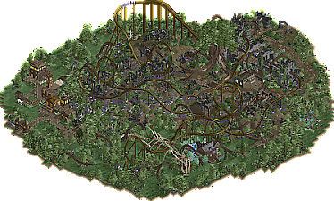
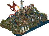
Park / The Will-O-The-Wisp
-
 22-August 23
- Views 1,490
- Downloads 129
- Fans 0
- Comments 11
-
 69.00%(required: 65%) Design
Babar Tapie 75% Jaguar 75% SSSammy 75% CoasterCreator9 70% Scoop 70% wheres_walto 70% Xtreme97 70% bigshootergill 65% ottersalad 65% posix 65% RWE 65% Terry Inferno 65% 69.00% -
Description
Listen closely and take heed,
To the warning that we plead,
Do not follow the will-o'-the-wisp's light,
Into the swamp, where danger takes flight,
For it is a trickster, a deceptive sprite,
Leading you through twisting turns, and dazzling height
---
This is a map Mulpje and I build for a DKMP contest. -
No fans of this park
-
Full-Size Map
-
Download Park
129
-
Objects
84
-
Tags
Similar Parks
-
Serenity Hills Fun World
-
2 8 1 4 - Birth of a New Day
-
Apothicon Servant
-
Journey to Rivendell
-
4 Seasons Model Railroad
-
Taste of Tuscany
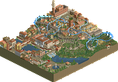
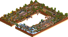
This coaster is wild! This all brown in this pallet is really great, really sets the vibes. The first dropping swoop is really fun and I love how it interacts with the huge gorgeous tree and sick ass station. The skeleton and glowing building is fantastic, that's a great statue. The rock work and foliage is really well developed through out the park. The fishing village is super cute and is my favorite part of the park, the blinking eyes are so GOOD! Really well done.
I really enjoyed this but in a different way than normal. It just had a real nice overall atmosphere that sucks you in rather than just looking and thinking such and such thing looks nice. The boat chase was one of my personal favorite parts to take in. Nice work and maybe you both can explain later who made what.
The upper area was done by Hobeon (the ruins, coaster, station building etc) and the lower area was done by myself (the swamp, the little village and the boat ride)
this is a cool map, great job to the builders. that skeleton is so cool, and the dock area is really characterful
This was quite interesting. I realise this was initially built for a DKMP event, but it's nice how well it fits the bill of NE's "Design" understanding. I think it's bee a certain while since we've seen what would be a fantasy Design.
I enjoyed the coaster and the naturalistic theme. Mulpje's trees are crazy and make sense here. My favourite bit was the station. The ruins theming looks beautiful here and is tastefully designed.
I wasn't the biggest fan of the palette. It just makes everything look quite drab and dark. I know some of that was intentional, but I'm not sure if it was successful. I would think that with the larger default palette available now, a lot can be done even without the use of a strong palette like that?
+ The station was pretty cool
+ The layout was pretty cool
+ I liked the little docklands villagy stuff below
+/- I'm not normally a fan of those big trees with track as roots, but I liked how the roots were used here as elements for the coaster to interact with
+/- I'm not sure about the rockwork, but that could also because maybe some objects were missing for me.
- I hate how the coaster is this weird poop-brown. A more striking colour like an ominous purple or red or something would have been way more effective imo. The palette is something I'm not sure about in general.
The dark fantasy atmosphere is great and the ruins are really well done, some great use of DKSO. The coaster's layout is pretty good and the track merges were pretty smoothly done considering the limitations, also some nice support work. And that skeleton is such a nice eye-catcher, some cool trackitecture there.
I think this map was great... there are some phenomenally creative hacks in here. You have glowing eyes in the cave and somehow managed to make them blink using ride cars... that's amazing.
Also, the ruins are beautiful, as is the landscaping. If there is anything I am not a fan of though, it's the general muddy, brown-ness of the map. However, this is ameliorated through occasional bursts of color with the swamp house and the shipwreck.
The ride itself was nice, I love the interactions it has with the ruins and tree roots. Overall, this is a very good design submission in a very distinct style.
Great ruins, great landscaping. love all the vines. Cool skeleton. I think the overall vibe and aesthetic is great... minus as Jag said the muddy-ness. Also agree with Faas that more color/brightness with the main coaster could've helped a tad as well.
But great ride, worthy of a design for me.
This work on the roots and the tree is incredible for me, I also really like the colors (except for the water, which doesn't contrast enough) and the overview. Overall, it's very pleasant to look at, although the composition and ruins lack a bit of variation. This work deserved an accolade, congrats to you!
Two builders specializing in immersive fantasy worlds unite and create one big magical coaster! Colorable Egyptian walls blend seamlessly with the equally colorable Mayan ruins, and the little swamp town has a lovely form all around - that diagonal window is a brilliant trick that I may just take with me into my next NCSO park. The coaster itself is fun and twisty, containing bold elements that one might not always see on a B&M floorless but are still within the realm of plausibility whether it be in a Six Flags park or a swamp. My favorite thing about it is that it continues to descend with the landscape, allowing larger elements like the final immelmann to take place near the end of the ride, which often makes for a more exciting ride experience than just having all of the "good stuff" near the beginning. The terrain work feels natural with no jarring aspects--I was not expecting a giant black cave, but why not?--and the flower object served as a solid grass substitute within the confines of DKSO. Along with the black ruins, the massive tree roots and the giant skeleton really sold the story of the environment and brought it all to a high level.
The biggest aspect holding this map back for me was the decision to paint the trees such a similar color to the water. Even in a swamp with green water, the setting is more effective when there is some contrast between the trees and the water. Some of the green swatches are purposely made very similar within this particular palette, but even here, the contrast could have been greatly improved simply by painting the trees a darker color (the forest green equivalent color would have been my first pick here). As it is now, everything blends together to the point where the shapes you've created with the trees and flower objects get lost in one giant sea of green (and no yellow submarine), giving it a much flatter look when zoomed out than a magical swamp should have. I see shades of Amras in the technical approach to foliage, and on that map, there are no contrast issues whatsoever, so this is only something to look out for on the rare occasion that water and foliage end up being a very similar color.
Always a pleasure to see work from both of you, whether it's a Design like this, a full map, or really anything you come up with.