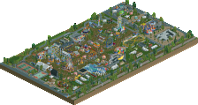
Park / JJ's Neverland
-
 21-April 24
- Views 423
- Downloads 27
- Fans 1
- Comments 6
-
-
Description
All children, except one, grow up.
-
1 fan Fans of this park
-
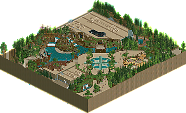
Full-Size Map
-
Download Park
27
-
Objects
1
-
Tags
Similar Parks
-
Porto Encanto
-
Pinocchio: Ride to Maturity
-
Cook County Fair
-
Knots Bessen Boerderij
-
Walley's World
-
Otter's Magic Kingdom
Great little entry you got here. Very strong on composition, the Peter Pan ride is placed perfectly at the other side of the water and that incredible path sign/logo brings it all nice together.
I do think the PP building should've been a lot bigger, now it kinda fades away in the environment. Those whole zone therefore kinda lacks a central focus, a weenie. It's also kinda an unfortunate choice to paint the roofs the same beige color as the path. Those blend in way too much.
Overall very promising and fun entry. I'm curious to see more work from you because this is some good rct.
This is really great! Love your style quite a bit. I do think that making the roofs the same color as the paths is the biggest thing holding this back. Typically flat roofs are light colored within theme parks (using google maps satellite as a ref). A lot of builders on NE tend to paint them more grey/black to provide better contrast as well. So a warm beige/tan color for the roof sadly sticks out in a wrong way - especially when it matches the path perfectly.
A good test that I always try with my parks is to zoom out and squint my eyes. If I can still clearly tell the difference between paths, roof, landscaping, etc from a macro perspective, then I feel comfortable with it. As of now, it the path and roof look the same when looking from afar.
All that said - I know this is a completed release and you're likely not looking for WIP feedback, so I apologize! Just something to keep in mind for your future releases, as I think your style is really great. Fantastic details on the ride itself, and the compass rose is excellent. Foliage overall is very nice throughout.
Thanks for submitting! Really looking forward to seeing more from you.
Josh
Nice little submission, ultimately not a whole ton to look at, but everything you included was quality. I think the scale is a little small for my tastes but ultimately you made it work pretty well, kudos for that. Hopefully more to come from you!
_jj Offline
Thanks dude! Agree with you completely. I did originally have the roofs grey, but then I kept checking google map views of newer rides and they seemed to be more beige, albeit darker than I have. Also agree on the weenie, It was supposed to be the treehouse on top of the rock work, but I don't think it works as well as it could.
Thanks for taking the time to feed back!
Cheers dude! Agree totally on the contrast, next time I'll be sure to keep it in mind, great point about zooming out too. Thanks for tkaing the time to write that out.
Thanks man! More to come when I have the time for sure.
Really nice outdoor section with the coaster, weaves through the terrain and looks like it'd be a lot of fun to ride with the views and near-misses, Nice path work too with the logo. Overall a nice first submission on NE with a well made small map.
Cool little slice of a park. I think theres some great theming and ideas here. Biggest issue for me is your scaling - everything is 2-3 units too short! Especially the part where the coaster goes back into the showbuilding.. doesn't appear to have enough clearance?
Anywho, I think the immersion is there. Perhaps more splashes of color could've helped, but a small palette can be quite powerful. Here, I get a dense jungle cove vibe.
I look forward to seeing your next project!