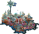
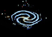
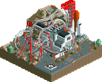
Park / [NEDC6] Hydrocelestis - The Ocean of the Stars
-
 06-May 25
- Views 1,220
- Downloads 214
- Fans 4
- Comments 28
![Park_6119 [NEDC6] Hydrocelestis - The Ocean of the Stars](https://www.nedesigns.com/uploads/parks/6119/aerialm6365.png)
-
![Park_6119_[NEDC6] Hydrocelestis - The Ocean of the Stars](https://www.nedesigns.com/uploads/parks/6119/logot.png)
-
 81.00%(required: 65%) Design
J K 95% CoasterCreator9 85% SSSammy 85% Terry Inferno 85% Turtle 85% deanosrs 80% posix 80% RobDedede 80% RWE 80% pants 75% Recurious 75% chorkiel 70% 81.00% -
4 fans Fans of this park
-
Full-Size Map
-
Download Park
214
-
Objects
1
-
Tags
Similar Parks
-
Void Extraction Research Base
-
The Hammer of God
-
Via Lactea
-
[H2H6] R3 - Hurricanes - Avatar
![park_2401 [H2H6] R3 - Hurricanes - Avatar](https://www.nedesigns.com/uploads/parks/2401/aerialt2145.png)
-
Lift-Off
-
[MM2014 R2] SKM-011K
![park_3196 [MM2014 R2] SKM-011K](https://www.nedesigns.com/uploads/parks/3196/aerialt2801.png)
Jaguar earns a well deserved Parkmaker spot by blending two common themes, space and water, to give us something we've never seen before - a wonderful, energetic intergalactic ocean.
earns NE Parkmaker
The pull of NE can be strong, leading many minds to bend over the years: how to conform to stylistic expectation, how to build 'successfully'. These are thoughts most of us know too well. Perhaps the question of finding oneself amidst all the execution sometimes comes too late.
But I imagine for Jaguar, it came to the fore sooner. Initially Jaguarkid on NE sixteen years ago, he learned non-conformity was a heavy cross he bore more than he probably wanted. His early by-the-book parks felt uninspired and listless, and you could soon sense he was at home in non-parks. He began hearing his own rhythm, and we were slow to take notice.
Hiatuses, absence, years of silence. Then suddenly Via
Lecta. A Gold with a park as quintessentially
non-park as can be. Still somewhat rare now as it was in 2016. It remains a seminal release, and made us start
seeing Jag in a different light. Could you expect him to repeat a feat like this?
Via
Lecta. A Gold with a park as quintessentially
non-park as can be. Still somewhat rare now as it was in 2016. It remains a seminal release, and made us start
seeing Jag in a different light. Could you expect him to repeat a feat like this?
Numerous impressive micros followed, culminating in a bigger map with Phototrophian. Jag had secretly
moved into his own world of fantastical maximalism, a place known to no one but him. Powerful, exuberant, and
yet just too inaccessible for NE. An enormous effort, missing 80% by a mere 1.5%.
I wasn't sure if Jag would bounce back, but today, five years later, I'm thrilled to announce he has.
Phototrophian. Jag had secretly
moved into his own world of fantastical maximalism, a place known to no one but him. Powerful, exuberant, and
yet just too inaccessible for NE. An enormous effort, missing 80% by a mere 1.5%.
I wasn't sure if Jag would bounce back, but today, five years later, I'm thrilled to announce he has.
Placing 4th in the NEDC6, with a fantastic 81.00% score, Jag has done it and broken through, and we have a new NE Parkmaker...!
Dear Jag, welcome to the crew. Congrats on this achievement. Thanks for your journey, for bringing us along, for always sticking to your guns against all odds, showing true originality is hard-earned, as few can.
Map looks crazy, but review will have to come later! Just want to comment on the green name thing... Man, who would've thought that this impossible kid who seriously struggled to win even any accolade at all, would at some point end up in this position? Your journey has been amazing to watch. Congratulations.
Some pure Jaguar density right here, and I’m here for it. Imagining outer space like a giant ocean is a really cool idea, and I am surprised nobody has ever thought of it. The massive tentacles reaching out from the void is such a cool moment, as are all the various alien animals swimming/floating around, again utilizing the new custom staff member feature. The coaster’s station as a giant floating space station was a great choice and added a nice color contrast with the majority of the map. Your style is obviously very dense and messy, and always has been, but I think with this map you managed to achieve a degree of cohesion and clarity despite the clutter that works well. Maybe it is due to the theme and the clutter therefore making more sense, but I also think much of it is owed to improved technical precision and design choices. Nice work!
Absolutely loved this, my real-time notes are pretty short and straightforward: "Ohhhhhhh ok ok ok this is something special. This actually feels like a cohesive theme and it's beautiful".
This scores VERY high on my "how interesting is the idea" scale, and the execution is pretty up there too. You could potentially propose some stylistic changes to dial back the messiness a tad, but that's the only thing, and who's to say that it wouldn't lose some of its wackiness if you did. The color palette is right there on the edge of too much, but the overall vibe is really successful.
I had this closer to 90 than 80 for my 85, there's just so much cool stuff everywhere. Personal highlights are the dive loop kraken, all the cool animals flying around, the air bubble rings, and the map edge gradient is really cool. Great map, unlucky not to be in the top 3 in my opinion. Congrats on parkmaker!
I'm really glad this ranked as high as it did; makes me happy to see really creative and unconventional approaches to rct getting rewarded. There is a style of construction to this and your work in general that is just so unique and fresh. It feels like a collage where the viewer is bombarded with all these ideas that add up to so much more. The concept, the colors, and the set pieces you've brought together like the space squid and the space port are really impressive. It all feels like something no one else could make because the aesthetic is inherently you. If I had one nitpick, I think that some of your land textures are pretty harsh in a way that looses readability. If you could take all these incredible ideas and balance them a bit more with places for the eye to rest, you'd be near unstoppable. Maybe that would detract from the collage styling of it all, but just a thought overall. A huge congrats on the top 4 placement, design, and parkmaker to boot. Always excited to see more work from you.
Congrats on the green name! This is really a great entry! Lots detail and scenes everywhere you look. The colors and music are great and there are so many unique structures that I've never seen anything like before. I think that does make some of it a bit hard to read and some areas are just so detailed I don't know exactly what I am looking at. But it does look nice. I wish the coaster also had a bit more focus on it, but I cannot deny the interactions with everything else is done extremely well. The starry background is striking and is probably the biggest thing that separates your entry from the others. Overall, fantastic work! I'd give it an 80.
Wow! This park is really really amazing! The macro of everything on this map and idea of this park are absolutely top notch. When you open this park the atmosphere and zoomed out view of the park is stunning. Everything truly feels out of this world in an extremely strange but awesome way. The pallette suits this park very well and the colour choices here make everything really pop.
Foliage and Landscaping: I really enjoyed the foliage throughout this entry. The object choices fit the vibe of everything really well. I've always found it hard to figure out foliage in settings like these so it was impressive to me how well the foliage fit together here. The landscaping was kind of a mixed bag for me. The forms were really great but the I think you used a few too many different rock objects. Everything ended up feeling really well constructed but over detailed for my taste.
Architecture: I really liked a lot of what was going on with the different structured. the forms were so unfamiliar but really well made overall. The colour choices in the different buildings did a really good job of making the important bits pop out. I really liked this little corner building
I do think that sometimes things were a bit too packed together so it was hard for them to breath. I would've liked a small area or two where there wasn't so much going on.
Everything Else: There were so many fun moments in this entry. The sea creatures moving around everywhere really added to the maps vibe. I also really liked how much movement you included in this entry. This squid monster thing was amazing
The starry background was also done extremely well and really adds to everything. I'm really happy that this park finished so highly in the contest and was rated over 80%. It definitely deserves it.
Overall: I'm very happy I checked this park out, it was really great to view. I would rate it 80%. Congratulations again!
Layers upon layers upon layers of detail and personality and story, this entry walks a dangerous line between density and accessibility, and I’m not sure if it is completely successful. It is immediately apparent upon the first look at this entry that Jaguar wanted to achieve a maximalist micro feel. Each angle is so packed with rich attention that it can become overwhelming.
This is not to diminish the quality of the piece, however. There are a wealth of sculptures which imply a futuristic setting which blend the design language of spaceships and submarines. These sculptures are imaginative and well executed, but I wouldn’t describe them as “clean”. I wouldn’t describe anything on this map as “clean”. It is hard to deny them the fact that they are extremely fun to admire, and there is a certain fun in parsing what is going on with each building, ship, and marine/space creature.
The dominant viewing angle appears to be “inside L”, where the cobra roll appears under the predrop curve. In an interesting twist, the cobra roll features a footpath which only crosses one of the tracks, then weaving between the two halves instead of crossing the next one. The rest of the layout is just as effortlessly integrated, with the diveloop passing through some abyssal maw before leaping into the barrel roll. One of the corkscrews is completely concealed, but the other is conceptually mirrored by the spiral of the racing track.
So much of this entry is packed with gorgeous movement, innovative use of colours and textures, and wonderful stylistic gestures. I think the main problem with this entry is how hard it is to actually parse what is going on. Readability is not something you need to throw to the wayside when you choose to take this highly dense approach, and truth be told, it becomes the most vital element as the density becomes more and more unforgiving.
That being said, I still think this is an outstanding display, and with some editing during the process, this could have won the whole darn thing. Jaguar, I hope this constitutes the start of a new era for you. I am very excited to improve the aspects of your game I have mentioned, as you are already operating on such a high level on so many other aspects. Deeply looking forward to your next project.
SCORE: 85%, though its hard to tell at a glance
Watch my initial reaction here!
Absolutely surreal and otherworldly, love the atmosphere, especially with that music. The ethereal look of the coaster made of light and the swirling effects around it, the rockwork and coral against the stars and the sci-fi architecture, all amazing.
It's an impressive show of skill to make something this chaotic look this pleasant and even peaceful, it feels H2H-like with how immersive it is (And it's ton of fun to explore), a well deserved 80%+ score and parkmaker title.
Hydrocelestis - The Ocean of the Stars is an outstanding and truly unique submission, blending outer space and underwater themes in a creative way. The architecture and landscaping are impressive, setting the tone beautifully, and the music ties it all together for a cohesive experience. As a maximalist, I love the intricate layering that reveals something new with every look, though at times, the abundance of detail can make the map a bit hard to read. The coaster’s color choice was a smart one, helping it stand out from the rich, complex backdrop. Overall, this is an amazing, immersive map that I really enjoyed exploring. Congratulations on achieving Parkmaker status!
This was really beautiful and very rich in details and colors. I loved the starry sky. Super cool design. Honestly, although the roller coaster was a little hidden, I didn't even care about that, because the overall scenery was spectacular. 90%
This was such a cool idea! One of my favorite concepts in the contest. The park itself was a bit overstimulating to me. There was so much going on and often not in the best way. It made the park hard to read generally. You made some interesting design choices, some worked better than others. The overall shaping of the rockwork with the plants was great, but it didn't really come together with the architecture for me.
Congratulations on making it to parkmaker! My score may not reflect it but I genuinely think you deserve it. You've come such a long way in building and your creativity is top tier. And it makes me happy that you got it by building in your signature style.
Just crazy. Reminded me a lot of Ethan. This is likely my new favourite animated tentacle set piece rendition in the game. The structuring of the rocks, how it blends with architecture, theming, or what is just the fantasy setting itself, is super complex and sometimes inpenetrable. It's certainly impressive however. At times it may become a little too much still, but I do find this to be the most composed entries of yours we've seen. I'm glad this one upgrades that aspect which hurt Phototrophian a bit, and as written above I'm so glad to see you win parkmaker with this. Congrats on finishing this Jag.
Congratulations on the parkmaker status! This park is really impressive, so much to explore, so many layers to unpack.
The atmosphere and setting are really strong and my favorite aspect of the park. The "fake" void with the starry background mixed with all the moving pieces, like bubbles and fish, mixed with the music create a very nice vibe.
Movement in general is done super well, i adore the way the track is done with the moving vehicles underneath! The spiral single rail trackitecture is quite nice and fortify this spiral motif that can be found within the coaster track itself and on the map edges too.
The track is also beautifully integrated, i love the interaction with the reef-like rockwork and the dive loop through the awakened-reef-monster-abomination-that-needs-a-friend is my favorite interation moment of the contest so far!
Of course this park is very busy and hard to read at times - you have heard this a bunch already. I dont mind it too much, but in certain spots i feel like that the black architecture couldve used a different color to blend in less with the rock work. Otherwise i actually quite like the color choices. Lots of nice pops of color with some of the vegetation choices and the coaster color is great too.
Overall this is a beautifully atmospheric map with tons to explore, done in you signature creative style. Amazing work Jag!
This park is so unique in it's style, and it's also a style that is soooo difficult to master. While I do agree on some of the concerns with readability, I also think that the park just has a certain abstract approach that makes it matter a bit less if you find a way to look at it layer by layer.
A comment for the readability issue is, I don't think it was as much of a macro problem for me as it was a color problem with the pathing. I think, had the path had it's own color, it would generally have been easier to distinguish it from what was landscape and buildings - make it easier to 'follow' the guests. I do think it caused some issues for the overall view of the park.
I really enjoyed the way you did the architecture. Making so many different objects look not randomly put together, but more like grand improvised structures is something I find to be immensely difficult, and so: very well done.
I also thoroughly enjoyed watching the rides traversing the landscape/universe/world. Great moments of interaction and I adore the way you decorated the coaster track. Wow.
While this may not be my own type of RCT, I give you huge respect for the creativity that went into it. Art.
Congrats on parkmaker!
I'd like to thank everyone for all the nice comments and reviews; and Posix in particular for the great writeup. It is very encouraging and I'll probably address them individually later. I'm happy to accomplish the goal I wanted for this contest and now with that done, I feel like I can just relax and build.
I do want to say that SSSammy is right about the design combining both spaceships and submarines, but there's also a good amount of biomimicry in this, for example: the hexagonal walls, the station's spaceship has solar 'sails' like a boat, but is also meant to be very fish-like; and the spiral motif and roof of the doom are supposed to evoke shells.
This park is definitely very dense, and quite messy, but I would recommend looking at things closely... this park has a lot of surprises in it and as CC9 mentioned, there are new things with each rotation of the camera; it looks different from every angle.
Overall, thanks for the reviews and I am extremely happy that this has passed the 80% threshold. I'm excited to see the next entries for this contest.
This map is absurd. The abstract feel to all of it is amazing, like you built this in a stream of consciousness. The octopus as others mentioned is probably my favorite part of the entire map. You layered everything here exceptionally well as well - the different textures against the station as well as how it all "sits" together and its overall flow reminds me of 90s albums covers. Excellent map and congrats on PM!