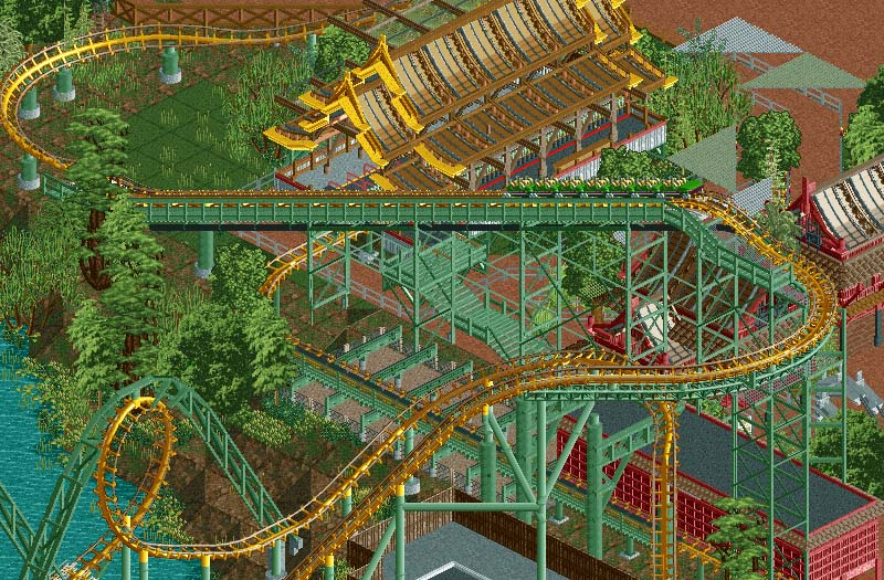
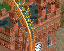
I think the discussion between Liam and you guys is pretty weird. The first thing I thought when I opened the screen was: "it's pretty messy, were should I look." Don't get me wrong, the skill is there and there is cool stuff like the red buildings on the right, but overall, I don't think this screen is very pleasing to the eye, whether it's meant to be like that or not. And that has nothing to do with "keeping Robbie's ego in check". Just take note that Liam is not the only one who doesn't give Robbie his standard 90% vote. It's not that he doesn't deserve it, but some people just have different preferences and taste when it comes to this game.
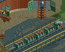
I can't stand those loop supports. Makes the support work look awful. I also wonder whether the lift hill supports look too thin and flimsy.
I'm loving the other supports though, great work with them.
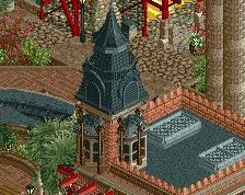
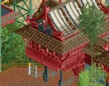
I'm questioning the vibrancy and the general opulence of the station. In 1978, would the station be built that grandly? Would it not be a bit more boxy in the roof and less opulent? And now many decades later, would the station still be so bright?
I feel like it's very likely that the station would be that well maintained simply because it's at a Busch park. Loch Ness Monster's queue for example is very well themed and maintained despite the age of the ride.
As far as station design they generally do a very nice job on stations that are openly visible from the pathway as this one is. You have a valid point about it being a little too nice but I don't mind a little creative license being taken because it really does look great and it would be a shame to tone it down for the sake of realism (holy shit... maybe FK is rubbing off on me). It's also possible that the building wasn't always a coaster station as Busch has a history of converting things into coaster stations that weren't before (Cheetah Hunt for example though that's a much more modern ride).
I agree about the loop supports not being perfect but I don't know if a better solution exists with this game. Maybe it does, but I don't know what it would be off the top of my head.
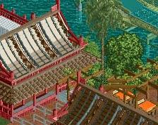
i really like the intricate support structure. but the foliage doesn't really does it for me, i wouldn't say it has the southeast asia feeling. overall you did a good job at recreating thailand though, but it misses scooters
i really like things who rob built. but there are so much things on the screen and i don`t know where i should look. in my opinion it hasn`t got rob status...
overall , nice things but , well , bit messy in my opinion.
Faas, I think this is what I was trying to say. It's technically good work, it's just a bad photograph of good work. It doesn't guide your eyes through the image like a good photograph does. There isn't much of a focus, and it shows too much of the grit behind the area. It's not pretty. It is real, it is good material, it's just not a great screen.
I'm not trying to defend this from all criticism. I don't think it's a good screen. There's a giant blob of light green foliage that's off-putting and another blob of green stairs that's also off-putting. those two things are right in the focal area of the screen. It's gritty and real, but it doesn't look good. Your eyes are drawn to the poorer parts of the screen, and not the beautiful station, the iconic loops, or the coaster train.
I think Louis is on the right track with his point. Not that I think this screen needs to be changed necessarily, but Nessie's station is actually quite boring IRL and feels very 1970s. (I lived in Williamsburg from 1997-2010 and have over 100 visits to the park). It's a big box of concrete, and the only detail is a bit of castle-like blocks on the top. On the inside it's even more lifeless, the only theming IIRC is a plaque detailing the history of the ride. The queue is really the special part, but it's hardly ever open because the lines rarely get that long.
The station is also quite dark on the inside, those openings you see in the attached photo are above eye level so you can't even see inside or out.
But I also don't think Rob's park is purely "what it would have looked like if Busch Gardens built an Asian themed park starting around 1975". I could be wrong, but he seems to have taken a bit of creative liberty in making this park, the result being a prettier, albeit perhaps less "truly realistic", park.
I think this is a great screen, Rob, and you're on track to simultaneously capturing the Busch Gardens feel, and creating a stunningly beautiful RCT park.
I really love the station, I think it's beautiful. I think my favorite part of your work, Rob, is all the textural variety that each screen has. Those thick supports, the red lattice building, and the trackitecture blends really well and offers a lot to look at. Though, in this case, sometimes maybe it's too little...I think Faas hit the nail on the head: the screen just looks messy. There are really good parts and elements as per usual, but overall there's too much criss-crossing in the center of the screen that my eyes get a little blurred trying to figure out what's where. I think the issue is the overuse of textureless objects - the roadlines, the pathing for canopies, some of the foliage and the guard rails for the queue. Having all these overlapping, textureless elements in the center of the screen really makes it look jumbled and confused.
I can't comment on the realism of the screen as that isn't my cup of tea, but I do agree and echo a couple of critiques that were already said.
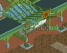
I don't particularly like the foliage, I think some of those objects don't look very good but I can see why you are using them for that south-asian feel.
I agree about the roadlines as supports; they are acceptable for fencing and even that's arguable, but they are definitely too thin for supports in my opinion. I think beefing up these horizontal supports will help with the overall cluttered look of the screen as well, as it'll give the center a bit more of a visual hierarchy whereas right now the supports blend too much with the foliage and grass.
Agreed about the green stairs as well, it does look a bit tacky and blends too much with the grass and foliage. I think changing the color can help with the look as well.
I also never really liked those triangular canopies made out of pathing, I think the texture just simply isn't right and it looks iffy.
i can see reason for critcism behind the screen. even though i love this style of
foliage i can see how others feel it's distracting as well as the green pathway (exiting?) the queue.
i'm not nor anyone else here is trying to whiteknight rob or trying to use him to make a point or anything like that. i think liam is at times waaaay too critical on relatively minor things in screens regardless of the member, but he's entitled to that even when it's wrong
I like them too. I simply dislike the objects you chose to make them. The green ones look like, well, floating green triangle paths. Maybe it's the angle of the mesh or the colors, but it doesn't work well for the canopies.
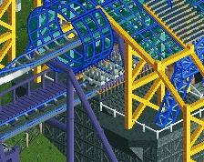
Busch Gardens Asia's Arrow Dynamics looper, Naga is the park's grandfather of thrills, speeding passengers through its iconic double loops and 540* helix since 1978.
 21-September 14
I think the discussion between Liam and you guys is pretty weird. The first thing I thought when I opened the screen was: "it's pretty messy, were should I look." Don't get me wrong, the skill is there and there is cool stuff like the red buildings on the right, but overall, I don't think this screen is very pleasing to the eye, whether it's meant to be like that or not. And that has nothing to do with "keeping Robbie's ego in check". Just take note that Liam is not the only one who doesn't give Robbie his standard 90% vote. It's not that he doesn't deserve it, but some people just have different preferences and taste when it comes to this game.
I can't stand those loop supports. Makes the support work look awful. I also wonder whether the lift hill supports look too thin and flimsy.
I'm loving the other supports though, great work with them.
I'm questioning the vibrancy and the general opulence of the station. In 1978, would the station be built that grandly? Would it not be a bit more boxy in the roof and less opulent? And now many decades later, would the station still be so bright?
I feel like it's very likely that the station would be that well maintained simply because it's at a Busch park. Loch Ness Monster's queue for example is very well themed and maintained despite the age of the ride.
As far as station design they generally do a very nice job on stations that are openly visible from the pathway as this one is. You have a valid point about it being a little too nice but I don't mind a little creative license being taken because it really does look great and it would be a shame to tone it down for the sake of realism (holy shit... maybe FK is rubbing off on me). It's also possible that the building wasn't always a coaster station as Busch has a history of converting things into coaster stations that weren't before (Cheetah Hunt for example though that's a much more modern ride).
I agree about the loop supports not being perfect but I don't know if a better solution exists with this game. Maybe it does, but I don't know what it would be off the top of my head.
i really like the intricate support structure. but the foliage doesn't really does it for me, i wouldn't say it has the southeast asia feeling. overall you did a good job at recreating thailand though, but it misses scooters
i really like things who rob built. but there are so much things on the screen and i don`t know where i should look. in my opinion it hasn`t got rob status...
overall , nice things but , well , bit messy in my opinion.
Faas, I think this is what I was trying to say. It's technically good work, it's just a bad photograph of good work. It doesn't guide your eyes through the image like a good photograph does. There isn't much of a focus, and it shows too much of the grit behind the area. It's not pretty. It is real, it is good material, it's just not a great screen.
members climbing over themselves to defend this screen from any criticism REALLY isn't a good look for this site haha
I'm not trying to defend this from all criticism. I don't think it's a good screen. There's a giant blob of light green foliage that's off-putting and another blob of green stairs that's also off-putting. those two things are right in the focal area of the screen. It's gritty and real, but it doesn't look good. Your eyes are drawn to the poorer parts of the screen, and not the beautiful station, the iconic loops, or the coaster train.
I think Louis is on the right track with his point. Not that I think this screen needs to be changed necessarily, but Nessie's station is actually quite boring IRL and feels very 1970s. (I lived in Williamsburg from 1997-2010 and have over 100 visits to the park). It's a big box of concrete, and the only detail is a bit of castle-like blocks on the top. On the inside it's even more lifeless, the only theming IIRC is a plaque detailing the history of the ride. The queue is really the special part, but it's hardly ever open because the lines rarely get that long.
The station is also quite dark on the inside, those openings you see in the attached photo are above eye level so you can't even see inside or out.
But I also don't think Rob's park is purely "what it would have looked like if Busch Gardens built an Asian themed park starting around 1975". I could be wrong, but he seems to have taken a bit of creative liberty in making this park, the result being a prettier, albeit perhaps less "truly realistic", park.
I think this is a great screen, Rob, and you're on track to simultaneously capturing the Busch Gardens feel, and creating a stunningly beautiful RCT park.
Attached Thumbnails
I really love the station, I think it's beautiful. I think my favorite part of your work, Rob, is all the textural variety that each screen has. Those thick supports, the red lattice building, and the trackitecture blends really well and offers a lot to look at. Though, in this case, sometimes maybe it's too little...I think Faas hit the nail on the head: the screen just looks messy. There are really good parts and elements as per usual, but overall there's too much criss-crossing in the center of the screen that my eyes get a little blurred trying to figure out what's where. I think the issue is the overuse of textureless objects - the roadlines, the pathing for canopies, some of the foliage and the guard rails for the queue. Having all these overlapping, textureless elements in the center of the screen really makes it look jumbled and confused.
I can't comment on the realism of the screen as that isn't my cup of tea, but I do agree and echo a couple of critiques that were already said.
I don't particularly like the foliage, I think some of those objects don't look very good but I can see why you are using them for that south-asian feel.
I agree about the roadlines as supports; they are acceptable for fencing and even that's arguable, but they are definitely too thin for supports in my opinion. I think beefing up these horizontal supports will help with the overall cluttered look of the screen as well, as it'll give the center a bit more of a visual hierarchy whereas right now the supports blend too much with the foliage and grass.
Agreed about the green stairs as well, it does look a bit tacky and blends too much with the grass and foliage. I think changing the color can help with the look as well.
I also never really liked those triangular canopies made out of pathing, I think the texture just simply isn't right and it looks iffy.
foliage i can see how others feel it's distracting as well as the green pathway (exiting?) the queue.
i'm not nor anyone else here is trying to whiteknight rob or trying to use him to make a point or anything like that. i think liam is at times waaaay too critical on relatively minor things in screens regardless of the member, but he's entitled to that even when it's wrong
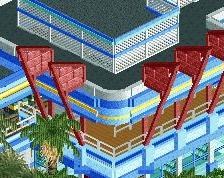
wow, nobody likes the canvas awnings...
Except me, which is why they're staying
i feel like the screen is too messy
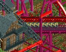
The station looks like it got accidentally MOM'ed...on the other hand I think the support work is neat
Those triangle things? I like them. I didn't at first, but they grow on you.
I like them too. I simply dislike the objects you chose to make them. The green ones look like, well, floating green triangle paths. Maybe it's the angle of the mesh or the colors, but it doesn't work well for the canopies.
wassup my naga
Naga