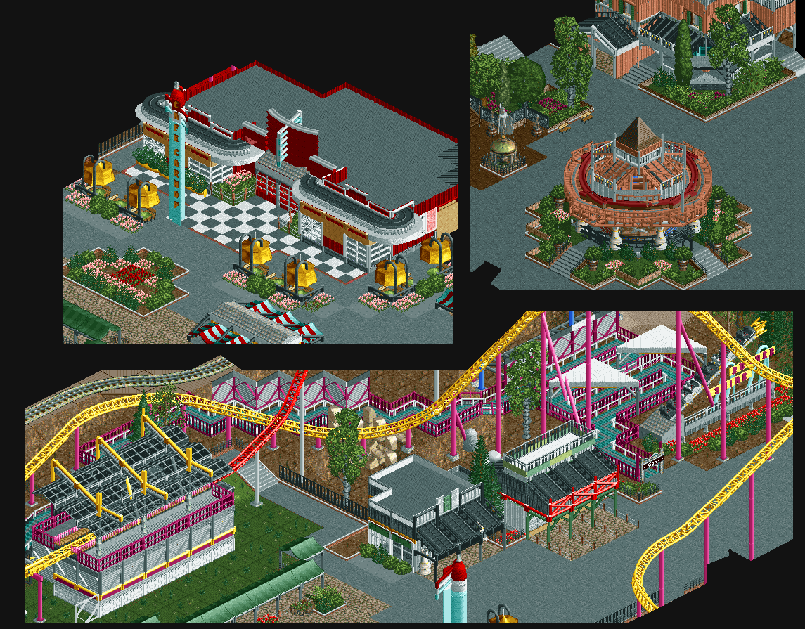
I love the foliage surrounding the carousel, and the areas above it. I think the suspended tents as awnings are a neat idea too, and a creative use for that object. I'm not sure if the red fits in with the pink and yellow combination you have for the coaster, but other than that, no complaints.
After stating that the queue isn't from the game it sticks out like a sore thumb imo. I'd swap it out for a default path that would match the color scheme of the ride/area.
 25-July 15


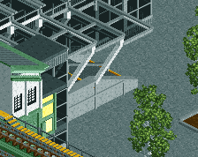
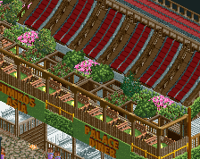
The queue is also not one of the standard game colors
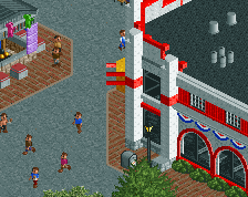
That diner/cafe is.. awesome
I love the foliage surrounding the carousel, and the areas above it. I think the suspended tents as awnings are a neat idea too, and a creative use for that object. I'm not sure if the red fits in with the pink and yellow combination you have for the coaster, but other than that, no complaints.
After stating that the queue isn't from the game it sticks out like a sore thumb imo. I'd swap it out for a default path that would match the color scheme of the ride/area.
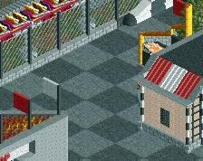
I like the architecture but I don't like the rest.
Especially the architecture in the bottom screen, I have no idea what is going on there.
This honestly seems messier to me than your other NCSO work.