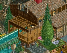
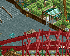
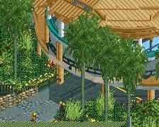
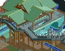
Not a huge fan of the wall texture underneath the brake run (what´s that anyway?) but otherwise I really like it! Great to see something from you again!
ncSo shit ncS౦ sHit thats ✔ some goodrct rightth ere right✔there ✔✔if i do ƽaү so my self i say so thats what im talking about right there right there (chorus: ʳᶦᵍʰᵗ ᵗʰᵉʳᵉ) mMMMMᎷМ НO0ОଠOOOOOОଠଠOoooᵒᵒᵒᵒᵒᵒᵒᵒᵒ Good rct
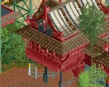
I don't like this. I fear that your NCSO work is getting like some other NCSO: messy, too much random trackitecture, unnecessary details and a texture density of 1000 per square meter. Tone it down.
I agree with those sentiments. You're really talented when it comes to making smooth compositions and stuff, and having good original ideas, but here the clutter ruins it. And not all ideas are working, like the diagonal fence which is horrible. Lastly, why is everything always brown or white with your work? I get that it works best for NCSO architecture, but the ride is similarly bland. 60-65%
1.) I'll give you the diagonal fences, they were an experiment to solve the game's lack of diagonal pieces which failed.
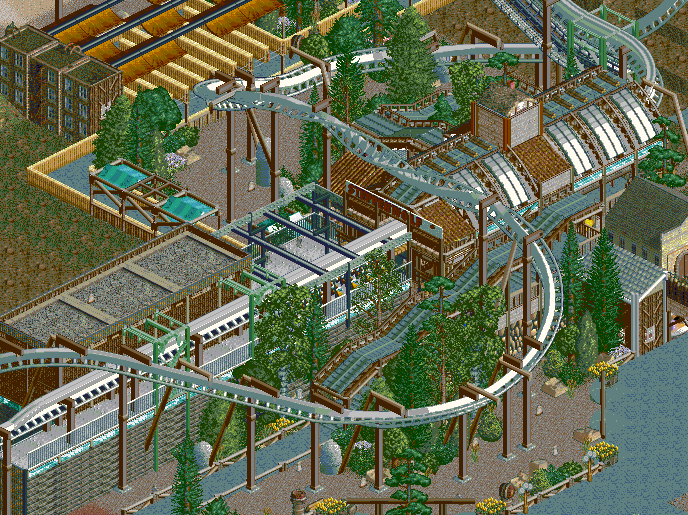
2.) It's a Northwest theme, so there will be lots of brown and white against a green mountainside, which works. There's meant to be a lot of woodwork, metalwork, etc. so that's intentional. I'll breathe some bright colors in there, but if you're looking for Faas's colorful parks, this is not that.
3.) What's cluttered? The foliage? That's how nature is. The station? That's how stations and brake runs are. If anything, I've given the coaster room to breathe with its sweeping drops near paths.
4.) Trackitecture looks good when not overdone, and I'd say this is not overdone. If I had a plain wooden roof, for example, that would be too simple, and this is not a simple design. Besides that, I need trackitecture for the transfer track and brake run.
 29-January 16
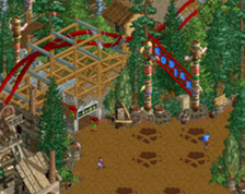
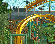
Love the swooping zero-g.
Don't know why, but the quality was messed up as I cropped it. Look at this one:
Attached Thumbnails
Not a huge fan of the wall texture underneath the brake run (what´s that anyway?) but otherwise I really like it! Great to see something from you again!
Nice work. It was almost hard to tell its NCSO. Can't wait to see more!
It has a very cold feel to it, but given the title, I'd say this fits perfectly!
i'm in love
This is incredibly nice.
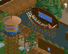
Did you use the medusa sign? I really like the area but the left side is quite bare . . .
ps. how do you get the fences to stay slanted at such a low clearance? I can't get them to stay unless they're above 2 land raises
The flow is gross ughh
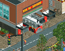
I like the textures used (the brake run and the city buildings next to the queue covers), they're uncommon and it makes it look less like typical ncso
is this a challenge
ncSo shit ncS౦ sHit thats ✔ some goodrct rightth ere right✔there ✔✔if i do ƽaү so my self i say so thats what im talking about right there right there (chorus: ʳᶦᵍʰᵗ ᵗʰᵉʳᵉ) mMMMMᎷМ НO0ОଠOOOOOОଠଠOoooᵒᵒᵒᵒᵒᵒᵒᵒᵒ Good rct
I don't like this. I fear that your NCSO work is getting like some other NCSO: messy, too much random trackitecture, unnecessary details and a texture density of 1000 per square meter. Tone it down.
1.) I'll give you the diagonal fences, they were an experiment to solve the game's lack of diagonal pieces which failed.
2.) It's a Northwest theme, so there will be lots of brown and white against a green mountainside, which works. There's meant to be a lot of woodwork, metalwork, etc. so that's intentional. I'll breathe some bright colors in there, but if you're looking for Faas's colorful parks, this is not that.
3.) What's cluttered? The foliage? That's how nature is. The station? That's how stations and brake runs are. If anything, I've given the coaster room to breathe with its sweeping drops near paths.
4.) Trackitecture looks good when not overdone, and I'd say this is not overdone. If I had a plain wooden roof, for example, that would be too simple, and this is not a simple design. Besides that, I need trackitecture for the transfer track and brake run.