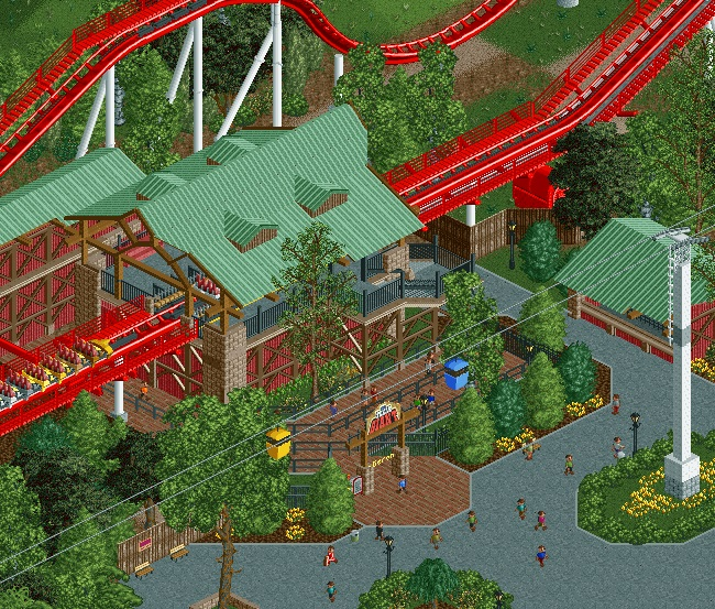
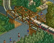
Oh and for the record I love this because I love realism and it's a good example of it. The multi colored skyway is a nice touch too. That always adds a nice burst of atmosphere.
For whatever reason I enjoy that long flat section of track before the lift that B&M has become so fond of lately on hypers so I'm glad to see that here.
I just think the layout could be handled a bit better, the steep slope up to the brake run is a bit extreme, the flat bit could also be a bit longer, IRL its at minimum the length of a train if I'm not mistaking. Seems way to short here, also, the supports are a bit of a mess, they should be evenly spaced along the ground and have more of an A shape than what they have now.
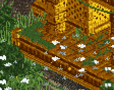
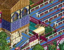
Also, the planter with the cable car tower on it should have the dirt object as well, just for cohesion, its a bit odd you dont have it there but its everywhere else in the screen.
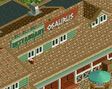
The station building though. Simple but so effective. Very nice. The paths are also very good, and using that ride base-texture for planters is great! I hope to see more of this!
 14-April 16

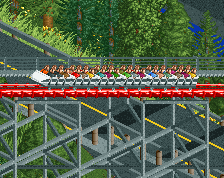
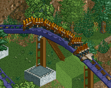
For whatever reason I enjoy that long flat section of track before the lift that B&M has become so fond of lately on hypers so I'm glad to see that here.
I just think the layout could be handled a bit better, the steep slope up to the brake run is a bit extreme, the flat bit could also be a bit longer, IRL its at minimum the length of a train if I'm not mistaking. Seems way to short here, also, the supports are a bit of a mess, they should be evenly spaced along the ground and have more of an A shape than what they have now.
Also, the planter with the cable car tower on it should have the dirt object as well, just for cohesion, its a bit odd you dont have it there but its everywhere else in the screen.
The station building though. Simple but so effective. Very nice. The paths are also very good, and using that ride base-texture for planters is great! I hope to see more of this!
I like it, therefore all previous comments are invalid.
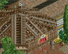
I'm just glad to see a sky ride that isn't blue for a change.
Whitehawk Fan Offline
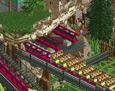
Attached Thumbnails
who is whitehawk?
This ride sucks!!!
ok I guess
I love coaster stations like that. I don't mind the red to much, like yea its very bold and in your face but I like it.