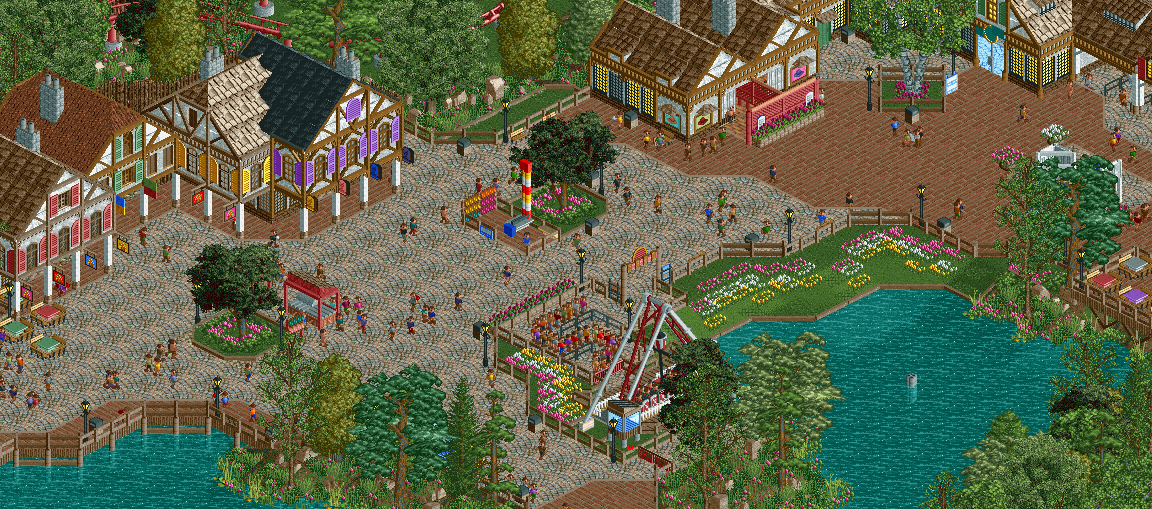
A solid screen. The atmosphere is almost there for me. I think you could push it even further by adding just a FEW tall trees around the architecture; right now, I think there's just a bit too much path. Otherwise, again, good stuff!
Very good. I agree with most of what has been said. It doesn't remind me of my continent at all, but it does work well as a bad persiflage (is that an English word?). Not really liking the abundance of variety in the buildings and the overload of signs (both the ones hanging over the building entrances as the hat signs) and windows. Some empty walls wouldn't hurt your buildings. The atmosphere is fantastic in this screen. Feels really theme park esque.
technically it's pretty good, but it feels the same as all the other stuff you've made. all of the buildings are basically copies of each other it seems like. most of them are just the same 3 tile building with some changes in the windows and trim. having so many of the same building ruins the screen for me, and it seems to be something you do pretty often. it is also pretty hard to distinguish this area from all of the other areas in your park as they all same the same foliage, path type, etc.. it just looks like starpointe v3, and after seeing this style of park making so many times i'm getting tired of it. i want you to try building more unique stuff, and not just the same old boring stuff. 55-60% in my eyes.
Coups, how in the fuck is this bronze level material to you? I hate this "i don't like this type of park, so irregardless of quality i won't like it" attitude. Anyway, is someone building in a certain style that you don't like worth criticizing over, if what's there is refined and great. Sure, the screen comes off as basic because it is, as you put it, the same building over and over again. But that's the point. Does intention mean nothing?
I wouldn't say that this is worth 55-60%, but a lot of the feedback that Coupon mentioned is accurate here. It's flat expanses of path, minimal variation in architecture, and the same foliage/landscaping we see time and time again. The execution is good, but it's flat. There's no heart, there's nothing interesting in this screen. Even subtle changes, like slight variations in the path textures or additional planters, or buildings with different heights would help. It's certain small things that elevate a screen from decent but bland to something truly special.
I always hesitate to reply to my own screens to avoid conflict and another Frontier-Trail. But I can understand the comments, at least some of them.
To those who dislike the style and all that. Sorry, I guess. But I dont think I'm going to build different things in the future just to please a few who have a problem with realistic parks in general. Its what I know, what I like, and what I enjoy. If you want to keep commenting and complaining about the state of the meta or realistic RCT, that's fine with me, but I could care less.
To everyone else, thanks for the opinions. Kind of feel like I'm a bit to far with this park to adjust its style and same-ness. In general the feel of the park isn't exactly how I envisioned it or intended it to be. Lots of stuff I'm not happy with but its definitely been an interesting and fun build, at least for the most park.
Wish I would have been able to employ a bit more of a realistic and gritty feel rather than the cartoonish RCT feel that I think this park shows off for the most part. Hopefully for my next full project the park can have a bit more believable feel and overall be a bit more interesting and unique because of that.
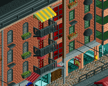
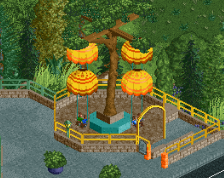
I do think there's some small stuff you could empl0y in this screen that would take very little time to fix. For example, in that stone path, throw a couple crazy-tile path pieces in there occasionally; they're similar enough to still make the path read as a singular element, but they add just enough of a textural difference to make those larger expanses of path read less "empty"; it's like when you're adding those voliere pieces to your grass to make it have a different texture, which is a smart idea. Also, maybe change that middle building to have a different colour of infill, like a yellow or something; plenty of real European towns have more than white on their walls, and I think it would go a long way in making that cluster of buildings feel nicer. Even if making the roof of one or two a couple tiles higher than the others can help too. That bathroom probably doesn't need windows on the wall, even if they're fake, as it makes it busier than it needs to be. Finally, if you fill that big span of path in the middle with a planter, a fountain, or even some more seating, it could help the area read as a bit fuller. I think even some shading elements on the swinging ship queue could "fill" the area out a bit.
GForce, the problem isn't with realistic parks. BGA, Zippo's, Kumba, Raptor, DAW, Starpointe, Paradise Pier, etc. are all testaments to the fact that realism doesn't have to be boring or cliché. The critique is both on your subject choice (bland uninspired cliché theme, been-there-done-that type work, seen-a-thousand-times-before architecture...) and the execution of it, which Coupon / Robbie hit the nail on the head on that point (they are much more qualified to critique a realistic style than I am).
I'm not asking you to change your style - because your work is really great: it's clean and polished. I'm simply wondering why you haven't ever considered doing something more unique / daring that is still realistic - something that can elevate your work beyond the typical complaints you keep hearing about cliché and overdone ideas.
I'm looking forward to your next park if you're going for a realistic, gritty feel. That could be potentially very interesting and refreshing. Also, I hope you know that although my critiques are maybe harsh, they do come from a genuine place because it's a shame to see so much talent not being utilized to its full potential.
GForce, the problem isn't with realistic parks. BGA, Zippo's, Kumba, Raptor, DAW, Starpointe, Paradise Pier, etc. are all testaments to the fact that realism doesn't have to be boring or cliché. The critique is both on your subject choice (bland uninspired cliché theme, been-there-done-that type work, seen-a-thousand-times-before architecture...) and the execution of it, which Coupon / Robbie hit the nail on the head on that point (they are much more qualified to critique a realistic style than I am).
I'm not asking you to change your style - because your work is really great: it's clean and
polished. I'm simply wondering why you haven't ever considered doing something more unique / daring that is still realistic - something that can elevate your work beyond the typical complaints you keep hearing about cliché and overdone ideas.
I'm looking forward to your next park if you're going for a realistic, gritty feel. That could be potentially very interesting and refreshing. Also, I hope you know that although my critiques are maybe harsh, they do come from a genuine place because it's a shame to see so much talent not being utilized to its full potential.
I would have to disagree with you here. While I don't like Gforce's work all that much I still have an appreciation for it. I feel like this screen is actually very realistic, in the sense of a small park who makes a small, cheap, same'sy themed area. It's not transferred throughout the entire park but in this screen it's definitely there. IMO this is more unique than BGA, and Starpoint because those two parks were created to look good in rct. While this may not look as appealing it is probably one of the most realistic parks I've seen alongside Raptor. I feel like we got to remember that not every realistic park has Disney quality architecture and realism doesn't always have to be appealing.
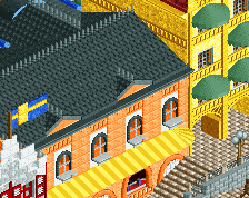
For the screen the only thing that bothers me are those purple shutters I don't feel like they fit the whole germanian theme. 70-75% for me.
@shogo
The reason I rated this screen 55-60% was that I thought that this screen perfectly defined the definition of bronze:
"Bronze parks are enjoyable to look at and typically highlight a player's certain skill or potential. Although they do have room for improvement, they are still deserving of an accolade."
The screen is enjoyable to look at, but after looking at it for a bit you realize that it is just the same stuff over and over again. I get that GForce is aiming for that, but I think that in order to get a higher score, one must be able to create something more interesting and less derivative of prior work.
What would your score be if you didn't use the definition of a bronze?
Sorry but I find saying this is bronze quality work really quite ignorant. Just wanna point out to everyone that you're not better and you don't get extra e-points for scoring people low.
Coupon, come on; you know this is much higher than bronze quality.
Call this bronze quality is either envy or ignorance.
In my opinion this is some pretty cool stuff and i like the stereotypical portrayal of european architecture in this. I think you could have made the buildings a little bit more different from each other or give one of them something more eye-catching.
I'm also not sure if the gorund level windows and the turquoise door are working over here.
I would have to disagree with you here. While I don't like Gforce's work all that much I still have an appreciation for it. I feel like this screen is actually very realistic, in the sense of a small park who makes a small, cheap, same'sy themed area. It's not transferred throughout the entire park but in this screen it's definitely there. IMO this is more unique than BGA, and Starpoint because those two parks were created to look good in rct. While this may not look as appealing it is probably one of the most realistic parks I've seen alongside Raptor. I feel like we got to remember that not every realistic park has Disney quality architecture and realism doesn't always have to be appealing.
Gurl... Let's not act like this wasn't made to look good in RCT as well. Starpointe and BGA were both made to look good in RCT AND function as realistic parks. If you want to make something look cheap or tacky, go all the way in the execution; don't just offer more of the same. That's not pushing the boundaries of realistic execution and concept, that's just falling back on a typical style.
I wouldn't call this bronze quality work, but I don't see anything above a silver in this screen. Other screens for this project have offered more, but there's nothing inspiring or interesting or captivating in this screen, and for someone to point this out as unique seems really, really misguided.
I would have to disagree with you here. While I don't like Gforce's work all that much I still have an appreciation for it. I feel like this screen is actually very realistic, in the sense of a small park who makes a small, cheap, same'sy themed area. It's not transferred throughout the entire park but in this screen it's definitely there. IMO this is more unique than BGA, and Starpoint because those two parks were created to look good in rct. While this may not look as appealing it is probably one of the most realistic parks I've seen alongside Raptor. I feel like we got to remember that not every realistic park has Disney quality architecture and realism doesn't always have to be appealing.
For the screen the only thing that bothers me are those purple shutters I don't feel like they fit the whole germanian theme. 70-75% for me.
I'm not quite sure you got what I was saying... I never called this park unrealistic, and I'm not asking him to be less realistic. I'm asking him to be more creative and imaginative. The way other realistic parkmakers like Pacificoaster, nin, Kumba and Robbie are.
To make the point clearer with an example: SF parks are definitely unappealing to me, but the level of detail and atmosphere required in the spotlight SF parks are amazing. And the execution is top notch. That's missing here for me - both execution and subject matter are boring and uninspired. There's nothing interesting or new here.
Robbie explained it pretty well, I agree with everything he said.
Quantity is important to obviously. This park has loads, especially when considering the data limit, you can only do so much. You really have to consider that.
 21-May 16
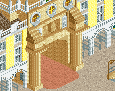
A solid screen. The atmosphere is almost there for me. I think you could push it even further by adding just a FEW tall trees around the architecture; right now, I think there's just a bit too much path. Otherwise, again, good stuff!
So good...
Same thing I said but in more detail =)
Coupon, that post had more words than all of your other posts combined.
I see where Avanine is coming from, but there's something appealing to build great "crappy" theme parks. It's super fun to try to get it just right.
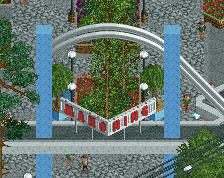
Very nice. Did you forget a fountain?
Coups, how in the fuck is this bronze level material to you? I hate this "i don't like this type of park, so irregardless of quality i won't like it" attitude. Anyway, is someone building in a certain style that you don't like worth criticizing over, if what's there is refined and great. Sure, the screen comes off as basic because it is, as you put it, the same building over and over again. But that's the point. Does intention mean nothing?
I wouldn't say that this is worth 55-60%, but a lot of the feedback that Coupon mentioned is accurate here. It's flat expanses of path, minimal variation in architecture, and the same foliage/landscaping we see time and time again. The execution is good, but it's flat. There's no heart, there's nothing interesting in this screen. Even subtle changes, like slight variations in the path textures or additional planters, or buildings with different heights would help. It's certain small things that elevate a screen from decent but bland to something truly special.
I always hesitate to reply to my own screens to avoid conflict and another Frontier-Trail. But I can understand the comments, at least some of them.
To those who dislike the style and all that. Sorry, I guess. But I dont think I'm going to build different things in the future just to please a few who have a problem with realistic parks in general. Its what I know, what I like, and what I enjoy. If you want to keep commenting and complaining about the state of the meta or realistic RCT, that's fine with me, but I could care less.
To everyone else, thanks for the opinions. Kind of feel like I'm a bit to far with this park to adjust its style and same-ness. In general the feel of the park isn't exactly how I envisioned it or intended it to be. Lots of stuff I'm not happy with but its definitely been an interesting and fun build, at least for the most park.
Wish I would have been able to employ a bit more of a realistic and gritty feel rather than the cartoonish RCT feel that I think this park shows off for the most part. Hopefully for my next full project the park can have a bit more believable feel and overall be a bit more interesting and unique because of that.
I do think there's some small stuff you could empl0y in this screen that would take very little time to fix. For example, in that stone path, throw a couple crazy-tile path pieces in there occasionally; they're similar enough to still make the path read as a singular element, but they add just enough of a textural difference to make those larger expanses of path read less "empty"; it's like when you're adding those voliere pieces to your grass to make it have a different texture, which is a smart idea. Also, maybe change that middle building to have a different colour of infill, like a yellow or something; plenty of real European towns have more than white on their walls, and I think it would go a long way in making that cluster of buildings feel nicer. Even if making the roof of one or two a couple tiles higher than the others can help too. That bathroom probably doesn't need windows on the wall, even if they're fake, as it makes it busier than it needs to be. Finally, if you fill that big span of path in the middle with a planter, a fountain, or even some more seating, it could help the area read as a bit fuller. I think even some shading elements on the swinging ship queue could "fill" the area out a bit.
I'm not asking you to change your style - because your work is really great: it's clean and polished. I'm simply wondering why you haven't ever considered doing something more unique / daring that is still realistic - something that can elevate your work beyond the typical complaints you keep hearing about cliché and overdone ideas.
I'm looking forward to your next park if you're going for a realistic, gritty feel. That could be potentially very interesting and refreshing. Also, I hope you know that although my critiques are maybe harsh, they do come from a genuine place because it's a shame to see so much talent not being utilized to its full potential.
For the screen the only thing that bothers me are those purple shutters I don't feel like they fit the whole germanian theme. 70-75% for me.
The reason I rated this screen 55-60% was that I thought that this screen perfectly defined the definition of bronze:
"Bronze parks are enjoyable to look at and typically highlight a player's certain skill or potential. Although they do have room for improvement, they are still deserving of an accolade."
The screen is enjoyable to look at, but after looking at it for a bit you realize that it is just the same stuff over and over again. I get that GForce is aiming for that, but I think that in order to get a higher score, one must be able to create something more interesting and less derivative of prior work.
Coupon, come on; you know this is much higher than bronze quality.
Call this bronze quality is either envy or ignorance.
In my opinion this is some pretty cool stuff and i like the stereotypical portrayal of european architecture in this. I think you could have made the buildings a little bit more different from each other or give one of them something more eye-catching.
I'm also not sure if the gorund level windows and the turquoise door are working over here.
I voted 70%.
Gurl... Let's not act like this wasn't made to look good in RCT as well. Starpointe and BGA were both made to look good in RCT AND function as realistic parks. If you want to make something look cheap or tacky, go all the way in the execution; don't just offer more of the same. That's not pushing the boundaries of realistic execution and concept, that's just falling back on a typical style.
I wouldn't call this bronze quality work, but I don't see anything above a silver in this screen. Other screens for this project have offered more, but there's nothing inspiring or interesting or captivating in this screen, and for someone to point this out as unique seems really, really misguided.
To make the point clearer with an example: SF parks are definitely unappealing to me, but the level of detail and atmosphere required in the spotlight SF parks are amazing. And the execution is top notch. That's missing here for me - both execution and subject matter are boring and uninspired. There's nothing interesting or new here.
Robbie explained it pretty well, I agree with everything he said.
Quantity is important to obviously. This park has loads, especially when considering the data limit, you can only do so much. You really have to consider that.