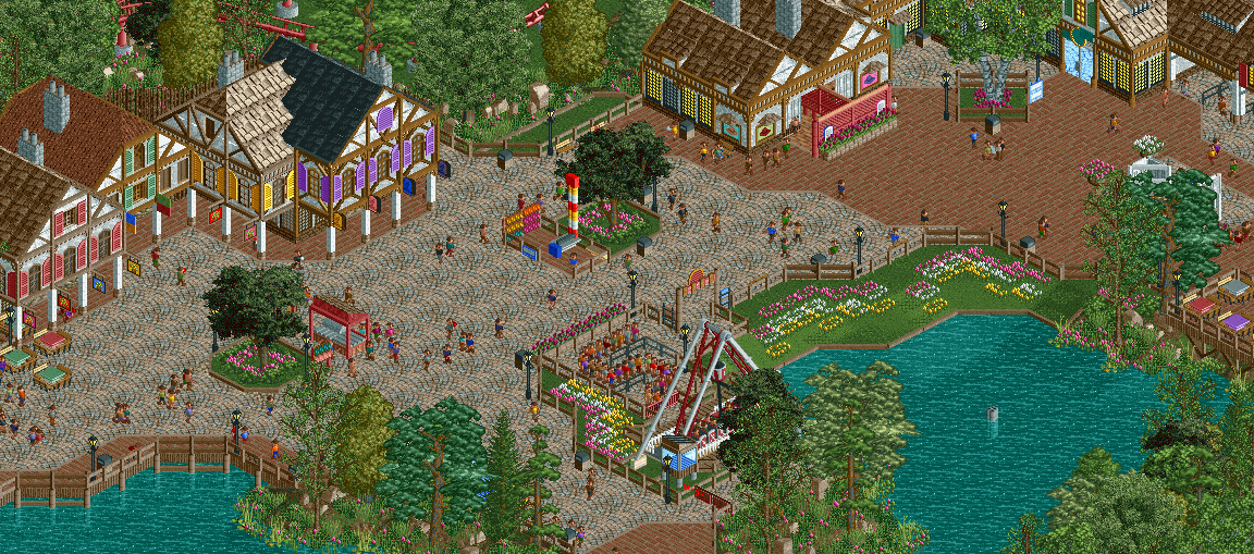
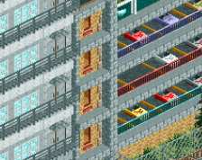
Yes but to achieve a certain quantity (which this park has a ton of, it's huge) you have to sacrifice details somewhere. I think this screen does a great job of that, and is nicely composed and placemade as well. Could it be better? Sure, but I don't see the need in the big picture.
I know it has become a trend where your screen comments sections devolve into an offtopic battleground, but this specific discussion is very centered on your work and there is plenty of great feedback here. Why does that make you not want to post anymore?
I know it has become a trend where your screen comments sections devolve into an offtopic battleground, but this specific discussion is very centered on your work and there is plenty of great feedback here. Why does that make you not want to post anymore?
It's not even that. It's solely the fact that there are almost 50 comments on this screen. Now before a whole new conversation starts let me give my feed back.
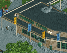
I think it looks good for what it is and knowing that you built it to be a bit bland with "light" theming means you have accomplished your goal. That being said there does need to be some deviation from building to building. If you take a look at the Spanish(?) section, there is distinction between buildings and an even better example the cedar point-esque area of the park (don't remember what it's called) There is something that defines each building. I hate using the word Samey but it is a good word for this screen. This screen is as clean as it gets though which does speak for something. any who I might have gotten off topic or this may be a jumble of words but I hope I got my points across.
Because:
1. This screen is average-good and doesn't deserve 45 comments
2. Its unfair to everyone else that this gets 45 comments for no reason. While much better screens or screens that deserve more attention don't
3. Its not fun anymore to post screens and get feedback when this is what happens.
I think you're right that it's unfair other screens don't get as much discussion. But doesn't that make it all the more exciting and worthwhile that your screens produce such lively debate and discussion?
Liam is right, I'm sure we all wish we could generate 4 pages of discussion with a simple screen. Enjoy the fact that you as a builder and your work is provocative enough to spark debate whereas most other people just hear "looks good", "ehhh" or "that's awesome" and that's it.
 21-May 16
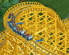
Yes but to achieve a certain quantity (which this park has a ton of, it's huge) you have to sacrifice details somewhere. I think this screen does a great job of that, and is nicely composed and placemade as well. Could it be better? Sure, but I don't see the need in the big picture.
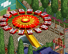
Pros: Technically excellent, theme is solid, great swinging ship placement
Cons: Too many shutters, questionable flower color choices, looks like everything else you build
Let's move on, shall we?
Can someone please lock this. I don't want to sound like a over dramatic teenage girl but I think I'm done posting screens here.
It's not even that. It's solely the fact that there are almost 50 comments on this screen. Now before a whole new conversation starts let me give my feed back.
I think it looks good for what it is and knowing that you built it to be a bit bland with "light" theming means you have accomplished your goal. That being said there does need to be some deviation from building to building. If you take a look at the Spanish(?) section, there is distinction between buildings and an even better example the cedar point-esque area of the park (don't remember what it's called) There is something that defines each building. I hate using the word Samey but it is a good word for this screen. This screen is as clean as it gets though which does speak for something. any who I might have gotten off topic or this may be a jumble of words but I hope I got my points across.
Because:
1. This screen is average-good and doesn't deserve 45 comments
2. Its unfair to everyone else that this gets 45 comments for no reason. While much better screens or screens that deserve more attention don't
3. Its not fun anymore to post screens and get feedback when this is what happens.
I think you're right that it's unfair other screens don't get as much discussion. But doesn't that make it all the more exciting and worthwhile that your screens produce such lively debate and discussion?
Liam is right, I'm sure we all wish we could generate 4 pages of discussion with a simple screen. Enjoy the fact that you as a builder and your work is provocative enough to spark debate whereas most other people just hear "looks good", "ehhh" or "that's awesome" and that's it.
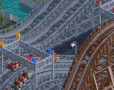
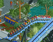
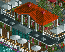
i like it. nice and quaint.