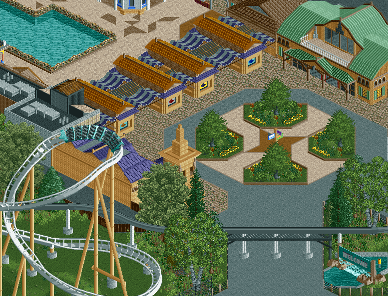
I like the little entrance buildings and I also like the layout of those planters. But the path textures are a total mess like the archy like in all the screens you've shown so far. There is just zero consistency and therefore flow.
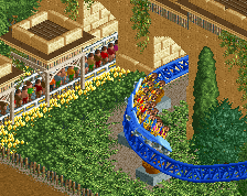
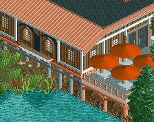
Each of these buildings look nice on their own, but there's just too much clash between color schemes of separate buildings. Other than that, the hammer head(?) turn on the hyper looks nice, excellent placement with that. And I love the monorail crossing and welcome sign, the little pump in there gives it nice authentic feel.
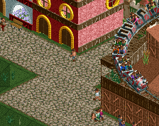
It's very nicely done but I agree with some of the remarks made before. Bit too much tan and a too small sign. Mayeb giving the coaster supports a different colour would help? I don't think the different forms of archy here is as messy in some of your other screens, but it does feel a bit lifeless. It's amazing how much stuff like trash cans, benches and lights can help the place seem a lot more alive.
I really want to like this project more, but things don't quite come together as has already been mentioned.
The macro possibilities are endless and every vision I have I love, but beginning with the lovely natural centrepiece is suddenly cut-off by tarmac. What could be an incredible position for a coaster turnaround has supports which blend in to the architecture and instead of manicured foliage seems overly wild with strange tree selection (ie colours and type). It is of course entirely possible the framing of the screen is the problem here and this transitions into a more open eg parking lot which brings the macro together more but from what's in the shown screen there are problems imo.
love that turnaround. Not so keep on the styles of the buildings but what's there isn't so bad. It's just a bizarre blend that looks a bit random in terms of the styling, as in I can't tell what kind of influences the buildings are working off of.
you seem to not have a clear art direction when going with this, and i'm not only talking about the various architectural elements that, together, don't work. i also mean your pathing, fencing, and ride placement. i'd say to remove 100% of the pavement, widen up the main (diagonal) entryway, and change the fencing to fit the more natural feel the center plaza has. i'd also thicken up the foliage.
As I've said before, the archy in this park doesn't really feel like it has a lot of purpose. It seems like you're just randomly selecting different textures and not really putting any purpose behind your decisions, both texture and form wise.
The path feels really dull as well, I know its unfinished, but it would help us a lot if you included peeps and such in the screens.
 12-September 16
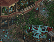
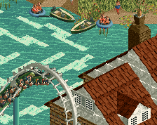
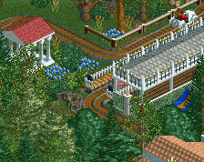
I like the part were the monorail goes over the path.
Each of these buildings look nice on their own, but there's just too much clash between color schemes of separate buildings. Other than that, the hammer head(?) turn on the hyper looks nice, excellent placement with that. And I love the monorail crossing and welcome sign, the little pump in there gives it nice authentic feel.
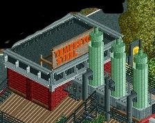
@nin - I'm planning on redoing that center sign but it's a problem of peep scale to what scale actually works.
It's very nicely done but I agree with some of the remarks made before. Bit too much tan and a too small sign. Mayeb giving the coaster supports a different colour would help? I don't think the different forms of archy here is as messy in some of your other screens, but it does feel a bit lifeless. It's amazing how much stuff like trash cans, benches and lights can help the place seem a lot more alive.
I really want to like this project more, but things don't quite come together as has already been mentioned.
The macro possibilities are endless and every vision I have I love, but beginning with the lovely natural centrepiece is suddenly cut-off by tarmac. What could be an incredible position for a coaster turnaround has supports which blend in to the architecture and instead of manicured foliage seems overly wild with strange tree selection (ie colours and type). It is of course entirely possible the framing of the screen is the problem here and this transitions into a more open eg parking lot which brings the macro together more but from what's in the shown screen there are problems imo.
Everything just feels like something is missing. But I never know what.
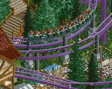
This might be a better view?
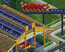
What is up with the monorail track on the left? (on the new screen)
Tram I'm assuming. I'm doing the same thing in my park and hacking away the track. It might be a pain in the ass with the diagonals though.
love that turnaround. Not so keep on the styles of the buildings but what's there isn't so bad. It's just a bizarre blend that looks a bit random in terms of the styling, as in I can't tell what kind of influences the buildings are working off of.
As I've said before, the archy in this park doesn't really feel like it has a lot of purpose. It seems like you're just randomly selecting different textures and not really putting any purpose behind your decisions, both texture and form wise.
The path feels really dull as well, I know its unfinished, but it would help us a lot if you included peeps and such in the screens.
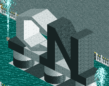
this is cute