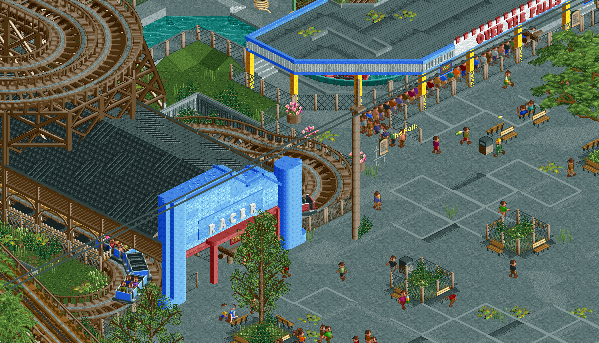
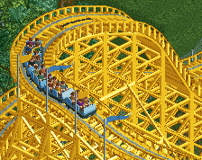
Screenshot / Racer and Over the Falls
-
 26-September 16
-
Euclid Beach Park
-
1 of 3
- Views 2,528
- Fans 1
- Comments 18
-
Description
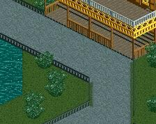
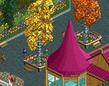
The Derby Racer (later renamed simply "Racer"), was built in 1913 by Frederick Ingersoll with much fan fair. The coaster formed a single "moebius" loop and raced itself around a double out and back layout.
Over the Falls originally opened as Mill Chute in 1921, was modified in 1937 to its current state. It features a long dark ride section and is finalized by a steep drop into a flume section below, an is a favorite amongst guests. -
Full-Size
-
1 fan Fans of this screenshot
-
Tags
References:
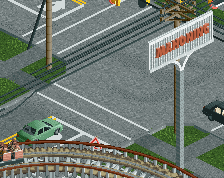
Excellent messy tarmac
I think you achieved your objective pretty well. This would look amazing with a muted color palette but it is nice as-is and a break from the more 'perfect' and cartoonish forms of realism.
The path itself is cool but I find the grey square outlines distracting.
I think you went way overboard with the weeds and cracks and frankly I think you can do away with almost all of it. At least all the detail you added doesn't really make it look more like the real thing. What I see in the picture is square concrete blocks as paths. And a little bit of weed in the shade and shelter of the benches. I'd use the roadlines in a pattern of 2x2 squares, but paint them black instead of grey. They will blend into the path texture quite a bit, but the square pattern will be noticable enough. Save this extremely messy tarmac for backstage areas. Limit the weeds to only the remotest of corners, edges and other obscure places. You can get the effect across with maybe six objects.
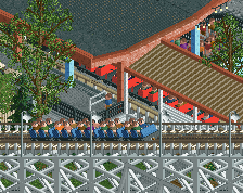
The entrance gate for Racer should be the lighter blue colour (not the ice colour, but light teal). The blue you used is way too bright and obnoxious. Some people commented you should try to make a different colour palette with less saturation or something. I think that will just make everything look bleak. Besides, you haven't really explored the possibilities of the default colour palette yet. All I see in your screens is the same colours! That's your personal palette within the RCT palette. Consider substituting most of your go-to colours with related colours that are less bright. Light teal instead of bright blue, dull red instead of bright red, and dull green instead of the grassy colour. Something else I notice about that entrance gate is that yours is much taller and therefore loses the 'horizontal' direction of the building. The reason it looks good in the picture is because the horizontalness is parallel to all the horizontal coaster stuff behind it. Can you find a way to make the entrance gate mirror its backdrop again? A 1:1 recreation won't work here. I'd try to make some ornaments that echo the mirrored/twinned stations. Those turns on each side of the gate look cool, use those in the entrance gate.
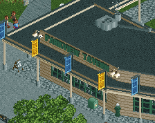
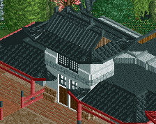
Using only one texture for the roof should be fine. Again, this is not the apocalypse is it? What is more notable about it in the picture is that it blends into the roller coaster structure. Therefore make it all brown. The flat roof of the other building looks too much like path, and again all the cracks don't seem necessery... I'd make it all dull brown without any of the cracks and shit. Only the weeds as moss do seem reasonable here, I'd keep those! Good idea. The building itself again has the wrong colour I think. The picture version is very light and soft green, so why did you go with white and bright blue again? Use that green colours Robbie92 loves so much.
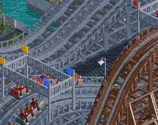
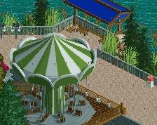
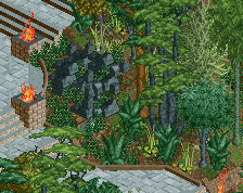
Lastly the second picture seems much more shaded than your screen. To achieve the same affect I'd place one more shady tree in about the same spot where the flume queue starts.
edit: Jesus, this is a lot of feedback.
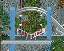
Def could use some thicker foliage, but that may just be the the screen isnt big. Probably some more foliage density off screen.
Go World's of Fun on this bitch.
All points considered though, I'll tone down the path details a bit and clean up the greenery a tad.
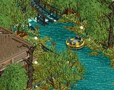
When it comes to the colors of the flume station, the picture I posted here is a recoloured post card. So the colors aren't at all accurate (atleast for the time period I'm going for). If you check the picture I posed in the gritty style thread, those are the colors I'm using for the majority of the park.
I'll definitely fiddle with them a bit, this screen is more of a rough draft and not at all what I want the final version to be.
On a slightly different note, does anyone know of a set of deco blocks that are curved like the ones used on the coaster station? That have a different texture from the standard used here?
I know dr dirt had a few sets, but none of those objects are curved like id like. Perhaps if not I'll just make due with a more angled set, as I don't know if the curved vertical elements I'm using are giving the correct feel.
Thanks all
I like it. Feels very abandoned. But with peeps
It's heading in the right direction for sure. As Liamipie said, it's a bit too rough in the path, especially the weeds in it. Maybe make a smaller foliage object to emulate the actual size of weeds in cracks, rather than a whole plant/bush. That said, I think you can push it further in the texture department - the building on the right has the look, but the Racer station could use some textures with a bit more 'bite', including the roofs. Maybe just use the dach bretter roof, but add a flat roof in the center to mix it up because the roof on the building to the right looks fantastic. Also, I agree it could afford some overhanging trees, but that could be an artifact of cropping the screen.
I actually like the messiness. A bit more organic. That word is far enough from him anyway. Good start.
simplicity with detail. love it!
THIS IS EXACTLY WHAT I WANTED YOU TO DO!!!!!
Thankyou for listening! It's amazing, I love it, fantastic <3
Only thing I would suggest is to get rid of some of the road lines, the boxes make it look a bit funny, I would just get rid of some of the lines, make it look less patchworky.
But yeah, omg, fantastic, well done, top quality work!
I like it, I think you did a good job on making it look gritty.
I have made some changes:
Oh damn, is that a new tree object?
I think the sign is maybe a unit or two too high, but maybe that's just me. The 'grit' is a lot more subtle in this second screen and I think it makes it better. Good stuff!
Ah, no. The Tree is one or Arjan v I's objects from his "Battle For the Throne" that got release a couple years ago.
Haha I don't know why I find this so funny but fuck, this comment killed me... good stuff.
Also, the second screen looks so much better, it still has a gritty feel but everything's clean and easy to look at.