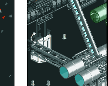
@steve I've been trying to (but failing) to cut down on the amount of architectural detail I use in parks. I peaked it with PoE, but I think now I got it to a level I am comfortable at (and doesn't glitch)
@trav Thanks!
@alex In retrospect I could have make the building a unit taller so that the roof gabled windows don't "touch" the other windows. Thanks though! Good luck
@Stoksy Yeah it's pretty dense, but a nice thing about that is that it forces people to actually rotate the screen to see everything. It's not -too- dense, trust me.
Absolutely amazing. The only thing I would do is to remove the "beyond" panel and the yellow and blue thing over the queue entrance, but that's maybe just me. Can't wait to see more.
Lovely architecture and I'm looking forward to the theme, but like others have said, it's over-detailed and too dense. The thing it's lacking is refinement. Instead of throwing everything onto a building to make an "impressive" statement, try building more purposefully: each trim and deco piece should be essential to the final product, and if it isn't, then leave it out. It'll not only save you time and prevent object limit issues but it'll more importantly clean up your already really strong aesthetic and make it more palatable and pleasing.
Just my suggestion, but I think these bits I highlighted are just a small sample of things that can be simplified / deleted while still being detailed. Remember, not every building edge needs a deco trim or crown molding piece to create an effective, immersive, and most importantly for you, a clean atmosphere.
A small part of me thinks Louis really isn't wrong. I count maybe upwards of six different brick textures, including the path. AC's comment is great advice though, listen to him!
Like I said on Discord, your Intamin design is fantastic because it is clean, its not like you are trying to impress anyone, same with some of your other submissions.
With your contest entries, H2H etc. and this, it seems like you are trying to hard to be the best, and score so high, that you over work everything, and that makes the work suffer.
Give some things some breathing space. Some of the textures here are incredible, but they don't have any space to breath amongst all the others.
 10-April 17
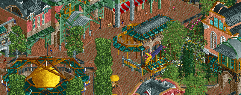


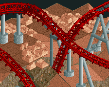
This looks so good. I love the little shooting star sign.
I don't get whats going on with those windows in the top left?
Overall picture is stunning though, nice job.
Yep really phenomenal, my only concern is that the foliage/multi-level archy is going to hide too many details/macro stuff.
Thanks peeps.
@steve I've been trying to (but failing) to cut down on the amount of architectural detail I use in parks. I peaked it with PoE, but I think now I got it to a level I am comfortable at (and doesn't glitch)
@trav Thanks!
@alex In retrospect I could have make the building a unit taller so that the roof gabled windows don't "touch" the other windows. Thanks though! Good luck
@Stoksy Yeah it's pretty dense, but a nice thing about that is that it forces people to actually rotate the screen to see everything. It's not -too- dense, trust me.
Absolutely amazing. The only thing I would do is to remove the "beyond" panel and the yellow and blue thing over the queue entrance, but that's maybe just me. Can't wait to see more.
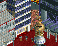
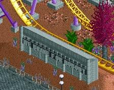
looks overly textured in my eyes.
technically it is very good, but there's no atmosphere and no excitement for me.
The screen makes me want to see more. Technical it is top notch, I think atmospherically it will be better in-game.
Overdetailed mess as always.
Lovely architecture and I'm looking forward to the theme, but like others have said, it's over-detailed and too dense. The thing it's lacking is refinement. Instead of throwing everything onto a building to make an "impressive" statement, try building more purposefully: each trim and deco piece should be essential to the final product, and if it isn't, then leave it out. It'll not only save you time and prevent object limit issues but it'll more importantly clean up your already really strong aesthetic and make it more palatable and pleasing.
Just my suggestion, but I think these bits I highlighted are just a small sample of things that can be simplified / deleted while still being detailed. Remember, not every building edge needs a deco trim or crown molding piece to create an effective, immersive, and most importantly for you, a clean atmosphere.
All a bit too tight, otherwise pretty spectacular.
I love this. I wish I had that level of commitment. Great job, Shogo!
This is also really, really good. Hard to predict a winner of this contest...
I don't find this to be overdetailed at all.
Its not overdetailed, its overtextured. There is literally no plain texture at all, even the path is textured. There's nothing to break it up.
I don't think it's overtextured or overdetailed. I think on a bigger scale, with areas of foliage and water, it'll seem much more refined.
What I would suggest is removing the path under the buildings along the top and using the simple concrete texture.
Like I said on Discord, your Intamin design is fantastic because it is clean, its not like you are trying to impress anyone, same with some of your other submissions.
With your contest entries, H2H etc. and this, it seems like you are trying to hard to be the best, and score so high, that you over work everything, and that makes the work suffer.
Give some things some breathing space. Some of the textures here are incredible, but they don't have any space to breath amongst all the others.