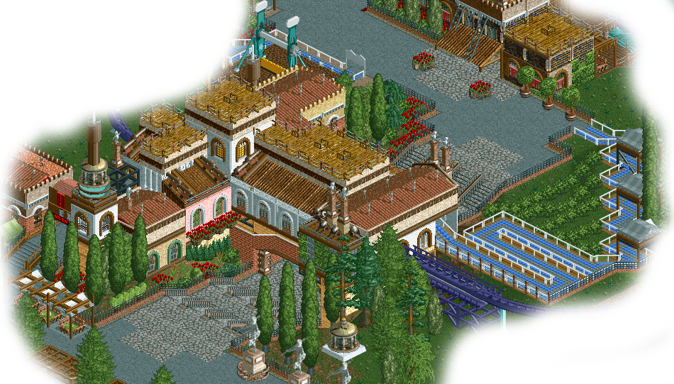
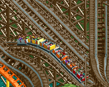
I like the general style and it is well executed. The roofs are a bit weird though. Also I'm not really sure about having the station over the path like that. Also the queue could be better: Having it squeezed in there like that just doesn't fit in my opinion.
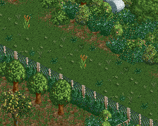
I'm also not really a fan of the choice of grey tarmac here. The path at all doesn't do much to me.
Otherwise solid stuff, 60% for me, good to see some productivity on the TP servers again!
Magnificent! I love the form, the subtle colour differences, the foliage, the atmosphere. This is just perfect. But I doubt that grey crazy path is NCSO... I'm pretty sure it's not.
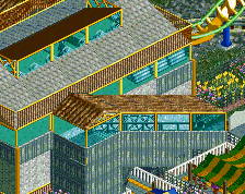
Pizza stalls have never looked better. Overall form of the structure is great also. However, it's kind of a mess too. White walls, pink walls, Roman walls, column walls, flying saucer roofs, path roofs, shingled roofs, observation tower spires... there's so many elements and then it goes even further with having cannons and more gravestones decorating it.
I'm not saying this isn't skillful. It is, and I really do like it still. It has a certain magnetic quality to it that almost forgives the crazy amount of shit going on here. I think this could benefit from having a few elements removed here. The white walls/pizza stall roof is great and I think you should still use it as a base, just remove some of the more superfluous details to clean it up. Keep going!
Agree completely with Steve, damn is that combination of pizza stalls and white/roman walls fucking gorgeous though. Inspired use of graves and small cannons for smoke stacks.
I think it looks great, just the roofs are a bit unnecessary, especially the cannons and the wood/light brown paths. Otherwise, the grass plots could use some more work, but I think it's slightly unfinished?
I don't mind the roofs nor the cannons. The use of cannons is excellent to be honest. Great stuff. I'd suggest to remove the black support structure that gliches through the wall. The other black support structure to the left is quite ugly too. Also, I'd suggest to add some tall trees in the queueing area. Only bushes don't work. Really good job though. Amazing work.
 29-May 17


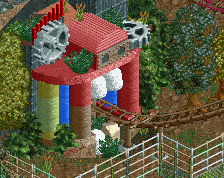
Love the barrel flowers
I'm also not really a fan of the choice of grey tarmac here. The path at all doesn't do much to me.
Otherwise solid stuff, 60% for me, good to see some productivity on the TP servers again!
Yeah really great. I like the station bridging the path, but I think it's an error to have the exit and entrance paths on different sides.
Magnificent! I love the form, the subtle colour differences, the foliage, the atmosphere. This is just perfect. But I doubt that grey crazy path is NCSO... I'm pretty sure it's not.
Strong ncso work as per usual, I'd love to see a fully completed park from you, it'd be a very strong Spotlight contender, perhaps even a shoo-in.
Is this your reddit entry?
No, that's TP S1 dude
I'm not saying this isn't skillful. It is, and I really do like it still. It has a certain magnetic quality to it that almost forgives the crazy amount of shit going on here. I think this could benefit from having a few elements removed here. The white walls/pizza stall roof is great and I think you should still use it as a base, just remove some of the more superfluous details to clean it up. Keep going!
I think the cloned graveyard statues in the underpass aren't really needed.
Gorgeous
So much of it seems pointless and un-needed.
Yeah, some details on the roof is quite questioning..I like the overall atmosphere though. this will be gorgeous with subtle refinements.
I think this is a bit too much and oddly composed. Not feeling it anywhere near some of your other work you've shown.
It looks better in game, even if it's still unfinished. Awesome work.
Agree completely with Steve, damn is that combination of pizza stalls and white/roman walls fucking gorgeous though. Inspired use of graves and small cannons for smoke stacks.
I think it looks great, just the roofs are a bit unnecessary, especially the cannons and the wood/light brown paths. Otherwise, the grass plots could use some more work, but I think it's slightly unfinished?
I don't mind the roofs nor the cannons. The use of cannons is excellent to be honest. Great stuff. I'd suggest to remove the black support structure that gliches through the wall. The other black support structure to the left is quite ugly too. Also, I'd suggest to add some tall trees in the queueing area. Only bushes don't work. Really good job though. Amazing work.