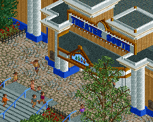
It seems to miss the details that make this minimalist sort of realism style work in your other parks. It needs more stalls, planters, signs...to add some colour and life. On a technical level, this is great stuff, but on a scenic one, it's lacking.
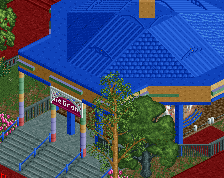
Still looks very Adventureland-ish to me. Love to see you do something else than the CF style, but still in your recognizable realistic style. Looking forward to more.
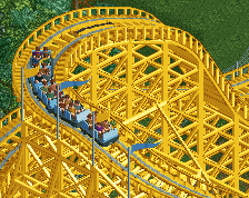
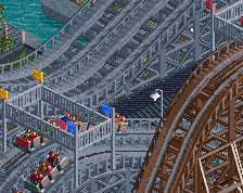
I still think the coaster looks better in green than blue. Blue & black is a combination to avoid anyway
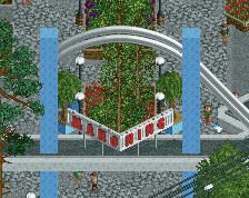
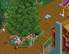
I like this. I just think the top left corner misses some content. Especially the viewpoint (?) looks kind of unfinished. Perhaps some flowers here and there could complete the screen.
I think to quiet the people commenting on the fact that this is dull, you should dust off that Jurrasic theming tab and go to town.
I know on the surface that sounds like the dumbest fucking idea ever, but Adventureland ACTUALLY pretty much just did that around Monster for some nonsensical reason and I 100% approve of this decision...
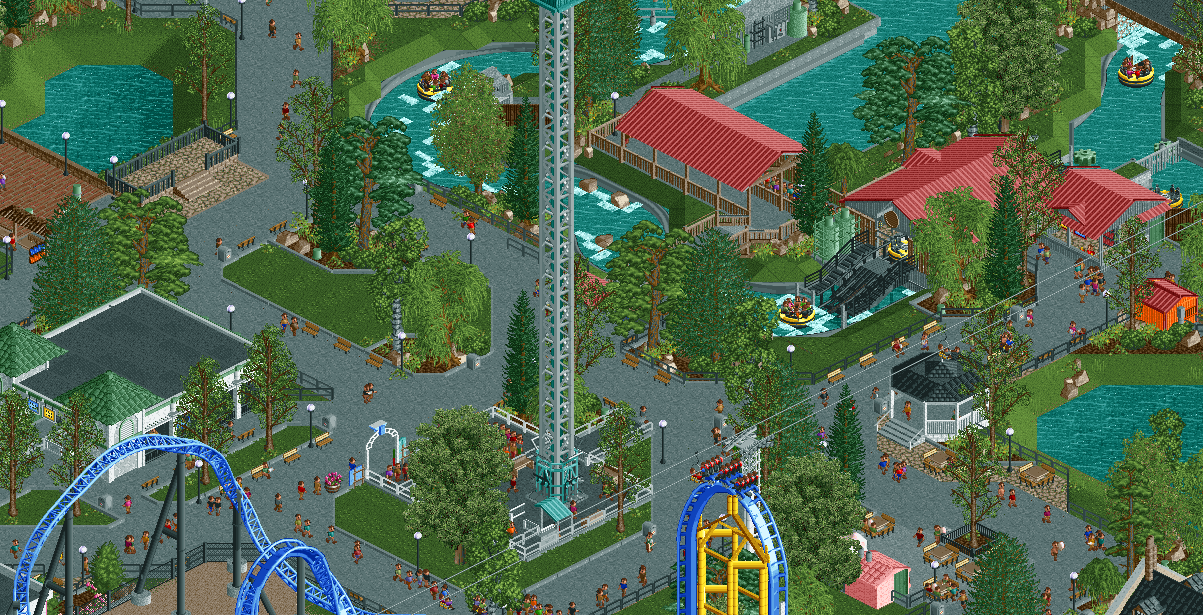
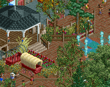
I think the path design is cool and open. The lil courtyard areas work well and look good too. The extra wide water paths are clean and flow smoothly. Maybe some water weeds etc where the corners are clipping could cover up those ares a little better. The red roofs pop nicely as well... The layout reminds me a lot of northwest style parks where less is more.
The paths feel like a mess to me. It seems like a giant mesh with a bunch of holes, but all the interconnection doesn't actually seem to have much benefit.
I also think the drop tower could use some sun shades.
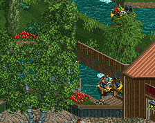
I like the rapids though, and even though the square station is unconventional, it works here.
what gets me about this is while pretty much technically perfect as is most stuff you've shown in the past 6 months, liam's comment about how you build sticks out. i dont know if i like it or not though, but how you build these little pockets all over and web them with path feels somehow off. i cant say if it's authentic or realistic because i dont know jack shit about parks.
As for the path, I think it will make a lot more sense in game. Its really not all that odd or complex, its mostly just the angle and all the diagonals that make it seem like more of a mess than it really is.
However, I will remove some of the grass objects in the open space or do some other patterns with them. I've unfortunately gotten to the point where open grass makes me feel like something is unfinished and is very bothersome to me. This is probably a bad thing.
 23-July 17
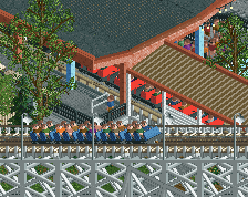
Love the open planters and grass. Otherwise this is a bit of a snoozefest.. sorry. Not much to spark my interest.
It seems to miss the details that make this minimalist sort of realism style work in your other parks. It needs more stalls, planters, signs...to add some colour and life. On a technical level, this is great stuff, but on a scenic one, it's lacking.
Still looks very Adventureland-ish to me. Love to see you do something else than the CF style, but still in your recognizable realistic style. Looking forward to more.
I still think the coaster looks better in green than blue. Blue & black is a combination to avoid anyway
I like this. I just think the top left corner misses some content. Especially the viewpoint (?) looks kind of unfinished. Perhaps some flowers here and there could complete the screen.
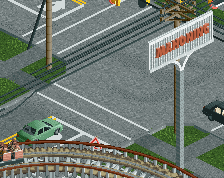
perfectly gritty.
and thankyou for not putting those grassy areas behind railings lol
i think you could do with a few flowers to brighten up the place a little bit, not too much, just a few here and there to add an extra bit of colour.
also, does every patch of open grass need mowing in stripes? lol
I think to quiet the people commenting on the fact that this is dull, you should dust off that Jurrasic theming tab and go to town.
I know on the surface that sounds like the dumbest fucking idea ever, but Adventureland ACTUALLY pretty much just did that around Monster for some nonsensical reason and I 100% approve of this decision...
More fucking Dinosaurs!
Really liking those river rapids. Otherwise, I agree with FredD about the blue and black combination.
I get the dull comments, but that's kinda what Adventureland looks like in real life so...
Bruh... did you not see those Dinosaurs?
I think the path design is cool and open. The lil courtyard areas work well and look good too. The extra wide water paths are clean and flow smoothly. Maybe some water weeds etc where the corners are clipping could cover up those ares a little better. The red roofs pop nicely as well... The layout reminds me a lot of northwest style parks where less is more.
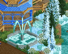
This is my favourite screen you've done tbh.
The paths feel like a mess to me. It seems like a giant mesh with a bunch of holes, but all the interconnection doesn't actually seem to have much benefit.
I also think the drop tower could use some sun shades.
I like the rapids though, and even though the square station is unconventional, it works here.
I like this a lot.
what gets me about this is while pretty much technically perfect as is most stuff you've shown in the past 6 months, liam's comment about how you build sticks out. i dont know if i like it or not though, but how you build these little pockets all over and web them with path feels somehow off. i cant say if it's authentic or realistic because i dont know jack shit about parks.
Thanks guys!
As for the path, I think it will make a lot more sense in game. Its really not all that odd or complex, its mostly just the angle and all the diagonals that make it seem like more of a mess than it really is.
However, I will remove some of the grass objects in the open space or do some other patterns with them. I've unfortunately gotten to the point where open grass makes me feel like something is unfinished and is very bothersome to me. This is probably a bad thing.