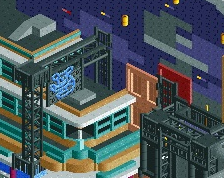
Hmm, something about this just doesn't come together for me like some of the other stuff. Might be the colors and textures, just kind of feels whatever without a specific vision or goal.
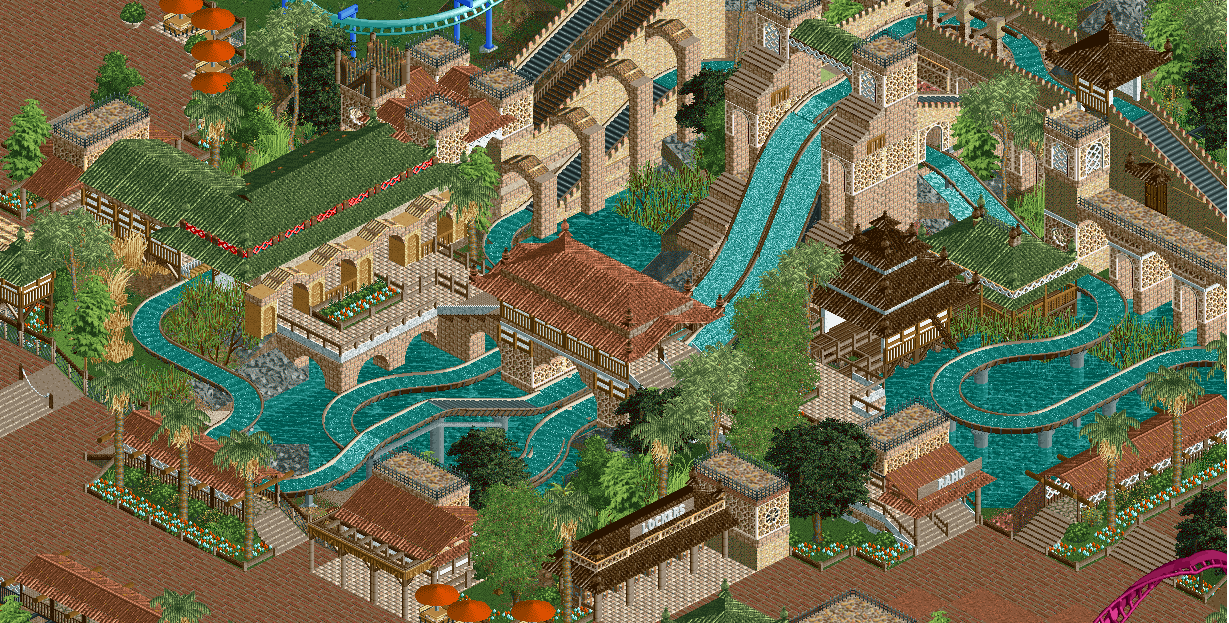
Wonderful, love the atmosphere. Not sure I’m feeling the green roofs. Are they supposed to be moss covered? They blend in a little too much with the foliage.
The path is dead, it needs a few benches and lamps to bring some life from it.
Otherwise, solid screen. Not sure about the station roof though. It looks plain compared to the other buildings, and that red border throws me off, not really fitting to the area.
i had a whole reply written out going into detail as to why i don't like it.
but i can't be bothered to rewrite it as i lost it after removing the stupid tags you'd put in.
basically, the textures and colours merge altogether and it doesn't make for pleasant viewing.
the layout is stupid, big drop - small drop - same big drop again
and its another unfinished screen, just finish something before showing everything you build, just seems a bit pointless constantly seeing unfinished work from this project.
feels too try hard to me. feels sterile and void of any atmosphere.
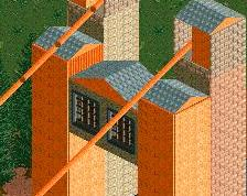
I'm surprised at the lukewarm reception this screen is getting, I think it's among your very best work. I love it. It's unusually clean for you, and it's a great find that those Indian arch walls line up perfectly with 1/8 blocks.
There's one major flaw here, though: the paths. It's always the paths. The peach tiles just don't work. They're too dark, and the colour is too similar to the dark peach roofs you have. The stone theming around the flume has a ton of depth and the front half of the screen with the peach paths and roof has no depth at all.
I think the queue path texture is also a bad choice. It blends in with the brick walls you have everywhere, the texture and colour is too similar.
In short, all path choices suck. I know you want to stick to path blocks... First thing that comes to mind that you can try is gray crazy paving. For both the queue and the main path.
Good work but I'm also not feeling it like the other screens you shared recently. I feel like some of the archy and paths are too bright. Also I think the log flume layout is a bit too complex and despite all the good archy around, it really misses something adventurous overall.
It seems hardly anyone builds flumes in this style anymore. Combined with the subdued colours, the prominent brick textures and the beige tiled path I get a strong LL vibe from this, while at the same time the modern objects, level of detail and generally the quality of the work here lifts this above indulgent nostalgia. That's what I love about this project so far: The density and subject of the theming that channels the spirit, the "look and feel", of the site's old masterpieces, combined with the more contemporary approach to detailing and the level of realism it affords, which makes the park much more believable than some of those golden oldies ever were. A respectful, tasteful and highly skilled update to the classic formula that made this site what it is.
I don't really know why people are disliking this one, it's on par with your mine train screen IMO. Kinda gives me a Rivers of Babylon feeling, and that's always good. I agree with Supra, you should definitely add path props.
Hmm, something about this just doesn't come together for me like some of the other stuff. Might be the colors and textures, just kind of feels whatever without a specific vision or goal.
It's intentionally abstracted. I felt as though trying to make anything super specific or authentic in terms of themes in order for better readability across the park. I'm using the real-life locations as a way to guide me to what colors and textures to use.
Wonderful, love the atmosphere. Not sure I’m feeling the green roofs. Are they supposed to be moss covered? They blend in a little too much with the foliage.
I am afraid to go overly bold on the roof color selection solely because i didn't want anything sans the ride itself to "pop". I think people expect everything to stick out both in color and in composition and people now see it "popping" as a criteria for both, but my goal with this was for only certain things (the rides) to pop out.
The path is dead, it needs a few benches and lamps to bring some life from it.Otherwise, solid screen. Not sure about the station roof though. It looks plain compared to the other buildings, and that red border throws me off, not really fitting to the area.
The path is unfinished, but i disagree with your idea to make the station more extravagant. Again I am being very picky about what things are highlighted in this screen and what arent, and i felt if i did that it would divert attention away from the double drop.
I think the dark red brick path clashes with the area around the ride. I think that's why it doesn't feel as cohesive as your other work.
It doesn't clash; if anything it blends in a little too well. Probably will end up changing paths even though its just to primarily appease ya'll.
In my mind, there's nothing horribly wrong with this other than maybe a few minor decisions with the paths. There's also nothing particularly interesting about this compared to other screens of the park. It either feels very similar or rather void of atmosphere. I'm sure peeps would help, but I'm struggling to articulate why it feels somewhat sterile to me. You mention having the ride "pop" but I don't think it quite does for me any more than the architecture; perhaps that's where I'm struggling.
I think I quite like it. theres some really nice moments in there, especially those buildings on the water and the double drop. quite old school compositionally. I think you just need to make sure that everything works on the macro- its sort of hard to tell from screens but I'm slightly worried about it all coming together as a whole.
Well, I think this is beautiful. I really like the textures and think all the colours work well together. I also think the layout is great, with plenty of twists, turns and drops, but without being too spaghetti-like. The double drop is impressive and the queue - as seems to be a prominent feature of your late work - has great interaction and placement.
For some reason this doesn't work for me either. The colours don't really want to play, and the composition is something crammed with a path around it. Of course this has so many of your beautiful qualities as always, but I too find it a bit forced. Like you didn't enjoy yourself when building.
 05-December 17


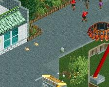
The path is dead, it needs a few benches and lamps to bring some life from it.
Otherwise, solid screen. Not sure about the station roof though. It looks plain compared to the other buildings, and that red border throws me off, not really fitting to the area.
Dem tags.
I think the dark red brick path clashes with the area around the ride. I think that's why it doesn't feel as cohesive as your other work.
Dang, Shogo, you're working quicker than I am with Redlynch Heights...then again, everyone is quicker than me with that crap..lol
Another quaint, lovely screen, but I am also finding that something is clashing with this screen. I agree with Iron Rattler on that.
Apart from that, lovely work!
I like the inclusion of WW objects. They fit here.
i had a whole reply written out going into detail as to why i don't like it.
but i can't be bothered to rewrite it as i lost it after removing the stupid tags you'd put in.
basically, the textures and colours merge altogether and it doesn't make for pleasant viewing.
the layout is stupid, big drop - small drop - same big drop again
and its another unfinished screen, just finish something before showing everything you build, just seems a bit pointless constantly seeing unfinished work from this project.
feels too try hard to me. feels sterile and void of any atmosphere.
I'm surprised at the lukewarm reception this screen is getting, I think it's among your very best work. I love it. It's unusually clean for you, and it's a great find that those Indian arch walls line up perfectly with 1/8 blocks.
There's one major flaw here, though: the paths. It's always the paths. The peach tiles just don't work. They're too dark, and the colour is too similar to the dark peach roofs you have. The stone theming around the flume has a ton of depth and the front half of the screen with the peach paths and roof has no depth at all.
I think the queue path texture is also a bad choice. It blends in with the brick walls you have everywhere, the texture and colour is too similar.
In short, all path choices suck. I know you want to stick to path blocks... First thing that comes to mind that you can try is gray crazy paving. For both the queue and the main path.
It seems hardly anyone builds flumes in this style anymore. Combined with the subdued colours, the prominent brick textures and the beige tiled path I get a strong LL vibe from this, while at the same time the modern objects, level of detail and generally the quality of the work here lifts this above indulgent nostalgia. That's what I love about this project so far: The density and subject of the theming that channels the spirit, the "look and feel", of the site's old masterpieces, combined with the more contemporary approach to detailing and the level of realism it affords, which makes the park much more believable than some of those golden oldies ever were. A respectful, tasteful and highly skilled update to the classic formula that made this site what it is.
I heartily disagree with Liam about the paths.
It's intentionally abstracted. I felt as though trying to make anything super specific or authentic in terms of themes in order for better readability across the park. I'm using the real-life locations as a way to guide me to what colors and textures to use.
I am afraid to go overly bold on the roof color selection solely because i didn't want anything sans the ride itself to "pop". I think people expect everything to stick out both in color and in composition and people now see it "popping" as a criteria for both, but my goal with this was for only certain things (the rides) to pop out.
The path is unfinished, but i disagree with your idea to make the station more extravagant. Again I am being very picky about what things are highlighted in this screen and what arent, and i felt if i did that it would divert attention away from the double drop.
It doesn't clash; if anything it blends in a little too well. Probably will end up changing paths even though its just to primarily appease ya'll.
I'll reply to the rest later
Interesting 50/50 reception on this one.
In my mind, there's nothing horribly wrong with this other than maybe a few minor decisions with the paths. There's also nothing particularly interesting about this compared to other screens of the park. It either feels very similar or rather void of atmosphere. I'm sure peeps would help, but I'm struggling to articulate why it feels somewhat sterile to me. You mention having the ride "pop" but I don't think it quite does for me any more than the architecture; perhaps that's where I'm struggling.
I think I quite like it. theres some really nice moments in there, especially those buildings on the water and the double drop. quite old school compositionally. I think you just need to make sure that everything works on the macro- its sort of hard to tell from screens but I'm slightly worried about it all coming together as a whole.
not sure but the colors feel off
Well, I think this is beautiful. I really like the textures and think all the colours work well together. I also think the layout is great, with plenty of twists, turns and drops, but without being too spaghetti-like. The double drop is impressive and the queue - as seems to be a prominent feature of your late work - has great interaction and placement.
For some reason this doesn't work for me either. The colours don't really want to play, and the composition is something crammed with a path around it. Of course this has so many of your beautiful qualities as always, but I too find it a bit forced. Like you didn't enjoy yourself when building.