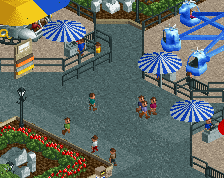
the way you're laying things down feels so disjointed. its like you're making islands in the path and putting things in said islands. generally, it's better to do the opposite.
the way you're laying things down feels so disjointed. its like you're making islands in the path and putting things in said islands. generally, it's better to do the opposite.
I was actually going to mention this on Discord. I agree with the sentiment about creating path islands; it's something I've seen a lot on OpenRCT's multiplayer, and it makes parks feel too artificial - if that makes sense.
Oh wow, this is giving me vibes of one of Fluxtrance's old rct2 projects. I'm quite excited for this park, the whole industrial theme looks beautifully done.
the way you're laying things down feels so disjointed. its like you're making islands in the path and putting things in said islands. generally, it's better to do the opposite.
I was actually going to mention this on Discord. I agree with the sentiment about creating path islands; it's something I've seen a lot on OpenRCT's multiplayer, and it makes parks feel too artificial - if that makes sense.
I was thinking the same. I actually didn’t build it that way, the rides were there before the paths were built, it’s just how it’s turning out now. I’m thinking there’s some ways I might be able to help, maybe reducing the low wall usage, adding some larger foliage, and accentuating regions where rides cross over the path (happens in more places, just not obvious in this screen. My foliage is rather thick and overgrown, and then the paths are just big swatches if nothing, and it’s giving it that effect of looking like an island. I’ll try to make the integration a bit better.
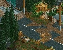
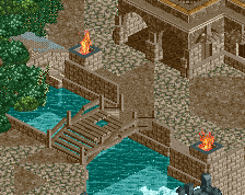
The smokestack for the tiny furnace? Maybe I should change it’s color if it’s blending in with the supports too much....
Oh that's what it is. If I were you I'd either change the color or look for a different object to use there. The glossy look of the supports doesn't fit a smokestack.
the way you're laying things down feels so disjointed. its like you're making islands in the path and putting things in said islands. generally, it's better to do the opposite.
This is exactly how I feel looking at this. There's so much path, that it encapsulates an area probably isn't too appealing to me. The work that is here is very well done, but I'd stay away from "islanding" your rides/areas. Keep up the good work, though!
looking back at this screen, i want to add that the foliage, fencing options, your blocky queue design, and how far you're unneedingly seperating your path from the coaster makes this feel a lot worse than it actually is. please dm me a more modern screen of this; you have the raw skill of a great player but you need help in terms of refining it.
 25-January 18
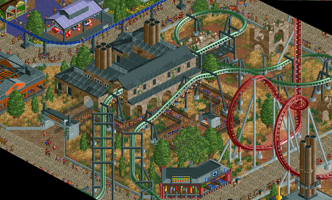
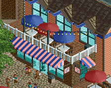
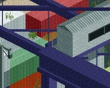
I like the juxtaposition between the newer factory and the older ruins, and those midway game stalls are spot on
the way you're laying things down feels so disjointed. its like you're making islands in the path and putting things in said islands. generally, it's better to do the opposite.
I was actually going to mention this on Discord. I agree with the sentiment about creating path islands; it's something I've seen a lot on OpenRCT's multiplayer, and it makes parks feel too artificial - if that makes sense.
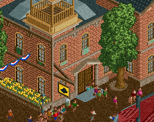
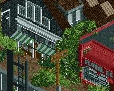
that station building is so great
I was thinking the same. I actually didn’t build it that way, the rides were there before the paths were built, it’s just how it’s turning out now. I’m thinking there’s some ways I might be able to help, maybe reducing the low wall usage, adding some larger foliage, and accentuating regions where rides cross over the path (happens in more places, just not obvious in this screen. My foliage is rather thick and overgrown, and then the paths are just big swatches if nothing, and it’s giving it that effect of looking like an island. I’ll try to make the integration a bit better.
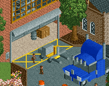
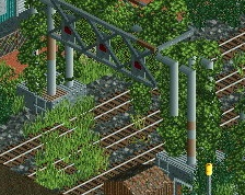
What's up with the vertical support not connected to the track in the middle of the queue?
The smokestack for the tiny furnace? Maybe I should change it’s color if it’s blending in with the supports too much....
Oh that's what it is. If I were you I'd either change the color or look for a different object to use there. The glossy look of the supports doesn't fit a smokestack.
This is exactly how I feel looking at this. There's so much path, that it encapsulates an area probably isn't too appealing to me. The work that is here is very well done, but I'd stay away from "islanding" your rides/areas. Keep up the good work, though!
The composition of the path layout is a bit problematic, it feels very square. Also it feels very plain and the colors are smothered.
I think you can do better than this because the station itself is super nice !
looking back at this screen, i want to add that the foliage, fencing options, your blocky queue design, and how far you're unneedingly seperating your path from the coaster makes this feel a lot worse than it actually is. please dm me a more modern screen of this; you have the raw skill of a great player but you need help in terms of refining it.