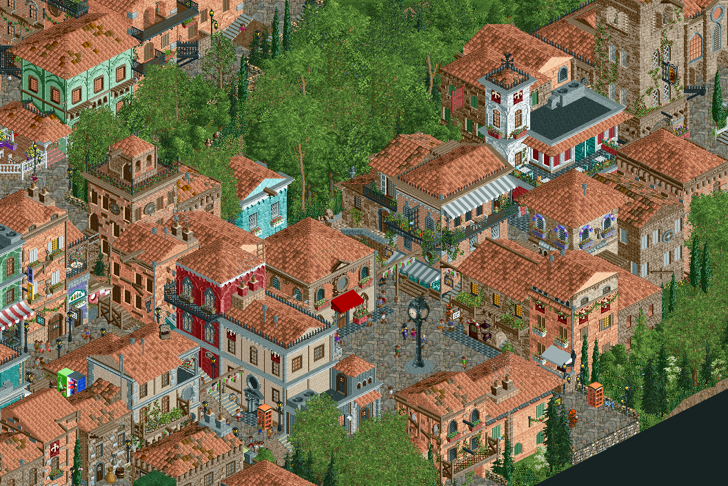
Screenshot / Zaccanapoli II
-
 07-February 18
-
Zaccanapoli
-
2 of 4
- Views 2,780
- Fans 11
- Comments 21
-
Description
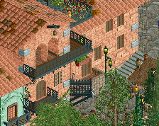
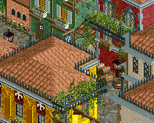
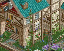
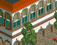
With Carnevale right around the corner, the festivities are well under-way. Various artists come from around the country to display their extravagant attires in the only town in all of Italy that celebrates Carnevale as hugely as Venice herself!
Happy awards season, everyone. -
Full-Size
-
11 fans Fans of this screenshot
-
Tags
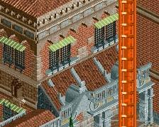
this is fantastic! feels just like a city. could we get more variation in roof colour though? one or two different colours splashed in will make the world of difference
I love it! The use of unusual objects makes it all even better. Echo Sammy about the roofs.
Did you know that the carnevale in Venice was only reintroduced in 1979 as a tourist attraction instead of being a cultural phenomenon that has been present throughout the centuries?
Aside of that it's an absolutely brilliant screen!! So so good, I really love it. Amazing ability in architecture and atmosphere.
Oh and I completely disagree about the roof color variation. Look at a satellite image of Venice, guys. It doesn't have roof color variation aside of at the doge's palace.
My biggest remaining question is: Where are the canals, and if you want to be true to Venice, then you've almost already got too much variation in building height, ground height and too few straight paths.
That said, this looks much better in RCT2.
Haha, I'm very intrigued to know that, Fisch! Assassin's Creed taught me wrong?
I'm sure more people will express concern about the roofs, so I'll address it right now. This is about as much as I wanna try to keep roof variation right now. The fact I found that roof object in the NE database is already a blessing to me, as I was really unsure. If there is too much of a public consensus leaning towards more variation, I guess it'd be hard not to do it.
On an off-note, tips on the foliage would be greatly appreciated.
Keep 'em coming!
[PS: This isn't directly supposed to be Venice. I just drop that name so that I have an excuse to bring more colours to the buildings because otherwise, I'd have a brown and tan blob of bricks, something I find to be the general image for a lot of Italian hill towns going by Google Images]
real life =/= good rct
I'm not sure about the path choice, I get why you use it but the texture is just too repetitive. Besides that this looks spectacular! So lifelike. Wonderfully lush foliage. You even made that clock object look good!
This is great. I love to explore all the details and the white tower on the right might be one of my favorite ones from what i've seen lately overhere. I'm not sure about your path and foliage textures though, maybe try to keep these a bit less busy, so the buildings can pop out more. The viewer might be able to read your stuff much better then.
I love this work. It nails the cramped Italian village theme well. It looks very good; especially how each building seems to each have its own character.
Keep up the stellar work!
That light blue building. My god
Awesome! Has a very mediterranean feel to it.
my beef right now is the texture balance. everything is textured on this screen which means that if feels too overhwhelming. one simple thing would be to choose a dofferent path type instead of that heavily textured stone (love the black tile path tho omg) and to cull maybe 1-2 texures more out of the picture.
The foliage is so good here. What I think about the roofs is that not the color but the shape should be changed, or be considered having changed. They're all pretty much rectangular and all look pretty similar. Keep it up, this is really good.
Wild style you're developing with these unusual textures. I love it.
@mintliqueur: Maybe that path texture has just grown too much on me through the months for me to give it up, man, but I don't think I'll be changing it. I'm glad you have nice things to say about the foliage!
@RWE: Do you have anything specific I can work with for the foliage, my dude? Sorry, I just couldn't find much better I could do after that advice you gave on the TP Discord, and I did try that tree you showed me, but finding similar textures to use with it turned out to be hard. Thanks a lot, man! I hope it's not too much of a bother.
@Shotguns?: So are you on the 'more variation' side or the other?
Also, thank you for the texture thing. I can work with that, and I think I agree to a minimal extent. Gonna be a challenge without changing the path (there is no better alternative to it for me that maintains this accuracy and atmosphere).
@Impulse: Yeah, I agree 100%, man. The roof shapes are mostly my inability to move away from this scale. Doing less 2x2s/2x3s is harder than I thought. I'll play around with more shapes. I am glad the foliage isn't an issue, though!
Thanks to you all for the kind words so far!
For my taste it's basically too much of the same green but in different textures. i think mixing it up a little with other shades would be better in my point of view. Looking at other comments overhere, i might be alone with that opinion though and you shouldn't change something haha
this is bad ass!! i would love to see 360 degrees around this. you made the scale work for you and the little accents make this a home run!
truly impeccable. the foliage blows me away.