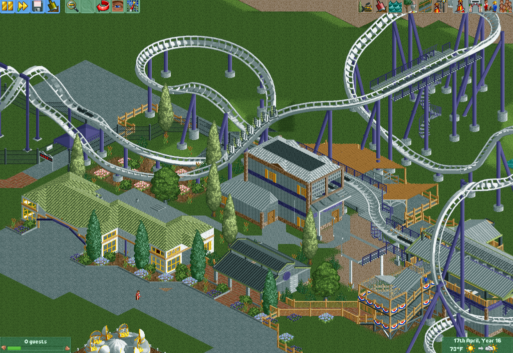
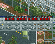
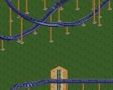
Overall I like it, I'm a sucker for realism. Looks like it could be a solid layout.
Couple minor things, but i do see this is unfinished so take it with a grain of salt. At the top of the screen the support doesn't match up with the actual track. Right now the stairs down from the brake section dont lead to anywhere, in my opinion the should be a little maintenance path there. Transfer track doesn't do it for me, looks really undersupported. One of the triangle tarmac path pieces has a glitch that may be able to fixed with the tile inspector in OpenRCT.
As far as actual changes the roofs are too light in my opinion. Id just make it all black to match the bottom building, I don't know play around with colours. Not convinced what you have is the best combination right now.
Layout looks really beautiful, very nicely drawn curves. I also dig the sparse foliage, good object selection. What lets this down is the transfertrack, which isn't particularly realistic, and unfortunately I can't really see a way to solve that without spoiling the beauty of the composition a bit...
The white roof color is a bit distracting, but this is definitely a nice start. Definitely watch your building scale though, some of them seem a bit low.
Overall I like it, I'm a sucker for realism. Looks like it could be a solid layout.
Couple minor things, but i do see this is unfinished so take it with a grain of salt. At the top of the screen the support doesn't match up with the actual track. Right now the stairs down from the brake section dont lead to anywhere, in my opinion the should be a little maintenance path there. Transfer track doesn't do it for me, looks really undersupported. One of the triangle tarmac path pieces has a glitch that may be able to fixed with the tile inspector in OpenRCT.
As far as actual changes the roofs are too light in my opinion. Id just make it all black to match the bottom building, I don't know play around with colours. Not convinced what you have is the best combination right now.
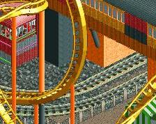
Oh that support looks terrible, can't believe i didn't notice that haha thanks for the suggestions all
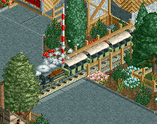
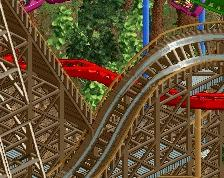
Looks really good as a base so far, if a bit dull perhaps. Needs more finish and life but I'm sure with the addition of peeps, stalls, lights, benches and the like, you'll fix that. Good screen!
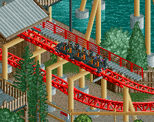
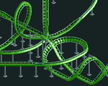
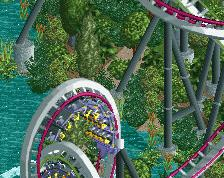
Here's the other project I've been working on. It's a B&M sitdown coaster with 6 inversions and a top speed of 59/mph. Would love to get your thoughts on this. :)
 12-September 18
Overall I like it, I'm a sucker for realism. Looks like it could be a solid layout.
Couple minor things, but i do see this is unfinished so take it with a grain of salt. At the top of the screen the support doesn't match up with the actual track. Right now the stairs down from the brake section dont lead to anywhere, in my opinion the should be a little maintenance path there. Transfer track doesn't do it for me, looks really undersupported. One of the triangle tarmac path pieces has a glitch that may be able to fixed with the tile inspector in OpenRCT.
As far as actual changes the roofs are too light in my opinion. Id just make it all black to match the bottom building, I don't know play around with colours. Not convinced what you have is the best combination right now.
Layout looks really beautiful, very nicely drawn curves. I also dig the sparse foliage, good object selection. What lets this down is the transfertrack, which isn't particularly realistic, and unfortunately I can't really see a way to solve that without spoiling the beauty of the composition a bit...
The white roof color is a bit distracting, but this is definitely a nice start. Definitely watch your building scale though, some of them seem a bit low.
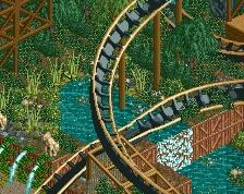
That looks like a delightful layout
Oh that support looks terrible, can't believe i didn't notice that haha thanks for the suggestions all
Looks really good as a base so far, if a bit dull perhaps. Needs more finish and life but I'm sure with the addition of peeps, stalls, lights, benches and the like, you'll fix that. Good screen!