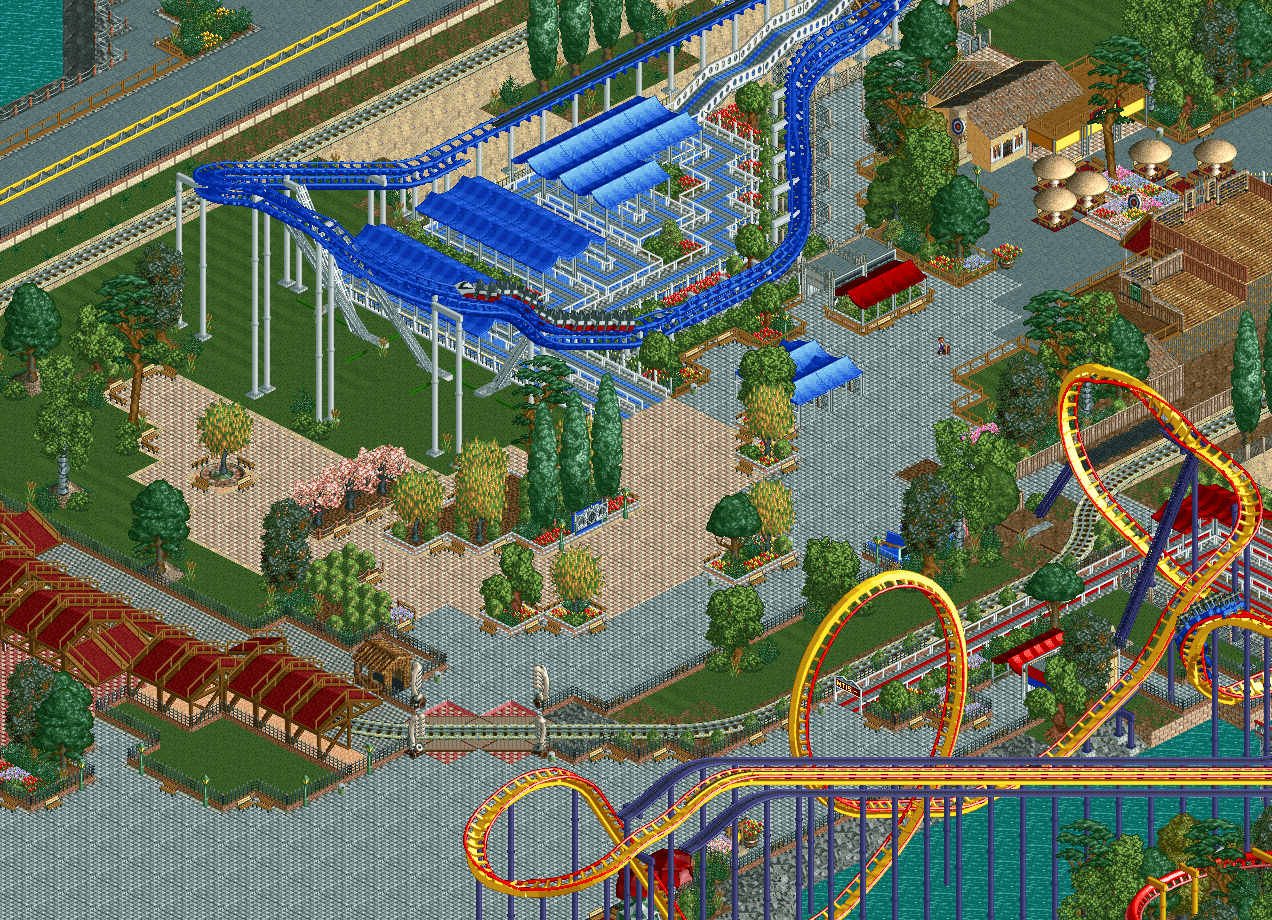
Neat stuff in here. Very post-modern school. For my money it's a noble effort but just .. doesn't look all that great. I can appreciate it as a recreation, I can appreciate the hack showcase, I can appreciate the ingenuity to try and achieve some of the realism details, but I think for me personally you're forced to make an unhappy compromise between a photorealistic park (for which you'd probably be better in 2) and a park that looks good in the constraints of LL, for which you'd probably have to abandon details like box track, catwalks, and a sea of tile pavers.
i only agree with intamin in the bottom chunk of the screen. I think all of the open grass and grey-tiled areas work really well aesthetically. I'm just not a huge fan of the the rocky slope to the water near mantis and the surroundings there, or the huge path chunk directly below the train station. That said, you're going for a rec, so I'm sure you're doing the best reasonable job with that
]['s, Cocoa's and anyone's criticism here is reasonable, but I also think that this project is rather unique and that's worth preserving. I'm actually hesitant to give any feedback. I want to see this thing in its purest form.
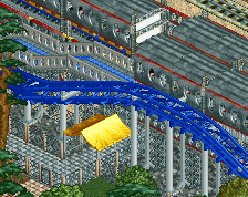
Wow, MF really does look fantastic, as does the area around it.
The lower half of the screen might need a bit of work, I think you can probably shave some path off around train crossing and lower bit. There's a little food shop right under the Mantis turnaround and across from the train crossing which would definitely help.
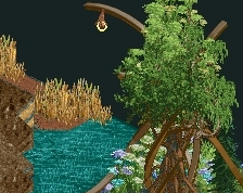
Very strange to see, but also refreshing, and definitely enjoyable. Somewhat forcefully realistic detailism, but then thankfully a good balance thanks to some bare tiles, sufficient amount of path, and unassuming architecture. I also like the composition of this.
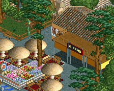
I love it, huge fan of this. I think this has a awesome atmosphere, instantly recognizable as the point. Best part of the screen for me is the panda express with the mushroom tables. There is too much grey path in the bottom of the screen as previously mentioned. But don't let that overshadow the quality of this screen.
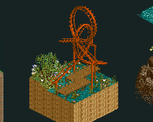
I wish it wasn't so flat! But I guess that's the way it really is. Kudos to you for attempting realism in LL (and pulling it off quite well). To me it looks like pierrot with color and more natural foliage. Also if you could get peeps in here it would help a ton.
thanks everyone for the comments
the path is definitely too wide at the bottom. i also added the dj booth in the queue after someone on reddit pointed out that it was missing
Also if you could get peeps in here it would help a ton.
thats the plan! but im not worrying about it until the map is more complete
 03-June 19
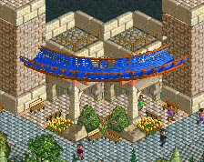
Neat stuff in here. Very post-modern school. For my money it's a noble effort but just .. doesn't look all that great. I can appreciate it as a recreation, I can appreciate the hack showcase, I can appreciate the ingenuity to try and achieve some of the realism details, but I think for me personally you're forced to make an unhappy compromise between a photorealistic park (for which you'd probably be better in 2) and a park that looks good in the constraints of LL, for which you'd probably have to abandon details like box track, catwalks, and a sea of tile pavers.
i only agree with intamin in the bottom chunk of the screen. I think all of the open grass and grey-tiled areas work really well aesthetically. I'm just not a huge fan of the the rocky slope to the water near mantis and the surroundings there, or the huge path chunk directly below the train station. That said, you're going for a rec, so I'm sure you're doing the best reasonable job with that
The lower half of the screen might need a bit of work, I think you can probably shave some path off around train crossing and lower bit. There's a little food shop right under the Mantis turnaround and across from the train crossing which would definitely help.
Looking great though.
Quite enjoyable. Definitely looks like CP.
Millennium Force is a fucking nightmare in RCT so I'm really interested to see how this turns out.
looks great, but i agree that bottom left half is questionable
Very strange to see, but also refreshing, and definitely enjoyable. Somewhat forcefully realistic detailism, but then thankfully a good balance thanks to some bare tiles, sufficient amount of path, and unassuming architecture. I also like the composition of this.
I love it, huge fan of this. I think this has a awesome atmosphere, instantly recognizable as the point. Best part of the screen for me is the panda express with the mushroom tables. There is too much grey path in the bottom of the screen as previously mentioned. But don't let that overshadow the quality of this screen.
I loved
I wish it wasn't so flat! But I guess that's the way it really is. Kudos to you for attempting realism in LL (and pulling it off quite well). To me it looks like pierrot with color and more natural foliage. Also if you could get peeps in here it would help a ton.
the path is definitely too wide at the bottom. i also added the dj booth in the queue after someone on reddit pointed out that it was missing
thats the plan! but im not worrying about it until the map is more complete