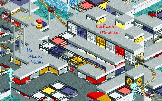
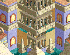
Screenshot / The Masters Palette - Modern Canvas
-
 23-July 19
-
The Masters Palette - RCTM #20
-
1 of 10
- Views 1,610
- Fans 0
- Comments 12
Community Forum Software by IP.Board
We've all know Escher Island for a while... I think it's amazing that we''re getting to see the companion pieces now. Is this new or old work?
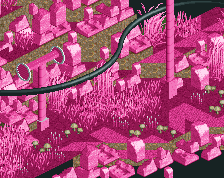
Mondriaan is probably from 2003 if I were to guess...I think I did it either 1st or 2nd of my 3, now 4 sections.
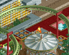
Everything in the MP is predominantly from 2003-2005, especially the ages of the benches and limited custom objects which date back to Jan 2003 with very little to no parkdat usage. I don't have a strong enough memory to remember which month the first custom scenery objects were ever released, but there are scant 1/4 tile blocks here. The basic variety, nothing fancy like art deco, Fisch lattice or flanges.
Mama Bear might have fine tuned some sections in 2010, but none of this has been released with the exception cBass carving out his island, which as I said before is completely understandable. I just look forward to others seeing the other artists on the original map and how it flows from top to bottom...nevermind the other 3.
This project isn't NCSO, but due bench/obj ages, I'd call it "Limited CSO". These are OLD benches.
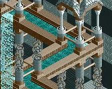
The only NEW section is from this past month where I am filling in the lone abandoned section on the Modern Canvas that was supposed to be Duchamp by d4rkj4nu5, and by 2010 via e-mail I almost came out of retirement to do the section, but with adifferent "artist".
No screens public on it yet, just 3 ppl have seen the last section privately...maybe release one as I get towards the end of it. I am still going with the artist that Mama Bear and I had agreed on, as hard as that is...
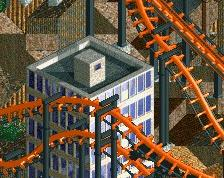
Note: in the spirit of the old benches, while I am using OpenRCT2 to build, and use minor zero clearance hacks, I AM NOT upgrading the scenery, and will work with the same pieces my peers and I did.
Thanks for the interest!
hpg Offline
Color me intrigued.
Definitely hoping to see some special fountains in the Duchamp area. ;-)
edit: Just realized you were saying the Duchamp area will be a different artist instead. I guess that might be for the best since I'm not sure what I'd do for that other than a bunch of urinal-shaped fountains.
hpg Offline
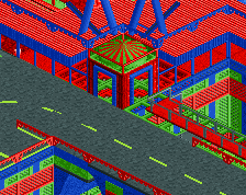
I'd be curious to see this with the lighter shade of blue by the way—the darker blue might be a bit too purple for Mondrian.
In this case the Duchamp idea was dead probably in 2005 and rotted while I went offline. I have looked at his art and quickly moved away to something not necessarily easier, but that is something I would rather try as a challenge and a bit different approach to the "artist".
I can look at other blue for Mondriaan, but likely it won't change cos I am not here in 2019 going to repaint over the initial impression version from 15yrs ago...likely I tried both at the time, neither are perfect cos this is stock RCT2 color palette (also not changing) and I liked this blue better than the others....my choice as artist for this version...but I might look tonight anyway out of curiosity.
I like both, but have lived with it for 15 as the darker.
Maybe I will ask James for his opinion also. This would be an easier fix than other areas to recolor, so if.... IF any color changes, this is it. I am not going to tweak my other 2 completed areas at all unless something isn't named or I missed a key path. Things like that...this is an impression of art via RCT2 after all, but for this color is important even more than the other artists I chose.
Maybe I will take a screen with both on it and put here tonight...
I like this purple/blue. There is not one exact shade used in De Stijl, this one fits. In my mind it has always been dark blue, and not purple, anyway.
What I found after testing and discussing with oldest son is that we like the deep purple on the glass, but the royal blue better on hard services, such as the gears shown here, or railings, marble flat surfaces, etc in others (not shown). So in the end, both with will exist where it makes sense to me.
The idea being that while primary colors were the main used, decades pass...paint fades with light, can darken with age/grime...
I usually treat deep purple in RCT as a dark blue also...cobaltish.
hpg Offline
Its just always sort of bugged me how the darkest blue in RCTs standard palette is right on the edge somewhere between blue and purple where the color is really susceptible to shifting from one monitor to the next.
Certainly not a huge deal either way. I was mostly just curious to compare the two.
edit: Missed your reply while I was typing mine. It sounds like thats a good route to take. Different objects make the colors appear a bit different as well so there might not be a single ideal color to use for everything.
If anything, I might have been on a monitor 15 yrs ago where the color settings on the monitor made it look more dark blue than purple, compared to those I am using now.
Either way, considerring the artist used different blues and different surfaces take paint and reflect it in different tones, I like the idea that I now have both logically.
I am not here to retweak 15 yr old sections, but in this case it was the right call and simple to do. Credit is on you for bringing it up, hpg.
Thanks.
I always liked this section. Thank you for bringing this park back to life. I can't wait to see it finished.