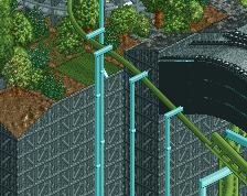
Screenshot / I don't even know why i made this.
-
 03-December 14
-
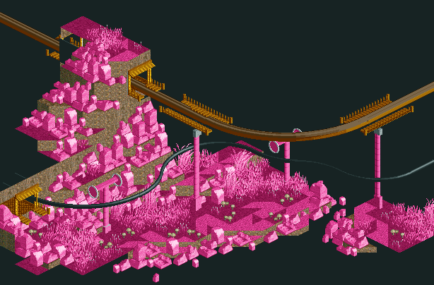
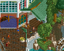
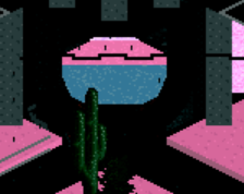
Abstract art park
-
1 of 4
- Views 2,360
- Fans 1
- Comments 16
Community Forum Software by IP.Board
I honestly think this is quite interesting.
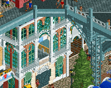
Did you know that there are colourable land blocks?
I didn't know that, but working with the flat rooftiles and some other basic blocks works fine too. I mean, it's hard to tell the difference between textures when everything's the same colour...
Some of your best work tbh.
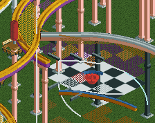
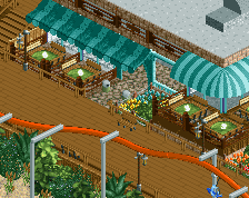
I'm not saying it cause it's different or fantasy or whatever, I think you've finally taken the time to work out what looks good and what doesnt, the foliage (albeit being pink) you've clearly given some thought to. What you've placed together is nice and natural. The interaction between the coaster and the monorail and the use of the supports is also well done.
Generally, the composition of the screen is very good.
Great work, keep it up.
Very FK inspired.
Where are you going with it? is it going to be a fully surreal design/park, or is it more like a section or component of a park?
^
yes indeed yeah, not only inspired by me downloading his parks yesterday, but also by a few abstract paintings i did at drawing lessons. Maybe pics of that later. I'm thinking of making this a section of a park, ofcourse everything else won't be as weird or pink or anything.
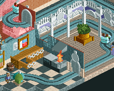
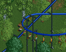
More progress:
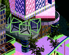
Art i made:
^I liked the contrast of the black suspended version better.
I think Liampie was more referring to the cliff faces being colourable...
I'm not entirely sure what I'm looking at, but it's certainly interesting. Definitely go with the black contrast for the suspended track.
GUYS GUYS ANOTHER PERSON DOING THE WEIRD SURREALIST ART THING! NOW IM NOT ALONE! ONE IS A LONER, TWO IS A TREND!!
Gotta say this is looking pretty cool, though taking it to the next level would be doing some color blending and multiple layers of color, rather than just one sea of pink. The forms are cool though, def an improvement from ur other work
Also should mention, being the only person to really do this style, its super weird seeing someone else try it.....
welcome to the pink landscape club
we approve of this project
can we please open an art topic please.
Its right here nin
http://www.nedesigns...ark/2806/swoon/
For real though
http://www.nedesigns...artment/page-23
Whow, thanks for the comments! Yeah, i'm going with black. The white track is just white because i'm going to toggle chain on them when the ride is finished and i forgot to set the colour to black for the screen. I'll definitely try to see what additional colours i could fit in.
I don't think you need any additional colours apart from the one main colour and then the black/gold work to break up the monotony.
I think this should definitely be a section of a larger park like you say, but please make the rest of the park follow a similar idea
I think it looks better though with extra colours.
I suppose it does and it relates to your painting more with the colours you've chosen.
I just meant you have to be careful over which colours to choose as it could effectively ruin the composition of the screen, but you've gone down the right route and made it even better.
Keep on going!