This is such a great atmosphere. Man, now I want to go to the Mediteranea. Just make sure they pour their excellent wine into gross glasses and have the waiter walk extremely slow for proper detailing.
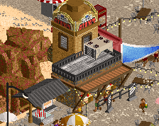
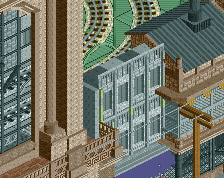
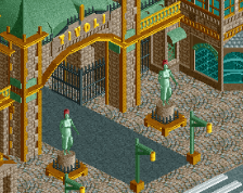
Really nice! That white building is hottt. Not sure about those big white arches on the building in the center though, feels like they stand out too much and like they’d need another unit to fit size wise. Also I’d add some thickness to the archways of the ticket booth, just like you did with the archways of the building on the right. Overall excellent stuff though!
So lovely RWE, and very much like you. Perhaps you must live in Italy later in your life Love the warm atmosphere and the look of the paths. Curious to see what you have planned with this project.
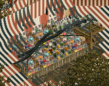
To build on dirt's suggestion to drop the black squares, you could try to use the flat grass texture object (colored grey) instead, to give the road some textural variability and make it look less perfect/more worn. It's more subtle but I often find it to work well, not only on roads but on any kind of large, single-colored surface where you want imperfections and variation.
 31-May 20
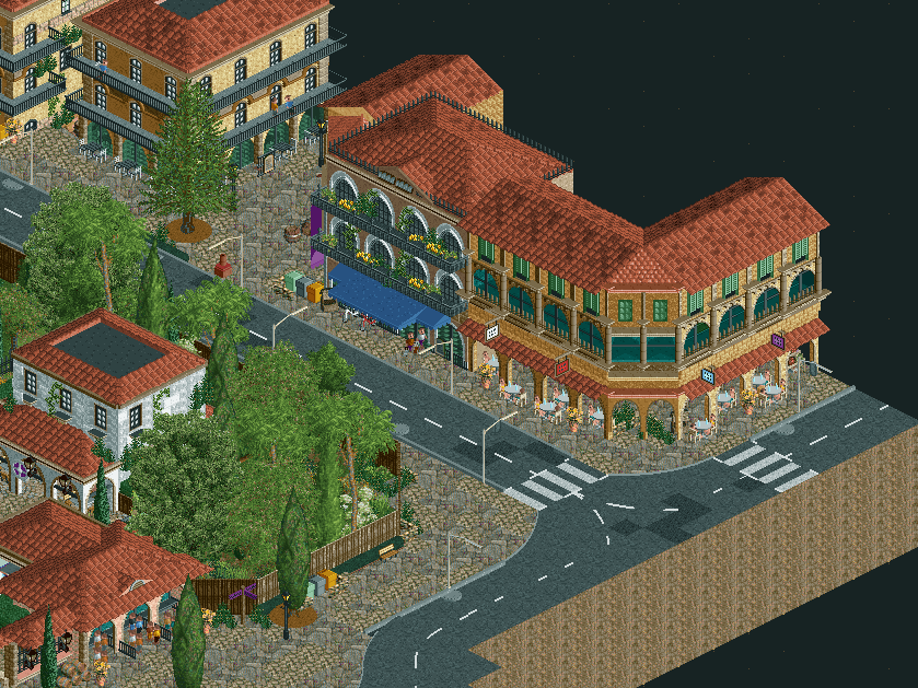
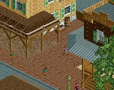
thats some sexy stuff and some cool textures
That's some real cool and atmospheric archy. And the textures are neat too! Great stuff!
not sure if I like those big rock paths.. Looks a bit repetitive. Buildings are sweet though!
Tbh I'm not that big a fan of the path textures... But if the rest likes tem, fine. Great work RWE, you've nailed the atmosphere!
Got that hot map edge. Seriously though, this is lovely. I think you've managed to blend in that ugly path decently so it doesn't look bad.
I love the archy dude. I'm not sure if I like the paths or not.
This is such a great atmosphere. Man, now I want to go to the Mediteranea. Just make sure they pour their excellent wine into gross glasses and have the waiter walk extremely slow for proper detailing.
So lovely RWE, and very much like you. Perhaps you must live in Italy later in your life Love the warm atmosphere and the look of the paths. Curious to see what you have planned with this project.
Many different textures, but it works. Very nice screen!
Very atmospheric. The spacing of the buildings allows for the heavy texturing imo. The road is a little lifeless.
excellent work, one of the best of this fiesta; drop the black squares in the road.
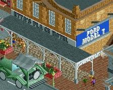
Really digging the blue on that awning
To build on dirt's suggestion to drop the black squares, you could try to use the flat grass texture object (colored grey) instead, to give the road some textural variability and make it look less perfect/more worn. It's more subtle but I often find it to work well, not only on roads but on any kind of large, single-colored surface where you want imperfections and variation.
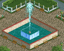
Good stuff overall, definitely a park I’m looking forward to seeing more of
Looks nice and very RWE-ish!
Like I said the path is now much better than it was before. I think it's good now, and it brings some good atmosphere.
Great textures.
Very rich textures, but very readable. Good amount of foliage too, and I think the variation in your buildings is spot on.