Those entrance signs are a perfect dash of color. It reminds me a little of the new EPCOT design-style (black/white with some bright colored diagonal stripes). I agree that the salmon colored pathway is a great choice. The rocket looks nice too. I think the buildingshapes could use a little more oomphf. I think I saw some screenshots from a Disney-space project that nailed the modern NASA/future vibe on the buildings. So maybe you could check those out for some inspiration. The standard streetlights don't work for me at all in this screen, I think you could find or assemble a better object for those.
Much better than the screen you've shown on discord earlier! All thanks to my feedback, of course. But really, great job man. I'm digging the desaturated look with splashes of bright colours. The trims with primary colours are a nice motif I'd like to see more of, maybe at the expense of the greens that seem like the odd ones out.
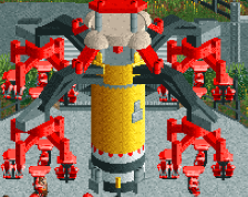
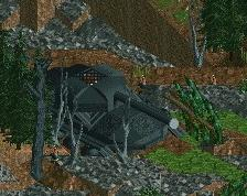
I'm also thinking the rocket has had a few too many pizzas, it's more likely to create a sinkhole rather than a lift-off. I think you can come up with a more elegant skinny design, and while you're at it maybe it's a good idea to give it a proper launch platform instead of a local pine forest - although launching a rocket from the woods is actually a great way to burn calories.
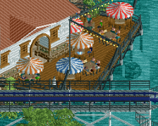
I'm liking the pathwork a lot, and the pops of colour from the towers are very well placed. Going monochrome for the buildings is definitely a bold choice, but it does allow the focal points of the area to stand out more.
 09-December 20
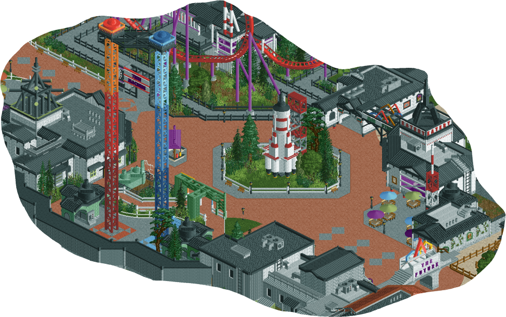
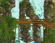
I dig it! Kind of weird seeing evergreen trees in this futuristic type setting though. Nice work! Looking forward to seeing it with peeps
No offense, but it doesn't look very futuristic to me, just sort of NASA-ish.
RaunchyRussell Offline
Futuristic? Maybe. Nonetheless this looks super nice! Like Ge said, "NASA-like".
That's a neat little chonky rocket you got there. I like it, the salmon path is a great choice. Would like to see more from this!
Those entrance signs are a perfect dash of color. It reminds me a little of the new EPCOT design-style (black/white with some bright colored diagonal stripes). I agree that the salmon colored pathway is a great choice. The rocket looks nice too. I think the buildingshapes could use a little more oomphf. I think I saw some screenshots from a Disney-space project that nailed the modern NASA/future vibe on the buildings. So maybe you could check those out for some inspiration. The standard streetlights don't work for me at all in this screen, I think you could find or assemble a better object for those.
Nice colors, great job
Much better than the screen you've shown on discord earlier! All thanks to my feedback, of course. But really, great job man. I'm digging the desaturated look with splashes of bright colours. The trims with primary colours are a nice motif I'd like to see more of, maybe at the expense of the greens that seem like the odd ones out.
I'm also thinking the rocket has had a few too many pizzas, it's more likely to create a sinkhole rather than a lift-off. I think you can come up with a more elegant skinny design, and while you're at it maybe it's a good idea to give it a proper launch platform instead of a local pine forest - although launching a rocket from the woods is actually a great way to burn calories.
Looking forward to seeing more! Great progress.
I'm liking the pathwork a lot, and the pops of colour from the towers are very well placed. Going monochrome for the buildings is definitely a bold choice, but it does allow the focal points of the area to stand out more.
thanks for the feedback everyone, I have a notepad full of stuff to change based on your ideas.
Travis Scott Offline
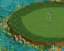
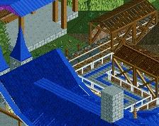
Something just feels... off, Like everything is so hard-outlined by either path, fencing, or buildings that it feels disharmonious.