Looking good! I really love that corkscrew over the entrance. Next steps would be to spiff up the locker building and break up the path near the sign, whether with texture or something like another planter. It would also help to have some sort of support for the sign. Right now it just looks like the letters are leaning up against the planter.
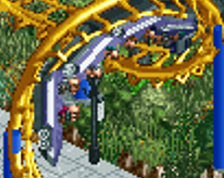
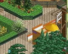
I wouldn't double up the queue fence like that, sorta looks inconsistent as a result. Good start tho, liking the fallen leaves around the trees it's very believable.
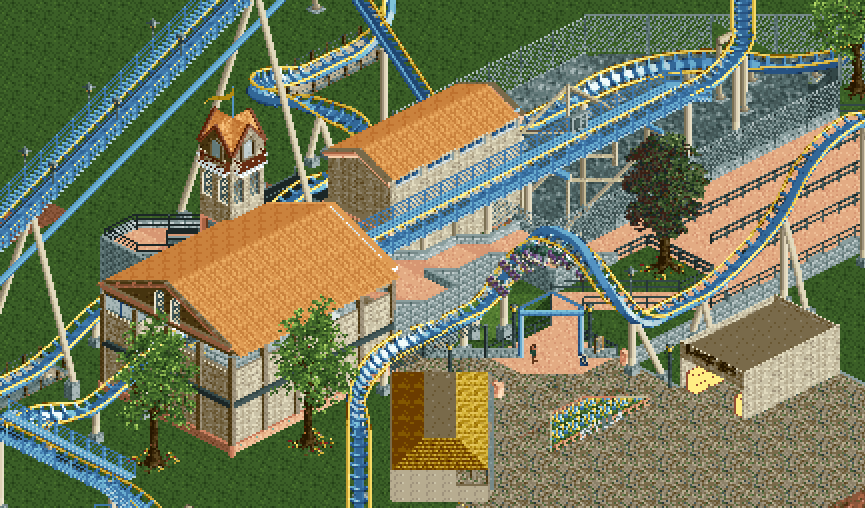
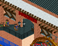
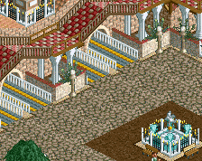
Great improvement to what you showed the other day on discord! I think the new walls and streamlined roofs help to sell the setting! Good stuff. Also liking the tower, I don't know if I noticed it the last time.
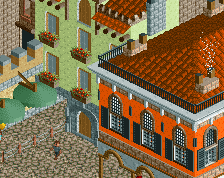
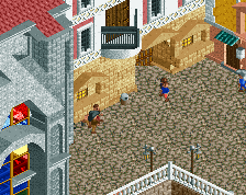
I think playing around with a bit more diverse ground textures and adding more foliage will help to avoid the still present "manicured" and artificial impression. I think especially placing bushes against the walls (in patches) to cover up the foundations will make it look more natural immediately and with quite a low effort, if you want to go for that style of course.
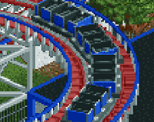
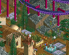
Born from tales that struck terror in sailors for centuries, SeaWorld Italy's mighty Scylla is a monster coaster like no other. *See comment for better quality screen*
 20-February 22
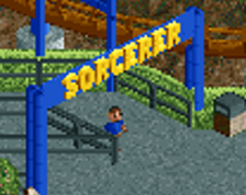

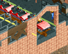
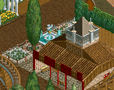
Looking good! I really love that corkscrew over the entrance. Next steps would be to spiff up the locker building and break up the path near the sign, whether with texture or something like another planter. It would also help to have some sort of support for the sign. Right now it just looks like the letters are leaning up against the planter.
Yes
Great improvement to what you showed the other day on discord! I think the new walls and streamlined roofs help to sell the setting! Good stuff. Also liking the tower, I don't know if I noticed it the last time.
I think playing around with a bit more diverse ground textures and adding more foliage will help to avoid the still present "manicured" and artificial impression. I think especially placing bushes against the walls (in patches) to cover up the foundations will make it look more natural immediately and with quite a low effort, if you want to go for that style of course.