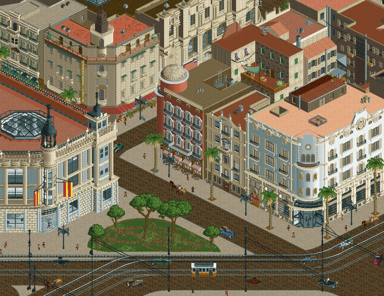
Screenshot / Hotel Reina Victoria i Casa Cometa
-
 04-March 22
-
Valencian City Project
-
5 of 5
- Views 2,252
- Fans 1
- Comments 14
Community Forum Software by IP.Board
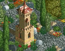
i love it, but i think its running into problems with roof texture. Im not sure how to get around it either, its just a huge problem in rct where a lot of what we look at is roof.
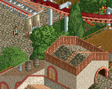
the faces of the buildings are gorgeous, and the street level stuff is charismatic, but I'm not sure where to go with the rooves.
I agree with sammy on the roof textures, just sort of feels like its missing the mark. And since so much of this is roof, it does detract a bit.
Same can maybe be said for the street textures too I think. Totally get you're trying to keep this clean but maybe they could be brought up a bit to match the detail level of the facades?
Stellar facades, gorgeous. It is getting a bit much roof, I think you need to add a lot more details on those. Same for the streets.
I hope the next screen won't be next year
I'm not so much bothered by the roofing textures as much as the colors and shapes of them: the colors of the roofs are essentially the same colors of the buildings themselves, washing everything in a sea of rust red and beige. I mean, it's an aesthetic, but I think contrast is missing. A black roof here and there or just any darker neutral used more abundantly could help. Outside of the facades against the streets themselves, the backsides feel pretty square as well. I'm sure it's true to life but I think some liberties with some diagonals back there could be welcome!
Everything else is flames. That curved white facade, oof.
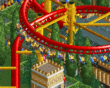
That's one large tram car!
Damn Tols, pulling out the big guns! I truly love how much you push this game to new heights.
Jeeeeeeeeeeeeeeeeeeeeeeeeeeeeeeeeeeeeeeeeeeeeeeeeesus! This is just absolutely nuts. Your architecture is on point and your use of those abstract triangles as half diagonal/rounded windows is so clever. The bottom half of the screen does look a bit unfinished though, with some peep-level details missing and not exactly much transition between the street and the trees. I do agree with the others on the roofs; considering how intricate the walls and decorations on the buildings are, the roofs do feel a little flat in comparison. Even a little G Forcing with some safety nets to add variation could make things pop. I do appreciate how the streets are open enough to really take in the architecture though; that's where this map really shines.
facades are really nice well done, everything else super questionable. Just the quality effort level between the two kinda noticeable.
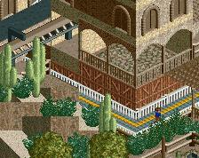
That texture on bottom left is like windows 95 maze screensaver.
Amazing
Great archy
The glass cheese block as a half-diagonal is brilliant, and it fits seamlessly with the diagonal door piece.
Is that curved dirt trim available for use yet?
Thanks guys for the comments, I see what I can do about the roofs. Other colors is definetely no option as I want to stay close to the original. I am always fascinated by backyard atmosphere in real life. I hope I will be able to convey that feeling with this park, so probably need to work on that still.
@Terry, I haven't released any objects for longer now, maybe I should make an updated post soon.
Agree that the foundation texture on the bottom left building doesnt really fit, but other than that, this is brilliant.
I don't mind the rooves, but that's just me. Nice facades. the curvy dirt trail is also funny.