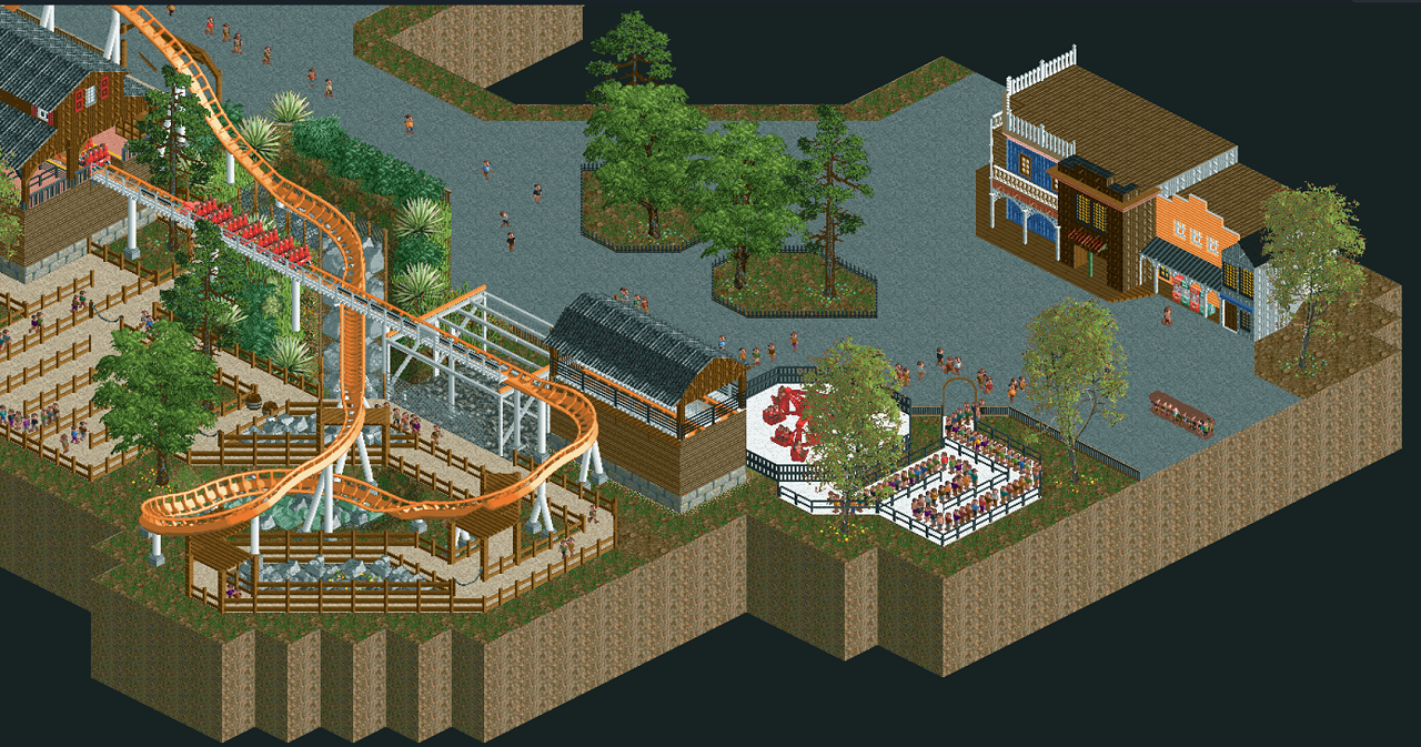
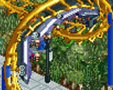
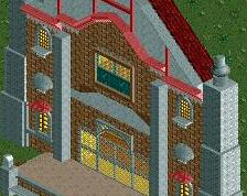
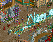
Good start for sure. The coaster-queue interaction is great, and the building facades are cute.
The white scrambler base and queue stands out a bit, I think you can switch to something else there to make it blend a bit more.
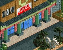
Some more path level details (benches, trash cans, tables, etc) can really elevate this, but I'd guess those will be added eventually.
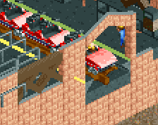
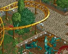
As for the transfer building/table, currently the train will be flying over the joints in the table at a high rate of speed. B&M's like this have the brake run and then the table, so they'll send the empty train around, it'll get stopped by the brakes, and then slowly moved onto the table. I think you should move the whole transfer building towards the station (right where the transfer table is currently), and then put the transfer table closer to the station. I think you can also improve the building itself a bit, it's blocky and very tall. Another tile of width, plus some more shaping might improve it.
Oh im not worried about the ratings. I know the screen is shit because it's still a WIP. I dont even mind the 40% but to lower the rating just because doesnt seem like what this community is supposed to be about.
I wanna echo what sax was saying about the transfer table. Looks like you have the space to push everything forward a few tiles.
There isn't much life to the new area and the facades, flat and planters are missing a sense of presence. Seems like you're putting more energy into the screen's reception than the actual building process.
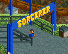
Commenting on the right side of the screen here since we have seen the left side already from another angle:
I would change the colour of the queue and base of that flat ride from bright white to something else. Try to remember if you have ever seen pristine bright white path anywhere.
The buildings are underdetailed and are currently barely accessible for peeps. Try opening them up a bit more.
The paths need detailing like benches and lamps etc.
The foliage is too bare, could use some more colour and density.
i don't think you're ever going to improve if you don't commit yourself to a project and keep building through the awkward phase. it's not about getting it right the first time, it's about taking the time to consider and refine something.
Hopefully I did the rating right. I tried to vote an honest %60 percent on a tablet because it looks like at least bronze work to me.
Maybe Where’s Walto was only joking? If I’m not mistaken that’s the type of humor a lot of people use at this site but all in good fun.
I really the screen. I think it shows good composition. Though I agree with Pants you should maybe finish things. Or not. To me if you’re having fun I’m not sure what other goal there should be.
I think my favorite part is the coaster element over the que.
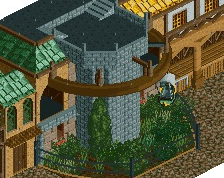
I would keep working on this area, maybe build a little more space around the queue and the coaster turn around to provide more space to work with. Start pumping in some details to build up the atmosphere: tables/umbrellas, food stands, benches, lamps, garbage bins, signs, planters, trees, bushes/grasses/flowers, etc... You have a solid base to build off, keep pushing it to the next level. This is how all parks get built in rct.
Here's an example from one of my parks to show how adding atmosphere can elevate an area.
Interesting psychological things going on here. Probably odd coming from me. I used to be fantastico. That aside, good friend, Dark Horse, maybe consider a humble apology, without saying anything else or defending your actions (which would mean it’s not being truly sorry). Just saying you were wrong and you’re sorry will suffice perhaps. Then take steps to recognize triggers and patterns. I’ve noticed patterns in many of your threads. I tend to think without an apology or true change then you’ll maybe get the same result in each thread. I don’t see how that could be enjoyable. I think it starts with attitude. Feel good about yourself and others and your outlook on things and that will affect your surroundings. Take or leave my advice. Just trying to be friendly and helpful.
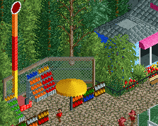
I really like the coaster colors, orange & white is always a winner in my book! Bit too much of the 1K ruins beneath it, less is more Paths are bare, just as the foliage. Add some flowers, bushes etc.
The white path of the troika is too distracting, it doesn't fit. Go for another path type that fits the gray tarmac better. Gray crazy path perhaps?
 27-May 22

Honey, how do you like your toast? With extra peep jam
Good start for sure. The coaster-queue interaction is great, and the building facades are cute.
The white scrambler base and queue stands out a bit, I think you can switch to something else there to make it blend a bit more.
Some more path level details (benches, trash cans, tables, etc) can really elevate this, but I'd guess those will be added eventually.
As for the transfer building/table, currently the train will be flying over the joints in the table at a high rate of speed. B&M's like this have the brake run and then the table, so they'll send the empty train around, it'll get stopped by the brakes, and then slowly moved onto the table. I think you should move the whole transfer building towards the station (right where the transfer table is currently), and then put the transfer table closer to the station. I think you can also improve the building itself a bit, it's blocky and very tall. Another tile of width, plus some more shaping might improve it.
Wasn't me, I didn't rate it.
I know it's hard, but don't worry about the screen ratings. Just reading the advice/praise people give is the most useful thing you can do.
I wanna echo what sax was saying about the transfer table. Looks like you have the space to push everything forward a few tiles.
There isn't much life to the new area and the facades, flat and planters are missing a sense of presence. Seems like you're putting more energy into the screen's reception than the actual building process.
I would change the colour of the queue and base of that flat ride from bright white to something else. Try to remember if you have ever seen pristine bright white path anywhere.
The buildings are underdetailed and are currently barely accessible for peeps. Try opening them up a bit more.
The paths need detailing like benches and lamps etc.
The foliage is too bare, could use some more colour and density.
i don't think you're ever going to improve if you don't commit yourself to a project and keep building through the awkward phase. it's not about getting it right the first time, it's about taking the time to consider and refine something.
Hopefully I did the rating right. I tried to vote an honest %60 percent on a tablet because it looks like at least bronze work to me.
Maybe Where’s Walto was only joking? If I’m not mistaken that’s the type of humor a lot of people use at this site but all in good fun.
I really the screen. I think it shows good composition. Though I agree with Pants you should maybe finish things. Or not. To me if you’re having fun I’m not sure what other goal there should be.
I think my favorite part is the coaster element over the que.
I would keep working on this area, maybe build a little more space around the queue and the coaster turn around to provide more space to work with. Start pumping in some details to build up the atmosphere: tables/umbrellas, food stands, benches, lamps, garbage bins, signs, planters, trees, bushes/grasses/flowers, etc... You have a solid base to build off, keep pushing it to the next level. This is how all parks get built in rct.
Here's an example from one of my parks to show how adding atmosphere can elevate an area.
I thought it was a nice screen and wanted to write some constructive feedback but upon reading DH's comments I decided not to.
this is a great read
What's the point of sharing a screenshot if:
A) You say it's shit
B) You get combative
C) You tell us you aren't even going to continue working on this
Like, what? Why? Saxman offers a great bit of feedback that is super constructive and then you torpedo the thread. I'm so tired of this behavior.
I really like the coaster colors, orange & white is always a winner in my book! Bit too much of the 1K ruins beneath it, less is more Paths are bare, just as the foliage. Add some flowers, bushes etc.
The white path of the troika is too distracting, it doesn't fit. Go for another path type that fits the gray tarmac better. Gray crazy path perhaps?