I think there's some screenshot shenanigans going on with the color - I don't recall it being so muted on Discord. Regardless, can't wait to see this completed.
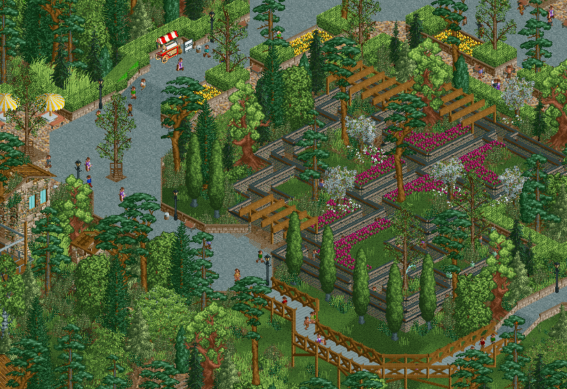
This is quite beautiful. It's such a dedicated and intense study on garden design that you can't but appreciate it. As always with your work when you go hard, I find myself admiring your colour choices a lot. I would honestly like to see you do abstract paintings, where "colours and shapes" is the main language, because I think you'd produce something really interesting. I still sense the disharmony with the tall trees, but that feedback from me is quite old at this point.
If I had to criticise, I would say what's there is great, but also a bit simple. For me it's not on the level of mega modern half diagonal crunch meta with new gradients and what not. I'm not fully convinced that's the desirable direction for us to head to, and seeing you advertise this makes me think neither are you, but then also think we just will, regardless.
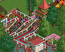
Thanks for the love guys. Like I may have said on Discord, having something this simple get this reception is motivating me to finish this park, knowing that there is still a place for this style of building on NE despite all the developments from the past few years. Sticking to clean shapes, default palette and an octagonal grid. Someone convinced me to add a tiny bit of crunch to the maze entrance though...
Chipping away at this park, mostly filling gaps in the foliage, trying to muster the courage to tackle some of the remaining large tasks. Park is like 70% finished but there's 30% of ???????? left.
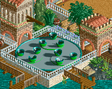
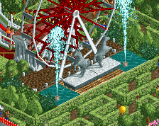
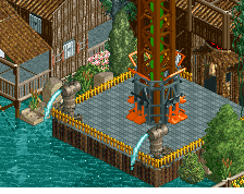
Very beautiful and well made. Putting that trim on the maze is such a small thing, but it makes this incredibly good.
Wondering if some of the diagonals could be replaced with curves with the objects we have now. Also someone should make a 'step hedge object' to adjust the hedge in the top left.
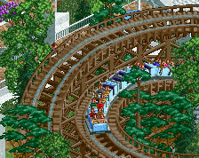
@RWE: I don't think there's a point in making it curvy unless I make the entire park curvy, which is a creative choice and not something that should be expected simply because it's 2023. I'm making the entire park on a octagonal grid. No half diagonals either. There's power in a consistent aesthetic.
Agree that you shouldn't shift to a curved or half diagonal aesthetic with the park this far along, I think sticking to the octagonal style is going to make this feel oddly fresh. I do think playing with the new colours might be a benefit but that could be a tough decision with the park at a significant level of completion already.
 01-April 23
So clean <3
I think there's some screenshot shenanigans going on with the color - I don't recall it being so muted on Discord. Regardless, can't wait to see this completed.
One of my most highly anticipated releases this year. Such an elegant project
RMM Offline
Elegant is the word.
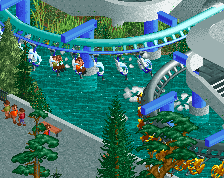
Atmosphere is so good, love the subtle touches and style of this.
Yes to all of it
This is quite beautiful. It's such a dedicated and intense study on garden design that you can't but appreciate it. As always with your work when you go hard, I find myself admiring your colour choices a lot. I would honestly like to see you do abstract paintings, where "colours and shapes" is the main language, because I think you'd produce something really interesting. I still sense the disharmony with the tall trees, but that feedback from me is quite old at this point.
If I had to criticise, I would say what's there is great, but also a bit simple. For me it's not on the level of mega modern half diagonal crunch meta with new gradients and what not. I'm not fully convinced that's the desirable direction for us to head to, and seeing you advertise this makes me think neither are you, but then also think we just will, regardless.
Snacks? The screen is the snack.
It's a brilliant idea, simple but so poetic
Great idea. Might steal.
RaunchyRussell Fan Offline
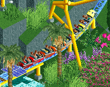
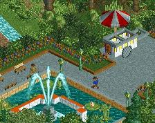
The maze ride is criminally underrated in this game. This is hot.
Thanks for the love guys. Like I may have said on Discord, having something this simple get this reception is motivating me to finish this park, knowing that there is still a place for this style of building on NE despite all the developments from the past few years. Sticking to clean shapes, default palette and an octagonal grid. Someone convinced me to add a tiny bit of crunch to the maze entrance though...
Chipping away at this park, mostly filling gaps in the foliage, trying to muster the courage to tackle some of the remaining large tasks. Park is like 70% finished but there's 30% of ???????? left.
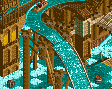
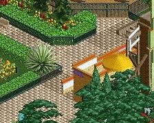
for the elevated walkway i suggest just using tussauds fencing? might looks cleaner and less beefy
Very beautiful and well made. Putting that trim on the maze is such a small thing, but it makes this incredibly good.
Wondering if some of the diagonals could be replaced with curves with the objects we have now. Also someone should make a 'step hedge object' to adjust the hedge in the top left.
@BelgianGuy: what is tussauds fencing?
@RWE: I don't think there's a point in making it curvy unless I make the entire park curvy, which is a creative choice and not something that should be expected simply because it's 2023. I'm making the entire park on a octagonal grid. No half diagonals either. There's power in a consistent aesthetic.
Agree that you shouldn't shift to a curved or half diagonal aesthetic with the park this far along, I think sticking to the octagonal style is going to make this feel oddly fresh. I do think playing with the new colours might be a benefit but that could be a tough decision with the park at a significant level of completion already.