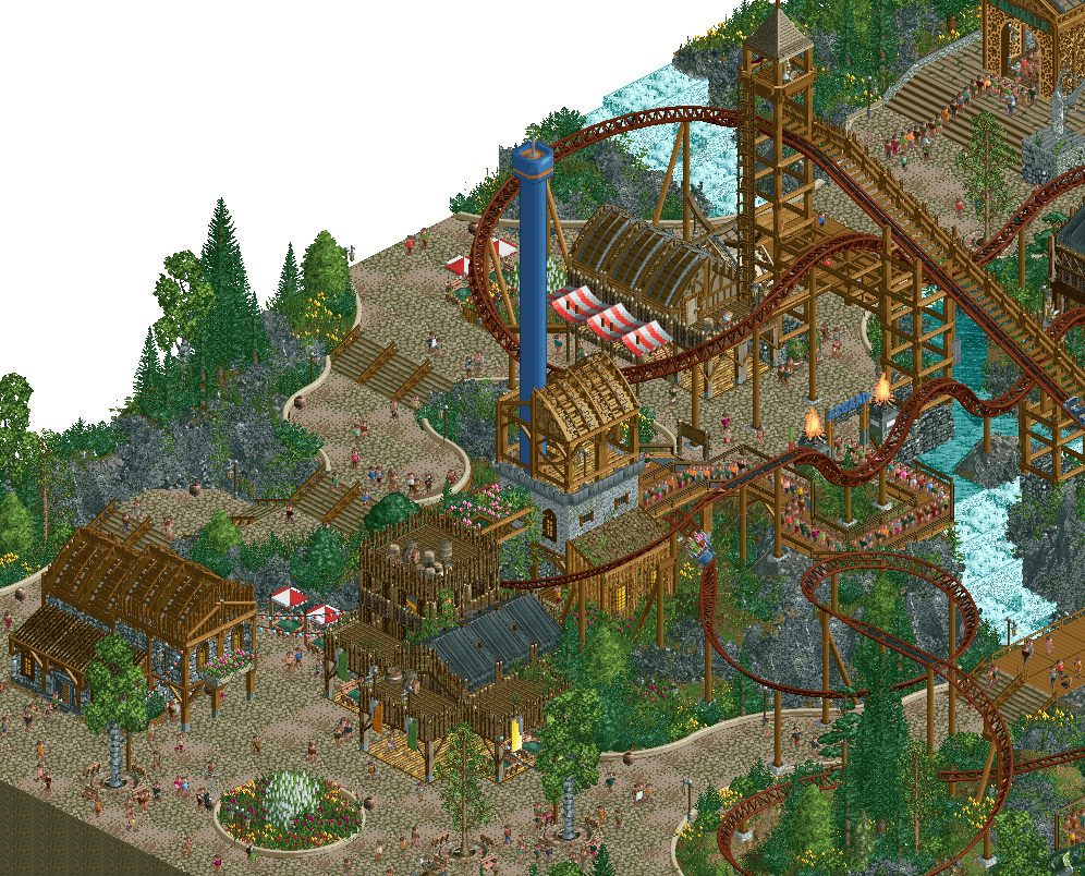
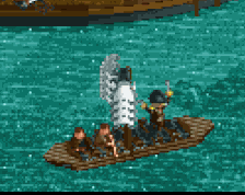
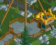
I'd have painted the coaster another color because it would make it stand out more, since the environment already is kinda brown. Other than that, I like everything else. Really great stuff!
Looks good! Very nice organic shapes. I'm with Fred on the Coaster colours. If you don't want it to stand out that much, the blue of the roto-drop is a nice inbetween colour with what you already have. You'll need to repaint that thing then, of course.
I'm not even gonna make any DKSO jokes. This is generational work regardless of objects. The fidelity is so high, especially the custom rockwork and the half diagonal hanging flags made with litter. Kanaiva's classic curvy paths work so well especially with that custom path block color. Ride design and interactions are stellar as is the archi. There's just so much in this screen I don't feel like I've seen before. Unfortunately I kinda can't unsee the ride color thing after Fred and Chorkiel pointed it out. Swapping the colors of the coaster and the roto drop I think would be a wise move. I also feel like it really needs an extra N somewhere.
the rocks look amazing here, as well as the foliage and flowers. everything is very good actually - this is likely the best theme i've seen from you yet!
On one hand, I'm not a big fan of the steel blocks in the paths. On the other much larger hand, I am a big fan of everything else. Killer work from you (and kanaiva) like always
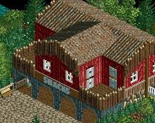
I think this is rather yummy work. For me, I like all the buildings separately but together, there seems a lack of cohesion between them aesthetically.
The only critique I'd probably give is maybe swapping the drop tower with the building inside the drop might have given a better over all macro to the map, but otherwise... Chef's Kiss. Bravo!
 27-February 26
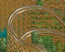
I'd have painted the coaster another color because it would make it stand out more, since the environment already is kinda brown. Other than that, I like everything else. Really great stuff!
Looks good! Very nice organic shapes. I'm with Fred on the Coaster colours. If you don't want it to stand out that much, the blue of the roto-drop is a nice inbetween colour with what you already have. You'll need to repaint that thing then, of course.
Not bad for DKSO.
I'm not even gonna make any DKSO jokes. This is generational work regardless of objects. The fidelity is so high, especially the custom rockwork and the half diagonal hanging flags made with litter. Kanaiva's classic curvy paths work so well especially with that custom path block color. Ride design and interactions are stellar as is the archi. There's just so much in this screen I don't feel like I've seen before. Unfortunately I kinda can't unsee the ride color thing after Fred and Chorkiel pointed it out. Swapping the colors of the coaster and the roto drop I think would be a wise move. I also feel like it really needs an extra N somewhere.
the rocks look amazing here, as well as the foliage and flowers. everything is very good actually - this is likely the best theme i've seen from you yet!
Love love this build
Cool layering. Your talent is so clear to see.
A pretty faultless screen. Excited to see this in-game.
I think this is rather yummy work. For me, I like all the buildings separately but together, there seems a lack of cohesion between them aesthetically.
This is such high quality. This is 90%+ stuff to me. So clean, really modern parkmaking stuff but on an NSCO bench. Crazy!
Really excellent. I love this screen.
The only critique I'd probably give is maybe swapping the drop tower with the building inside the drop might have given a better over all macro to the map, but otherwise... Chef's Kiss. Bravo!