(Archive) Advertising District / Dump-Place
-
 19-April 07
-
 Roomie
Offline
Still working on building ideas for the cityscape Some more successful that others.
Roomie
Offline
Still working on building ideas for the cityscape Some more successful that others.
Some of the attempts. Not sure on the top of the supports on the central building. I like the lower section but making the top look less messy would be handy.
The support in the middle of the road needs to be fixed and need to expand that tiny pond. This is the monorail line that runs down and through Delphic Shores. -
 Jonny93
Offline
Shotguns, i think your NCSO is much better than your CSO. Pretty good screens.
Jonny93
Offline
Shotguns, i think your NCSO is much better than your CSO. Pretty good screens.
Roomie the first screen is excellent. -
 pierrot
Offline
Shotguns, as I said before you're much more talented in NCSO. love the mixture of car ride & single rail track.
pierrot
Offline
Shotguns, as I said before you're much more talented in NCSO. love the mixture of car ride & single rail track.
Roomie, that bobsled sculpture in the far corner of the first screen is brilliant. -
Airtime Offline
(100% NCSO, promise)
Nope. That black path isn't NCSO nor is the road line. If I'm being an arse that crazy pathing isn't either />
/>
But it's really great. The second screen is beautiful. I think you've really hit the colours on that one.
Roomie. That building with the black glass is great. I'm not sure about the building with the 3D cinema though, I don't like the track arching over it. -

BigB Offline
Nope. That black path isn't NCSO nor is the road line.
I think the road line is a roman fence put down under the path, so you jsut see the top of it.
Shotguns, I think the colors u use doesn't fit with those palm trees.
The atmosphere of this place is more cold and a little bit lifeless, I think the black from the path (what is just base blocks with an invisible path?) killed it for me.
Maybe brighter colors and more live would fit better... -
Airtime Offline
The road line is rapids track.
BigB got it. Took a bit of looking but I can see it now. That's real clever sho go. -
Roomie
Offline
Roomie. That building with the black glass is great. I'm not sure about the building with the 3D cinema though, I don't like the track arching over it.
Yeah it's not staying. Its left over from last years work and it was slated then. I have big ideas for that building just not got round to working on it yet.
-
 Cocoa
Offline
I love how it resembles laqua, its very interesting and well-hacked and whatnot, but that red brick wall just kills it. I don't really know what you could do about it- there's not a lot of options in LL. But I just can't imagine a modern mall with an intamin rollercoaster made with red brick.
Cocoa
Offline
I love how it resembles laqua, its very interesting and well-hacked and whatnot, but that red brick wall just kills it. I don't really know what you could do about it- there's not a lot of options in LL. But I just can't imagine a modern mall with an intamin rollercoaster made with red brick. -
 10ryansmith
Offline
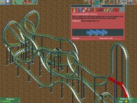
Eurofighter. Trying to get back into the game. The ending sucks so I'm going to try and redo it.
10ryansmith
Offline
Eurofighter. Trying to get back into the game. The ending sucks so I'm going to try and redo it.Attached Thumbnails
-
-
 Ling
Offline
I like the idea, but I'm pretty sure that hack (with the extended inverted section) is not going to work.
Ling
Offline
I like the idea, but I'm pretty sure that hack (with the extended inverted section) is not going to work.
RRP, on the whole I really like the layout. The huge helix as the second/third hill seems a little... off? Asymmetrical, somehow. I feel like some of the flat wide turns should be banked as well, given the speeds the train must be traveling at those points (bottom of the hill by the water, most notably). Also I assume you have something specific planned for the little set of "hops" towards the end of the ride? They seem a bit random now. -
 Wanted
Offline
RRP, I wish you and Phatage could make a park together just to wow us with epic layouts.
Wanted
Offline
RRP, I wish you and Phatage could make a park together just to wow us with epic layouts. -
 inthemanual
Offline
inthemanual
Offline
Am I the only one who doesn't like that layout?
I like most of it, but I think the part after it crosses under the lift the second time looks boring and blocky, and that the big oblong hill/helix thing doesn't really do anything for me. it just seems like added length and I think it looks bad. -
 Faas
Offline
I don't like the layout RRP. Especially the part on the left of the screen doesn't do much for me.
Faas
Offline
I don't like the layout RRP. Especially the part on the left of the screen doesn't do much for me.
10ryansmith: Not much to say. Cool element on the left of the screen.


Tags
- No Tags